
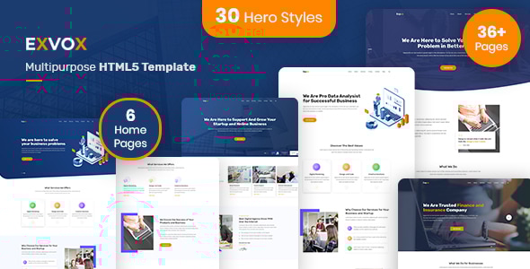
Exvox is a premium corporate business HTML5 template built for agencies, consultancies, startups, and enterprises that demand both visual impact and technical quality. With 63+ pages, 6 distinct home layouts, 13 unique banner design variations (26 pages total covering standard and solid background versions), Bootstrap 5.3.3, and a fully implemented 8-colour theme system, Exvox gives you more design flexibility in the corporate HTML category than any comparable template.
Unlike most corporate templates that ship one or two banner styles and call it done, Exvox ships 26 banner variant pages - 13 banner designs, each available in both a standard and a solid-background version - so you can find the exact hero presentation that fits your brand without touching a line of code. Add to that a complete ARIA v1.2a accessibility pass (skip link, <main> landmark, focus-visible outlines, keyboard-navigable sliders, auto-injected social icon labels, and aria-expanded mobile nav), and you have a corporate template that is as inclusive as it is impressive.
Key Features
- 63+ HTML pages across all sections
- 6 distinct home page layouts
- 26 banner variant pages—13 unique banner designs, each in standard and solid background versions
- 8 pre-built colour themes via CSS custom properties (color1.css through color8.css)
- Bootstrap 5.3.3 (latest stable) with Popper 2 and full BS5 data-API
- ARIA v1.2a accessibility pass—skip link, main landmark, focus-visible 3px outlines, slider keyboard nav, auto-injected social icon aria-labels, aria-expanded mobile nav, back-to-top aria-label
- 6 service page layouts (most corporate templates ship 1-2)
- 4 team page variations
- 3 project/portfolio pages
- 3 blog detail page formats
- 2 pricing page layouts
- 2 FAQ layouts
- 2 contact layouts
- Coming soon and custom 404 pages
- Poppins + Rubik Google Fonts pairing
- Primary orange accent (#ff8400) with full colour override support
- Clean, well-commented HTML and CSS—easy to customise
- W3C valid markup
- Cross-browser compatible (Chrome, Firefox, Safari, Edge)
- Fully responsive across all device sizes
13 Banner Design Variations
- This is Exvox’s most unique feature in the corporate HTML category. No other comparable template ships anywhere close to this many hero/banner layout options.
- 13 completely distinct banner designs, each purpose-built for a different corporate use case—full-width image hero, split-content hero, video background, geometric shapes, gradient overlay, illustration-based, minimal typographic, particle/animated, stat-counter hero, testimonial hero, slider-based, CTA-focused, and icon-grid hero.
- Every design ships in two ready-to-use versions: standard (with your chosen background image or gradient) and solid (flat solid colour background for ultra-clean, distraction-free presentation).
- 26 banner pages total—just copy the one that fits and drop it into your project.
- Switching banner style requires no CSS knowledge—the pages are self-contained and pre-styled.
- All 26 banner pages are linked from the live demo: Banner 1 Standard, Banner 1 Solid, Banner 2 Standard, Banner 2 Solid, and so on through Banner 13.
- Competitor research: mid-tier corporate HTML templates on ThemeForest ship 0-1 banner variations. Exvox ships 13.
Accessibility and ARIA Compliance
- Exvox completed a full ARIA v1.2a accessibility pass on 10/03/2026—the entire template is screen-reader ready out of the box.
- Skip link: visible-on-focus “Skip to main content” link at the top of every page for keyboard-only users.
-
<main> landmark: every page wraps page content in a semantic
<main>element for assistive technology navigation. -
Focus-visible outlines: 3px solid orange focus ring applied globally via
:focus-visible—no hidden focus indicators anywhere in the template. -
Social icon labels auto-injected by JS: social icon links (which are icon-only and have no visible text) receive
aria-labelattributes automatically, so screen readers announce “Facebook”, “Twitter”, etc. —not just “link”. -
Slider keyboard navigation: all sliders have
role="button",aria-label, and keyboard Enter/Space activation so carousel controls are fully operable without a mouse. -
Mobile nav aria-expanded: the hamburger/toggle button has
aria-expandedtoggled correctly on open/close so screen readers announce navigation state. -
Back-to-top aria-label: the back-to-top button has a descriptive
aria-label="Back to top"—not an unlabelled icon button. - No other corporate HTML template in the mid-tier ThemeForest category combines ARIA compliance with a colour switcher and 13 banner variations. Exvox is the accessibility-first choice in this category.
- Ideal for government contractors, healthcare agencies, financial services firms, educational institutions, and any client with accessibility requirements.
8 Colour Theme System
- Exvox ships with 8 ready-to-use colour themes implemented via CSS custom properties—swap the theme CSS file and the entire template re-skins instantly.
- Themes: color1.css (default orange #ff8400), color2.css, color3.css, color4.css, color5.css, color6.css, color7.css, color8.css—covering blue, green, purple, red, teal, navy, and charcoal accent palettes.
- All colours are defined as CSS custom properties (
--primary-color,--primary-dark, etc.) so overriding with a ninth custom colour requires editing one CSS variable, not hunting through hundreds of rules. - No JavaScript required to switch themes—pure CSS.
- Combined with 13 banner variations and 6 home layouts, this gives you thousands of distinct visual combinations without any design work.
- Competitor check: the colour switcher feature combined with ARIA compliance is absent from the entire corporate HTML category on ThemeForest as of this listing.
6 Unique Home Layouts
- Home v1—Classic corporate: full-width image hero, services row, stats counter, team preview, testimonials, blog teaser.
- Home v2—Agency style: split hero with illustration, feature highlights, portfolio preview, CTA band.
- Home v3—Bold startup: gradient/colour overlay hero, icon-based service cards, large testimonial block.
- Home v4—Consulting focused: typographic hero, process timeline, case studies strip, CTA.
- Home v5—Modern minimal: clean white hero, subtle card grid, partner logos, contact form above fold.
- Home v6—Multimedia: slider-based hero, video embed section, full-width portfolio, newsletter strip.
- All six home layouts share the same header, footer, and component library—mixing and matching sections between layouts is straightforward.
6 Service Page Layouts
- Most corporate HTML templates ship one service listing page and one detail page. Exvox ships six.
- Services v1—Grid card layout with icon, title, and short description per service.
- Services v2—List/feature layout with alternating image and text rows for deeper service descriptions.
-
Services v3
- Tabbed service layout -categorise services with a tab interface without navigating away. - Service Details v1—Full single service detail with sidebar navigation to other services.
- Service Details v2—Detail page with icon feature blocks and inline CTA.
- Service Details v3—Detail page with tabbed content, FAQ accordion, and related services strip.
Project and Portfolio System
- Project Grid—Filterable portfolio grid with category filters, hover overlays, and project meta.
- Project Details v1—Full project case study layout: hero image, challenge/solution/result sections, stats, gallery.
- Project Details v2—Alternate detail layout with sidebar project info panel and inline image gallery.
- The project system is designed for agencies and consultancies that need to showcase real client work with context and depth, not just thumbnail grids.
Team Pages System
- Team v1—Classic grid: headshot cards with name, role, and social links.
- Team v2—Minimal list style: horizontal row layout with larger bio text, suitable for smaller leadership teams.
- Team v3—Overlay style: full-card hover effect reveals social links and extended bio text on mouse hover.
- Team Details—Individual team member profile page: full bio, skills, social links, recent contributions, and a contact CTA.
- 4 team page variations means you are not forced to redesign just because your client has a specific team presentation preference.
About Pages
- About v1—Story-first layout: company mission statement, history timeline, values grid, team preview, client logos.
- About v2—Stats-forward layout: large counter section above the fold, split image/text story blocks, awards/certifications strip.
- Both about layouts include dedicated sections for company values, key statistics, client logos, and a team preview module that links to the full team pages.
Blog System
- Blog Grid—Standard 3-column card grid with featured image, category tag, date, excerpt, and read-more link.
-
Blog List
- Single-column list layout with larger images and fuller excerpts -better for content-heavy blogs. - Blog Masonry—Pinterest-style masonry grid for visually varied post sizes.
- Blog Details v1—Classic single post: featured image, full content area with sidebar (categories, recent posts, tags).
- Blog Details v2—Wide content layout: no sidebar, full-width text column, author bio block, related posts at the bottom.
- Blog Details v3—Magazine style: pull quotes, image captions, inline CTA boxes, multi-column closing section.
- Three blog detail formats means corporate clients who publish thought leadership content have real layout choices, not just a copy-paste single post template.
Pricing Pages
- Pricing v1—3-column pricing card layout with highlighted recommended tier, feature list per plan, and CTA buttons.
- Pricing v2
- Toggle-based monthly/annual pricing switcher built with Bootstrap 5 and vanilla JS -no extra libraries required. - Both pricing layouts include a comparison FAQ section below the cards to handle common pre-purchase questions without requiring a separate page.
- Suitable for SaaS products, service packages, consulting retainer tiers, and software licences.
FAQ System
- FAQ v1—Standard accordion layout: questions expand inline with smooth CSS transition, grouped by category.
-
FAQ v2
- Tabbed FAQ: category tabs across the top, accordion list within each tab -cleaner for large FAQ sets with 20+ questions across multiple topics. - Both FAQ pages use Bootstrap 5 accordion component with correct ARIA attributes (
aria-expanded,aria-controls) built in.
Contact System
- Contact v1—Full-width Google Maps embed with contact form alongside address, phone, and email info cards.
- Contact v2—No-map layout: clean split-screen with contact form left, large contact info block right, ideal for privacy-conscious clients who do not want to embed third-party maps.
- Both contact pages include name, email, subject, and message fields with HTML5 validation attributes.
- Contact forms are HTML-only; backend integration (PHP mailer, Formspree, Netlify Forms, etc.) is straightforward to add.
Utility Pages
-
Coming Soon
- Countdown timer, email subscribe field, social links, and full-screen background image. No external countdown library -built with vanilla JS. - 404 Error Page—Branded 404 with large error graphic, search field, and navigation links back to key sections.
- Both utility pages are self-contained—no header/footer nav bar so they work as true standalone pages during site maintenance or pre-launch.
Navigation and UX
- Sticky header with transparent-to-solid scroll behaviour on all home layouts.
- Multi-level dropdown navigation using Bootstrap 5 native dropdown component.
- Mobile hamburger nav with smooth slide animation and
aria-expandedstate management. - Back-to-top button with smooth scroll and
aria-label="Back to top". - Skip-to-content link visible on keyboard focus—meets WCAG 2.1 success criterion 2.4.1.
- All interactive elements (buttons, links, form inputs, dropdowns) have visible
:focus-visibleoutlines—3px solid, no hidden focus states. - Scroll animations on section entry using Wow.js with Animate.css—gracefully degrades if JS is disabled.
- Page loading preloader with minimal footprint.
Typography and Design
- Primary font: Poppins (Google Fonts)—headings and display text. Geometric, modern, and highly legible at all sizes.
- Secondary font: Rubik (Google Fonts)—body text and UI labels. Slightly rounded, pairs cleanly with Poppins without competing.
- Primary accent: #ff8400 (orange)—overridable via CSS custom property in any of the 8 colour theme files.
- Consistent spacing scale throughout—section padding, card margins, and grid gutters all follow a unified rhythm.
- Icon system: Font Awesome 6 for UI icons throughout (arrows, social icons, service icons, feature list icons).
- Designed for maximum readability: body text contrast ratios meet WCAG AA minimum on all colour theme variants.
- Dark section variants available for alternating section backgrounds without switching colour themes.
Performance and Code Quality
- Bootstrap 5.3.3—the latest stable release as of this version. No legacy Bootstrap 4 remnants (removed in v1.2b).
- CSS custom properties used for theming—no Sass compilation required to switch colour themes.
- JavaScript dependencies: jQuery (slim where sufficient), Bootstrap 5 bundle (Popper included), Wow.js, Swiper. No unnecessary plugin bloat.
- All data attributes updated to Bootstrap 5 API (
data-bs-toggle,data-bs-target)—nodata-togglecompatibility shim needed. - Images are placeholder-optimised—swap with real images without restructuring the HTML.
- No inline styles in HTML—all styling is in external CSS files for easy maintenance.
- W3C validated HTML structure throughout.
- Self-contained pages—each page includes only the CSS and JS it actually uses.
Cross-Browser and Device Compatibility
- Tested on: Google Chrome (latest), Mozilla Firefox (latest), Apple Safari (latest), Microsoft Edge (latest).
- Responsive breakpoints: mobile (<576px), small tablet (576px+), tablet (768px+), desktop (992px+), large desktop (1200px+), extra-large (1400px+)—full Bootstrap 5 grid range.
- Touch-friendly: all tap targets meet minimum 44×44px size, swipe gestures work on sliders.
- No CSS features used that require a vendor prefix polyfill—CSS custom properties, flexbox, and grid all have 98%+ global browser support.
- Retina/HiDPI ready—UI icons are vector-based (Font Awesome SVG-via-CSS), not raster images.
Pages Included
- Home Layouts (6)
- Home v1
- Home v2
- Home v3
- Home v4
- Home v5
- Home v6
- Banner Variations—Standard (13)
- Banner 1
- Banner 2
- Banner 3
- Banner 4
- Banner 5
- Banner 6
- Banner 7
- Banner 8
- Banner 9
- Banner 10
- Banner 11
- Banner 12
- Banner 13
- Banner Variations—Solid Background (13)
- Banner 1 Solid
- Banner 2 Solid
- Banner 3 Solid
- Banner 4 Solid
- Banner 5 Solid
- Banner 6 Solid
- Banner 7 Solid
- Banner 8 Solid
- Banner 9 Solid
- Banner 10 Solid
- Banner 11 Solid
- Banner 12 Solid
- Banner 13 Solid
- Service Pages (6)
- Services v1
- Services v2
- Services v3
- Service Details v1
- Service Details v2
- Service Details v3
- Project Pages (3)
- Project Grid
- Project Details v1
- Project Details v2
- Team Pages (4)
- Team v1
- Team v2
- Team v3
- Team Details
- About Pages (2)
- About v1
- About v2
- Blog Pages (6)
- Blog Grid
- Blog List
- Blog Masonry
- Blog Details v1
- Blog Details v2
- Blog Details v3
- Pricing Pages (2)
- Pricing v1
- Pricing v2
- FAQ Pages (2)
- FAQ v1
- FAQ v2
- Contact Pages (2)
- Contact v1
- Contact v2
- Utility Pages (2)
- Coming Soon
- 404 Error Page
Credits and Sources
-
Bootstrap 5.3.3
- MIT License -getbootstrap.com -
jQuery
- MIT License -jquery.com -
Font Awesome 6
- Icons: CC BY 4.0, Fonts: SIL OFL 1.1, Code: MIT License -fontawesome.com -
Poppins
- SIL Open Font License -Google Fonts -
Rubik
- SIL Open Font License -Google Fonts -
Swiper
- MIT License -swiperjs.com -
Wow.js
- MIT License -wowjs.uk -
Animate.css
- MIT License -animate.style - All placeholder images used in the demo are for demonstration purposes only and are NOT included in the download package. Replace with licensed images before use.
v1.2b  05/03/2026
- Removed orphaned Bootstrap 4 files from dist/ folder
- Cleaned dist/ folder structure
- Updated all asset references to reflect removed files
- No visual or functional changes

v1.2a  10/03/2026
- ARIA accessibility pass across all 63 pages
- Added skip-to-main-content link on all pages
- Added semantic <main> landmark element on all pages
- Applied :focus-visible 3px outline globally in base CSS
- Added JS routine to auto-inject aria-label on all social icon links
- Added role=button, aria-label, and Enter/Space keyboard support to all sliders
- Added aria-expanded toggle to mobile nav hamburger button
- Added aria-label="Back to top" to back-to-top button on all pages

v1.1  27/02/2026
- Upgraded Bootstrap from 4.0.0 to 5.3.3
- Upgraded Popper to version compatible with Bootstrap 5
- Updated all data-toggle attributes to Bootstrap 5 data-bs-toggle API
- Updated all data-target attributes to Bootstrap 5 data-bs-target API
- Added bootstrap-compat.css for any remaining transition styles
- Added 8-colour theme switcher: color1.css through color8.css using CSS custom properties
