
603 comments found.
Hello,
Please, please help! I really need to learn where to place images for your Parallax template. I’ve looked through every CSS doc with no success.
Hi, Sorry for late reply.
Here is the instructions. html indication is https://monosnap.com/file/tJfF3rUyAUQ8YMDUW7OoO6C4VNiPEv css indication is https://monosnap.com/file/YPFlpVPpyn9FE5hOkzBxhv545dEjZLThx
Hello,
Recently purchased your “Massive” template and can’t figure out how to change LOGO positioning. I’d like to reduced the padding at the top. Your help is very much appreciated! Thank you
I am the author of the above question and this one does not need to be answered any longer.
Hi, I have a couple of questions regarding the one page-default:
1. Is there a way to delete the “link” icon when you hover over the portfolio description (external basic-link)?.
2. I’m trying to change the font color on the top menu and some of the headers but somehow it’s not working. I’m using dreamweaver to edit them and they change on the design preview but when I go and preview them on safari or firefox they don’t change. I was wondering if it’s a problem on my end with the application itself.
Thanks!
Do you know why the 3 grid gutterless portfolio page’s isotope grid breaks when I view a local version of the site? I use a 2015 macbook pro and whenever I have the browser at full screen (1440×900) the right column appears briefly before re-stacking to a two column left aligned grid. It seems to only happen at 1300+ screen size but it’s pretty sporadic, sometimes it won’t re-stack, sometimes it does. It works fine on a live version of the site though, it’s just bothersome. Any help would be appreciated. Thanks!
I’d like to make my desktop menu behave like a mobile menu. My desktop main menu has one top item with 5 sub items. I’d like the mobile version of this menu top open as if it has 5 list items and no sub item-thus avoiding the need to double tap to open all items.
Is this possible?
site is at www.arnolfodesign.com/wynns/
Thanks,
Looks like i have figured it all out.
I set the submenu parent ul and li item to class “mm-opened” at @media(640px) Then set the main list item to display:none at @media(640px) as well.
Seems to work.
Hello, how can I change the accordion with all panels closed on page load and all panels collapsible?
I have downloaded and attempted to upload Massive Responsive Multi-Purpose after purchasing it. It came up with an error saying: ‘theme is missing the style.css stylesheet’
I have searched for the reason for this. Envato’s Help Centre intimated that I should download the Installable WordPress file only. When I go to the download options, this is not an option to be found. I can not find any instructions on how to upload this theme in the documentation I have managed to download.
I have been trying to get this right for over a month now, with no success. I am very frustrated. Please help me.
Best, Gina Kraft
Hi, First of all this theme is not WordPress version. Its just made HTML, CSS and JS only. But the good news is we already submitted WordPress version hope soon it will be available in themeforest.
Thanks for your keep patience.
Hi,
Could you please tell me how I can get the responsive menu (dropdown menu for Tablets and phones) to kick in on a higher media screen than it is set at the moment?
I can get the drop down menu to kick in, but it is not cropping up to the corner touch button.
I hope this make a bit of sense to you and I hope you can help me out
Realy Great Theme! But I have an issue with the full width banner height 600. It doesn’t scale nicely on mobile. How can I make it responsive in a way the width gets to 100%? (adjusting the height to auto)
http://schildersvannu.nl/Thanx!
Hello there,
Can you please give us your screenshot, if you don’t mind? So that, we can understand your problem and find out the best solution.
Thanks ")
Dear,
Thank you for this great template design, really happy with it. I do have to things that i can not seem to solve by myself, would you be so kind to help me?
- My customer wants the next and previous button in the gallery lightbox popup, is this possible to do in an css?
- I can not seem to find out why the logo is not showing on my mobile phone, simulating the same size on my computer does show the logo correct. Can this be related to the high res screen of the phone? I think i am using the retina version of the logo though.
You can view the site: http://pdlconcept.com/home.htmlAnd my purchase code is: ff9a3fac-49db-4721-a572-4ab8a2aae8f3
Thank you in advance.
Kind regards Michiel
Did you found time to look into this?
Hello there, we are cordially apologizing for the late reply.
We are very glad that you are happy with our template
You can serve your customer, whatever he wants, with our template. You can check the following pages. You will find your solution there.
go http://massive.markup.themebucket.net/mp-index-renovation.html check OUR PROJECTS section
or
go http://massive.markup.themebucket.net/mp-index-event.html check EVENT GALLERY section
or
go http://massive.markup.themebucket.net/mp-index-decor.html check RECENT PRODUCT section
or
go http://massive.markup.themebucket.net/mp-index-restaurant.html check MENU section
or
go http://massive.markup.themebucket.net/mp-index-wedding.html check PHOTO GALLERY section
Thanks
Hey. I just saw your wonderful one-page http://massive.markup.themebucket.net/op-index-revslider-fullscreen.html but my adblock gone mad and blocking some images. What is the reason?
Its really tough to say something based on any assumption. Can you please tell us which adblock you are using. And also share the screenshot with us.
We are very glad that you liked our theme
have a problem with the contact form … to send the message … the input fields are not deleted
Sorry! we can’t understand your problem. Could you please explain in details?
Thanks
Hello,
I’ve opened a ticket and solved it – one script was missing. You can close the ticket. And can you please remove may purchase-code within the text? Thanks, Wolfgang
Hi,I use the following template “op-index-boxed” and recognized, that the “active status” ist not updated, then I scroll down. In other templates, this behavior does not exists. I’ve uploaded the page here: ff-malchen.de/preview Can you help me?
Regards, Wolfgang
My Purchase-Code ist: d1d687ef-5742-47a2-a0f1-213cd8e61a0d
First of all, thank you for finding out the bug and informing us about it. We are working on it. We will let you know as soon as we get something.
Thank you
Hi,
I have a question. Is it possible to adjust the size of the images in the light box and add more text in it? Is so, how can I do that?
Thanks,
Kristen
Yes, you can. For details check magnific-popup documentation page http://dimsemenov.com/plugins/magnific-popup/documentation.html
Thanks
Hi,
I use the following template “op-index-boxed” and recognized, that the “active status” ist not updated, then I scroll down. In other templates, this behavior does not exists. I’ve uploaded the page here: ff-malchen.de/preview Can you help me?
Regards, Wolfgang
My Purchase-Code ist: d1d687ef-5742-47a2-a0f1-213cd8e61a0d
First of all, thank you for finding out the bug and informing us about it. We are working on it. We will let you know as soon as we get something.
Thank you
Hello, I don’t know if this has been covered already and maybe I am just missing the code as to where to remove the zooming of an image banner background in the Slider Revolution. I am using the op-index-revslider-short. Thank you for your time on this matter.
this is revolution slider setting issue. they have option to stop zooming of background image. maybe that is ken-burn effect. if you want you can stop that. please take a eagle eye look at the settings
Hello, No changing the slider to Kenburns doesn’t change the zoom image thing all it seems to do if you turn the setting for Kenburns on or off is make the image pan out a little but I don’t want it to pan at all. All I want is the original image at the size set, which they show as 1920×1080.
can you send us your site link and user id and password to our email address at themebucket@gmail.com with your envato name and problem details please
My page backgrounds look like zoomed in mobile devices, i ask it about 22 days and still waiting for a answer… not happy
Million apologizes. We are terribly sorry for the delayed response.
You mentioned that your backgrounds look like zoomed in mobile devices. Could you please give us the mobile devices name and the page name?
Thanks
hello, mi page is this: http://bit.ly/1qkpcTj the device im using is iphone 6s and iphone 5s both with latest iOS i dont know if is the same on other devices but at least in them are.
Wonderful page
Thank you for informing us about this. We’re trying to solve it as soon as possible and will let you know after we get any solution.
25 days after your last reply any update on this?
hello, im still waiting for a solution about this… a theme update has come out but it change everything i cant re-do my whole website… how can i fix it?
I need the solution for the next bug: “the menu is automatically expanded instead of collapsed. This only seems to happen for the slider revolution pages”. I´ve seen more people reporting the bug but i haven’t seen any solution. Have you fixed it up?Thank you in advance
We are cordially apologizing for the late reply.
First of all, thank you for finding out the problem and informing us about it.
The thing is, many complained about this problem but its not occurring in our device. Can you please give us your page link? And also the screenshot, if you don’t mind. So that, we can understand your problem and find out the best solution.
Thanks
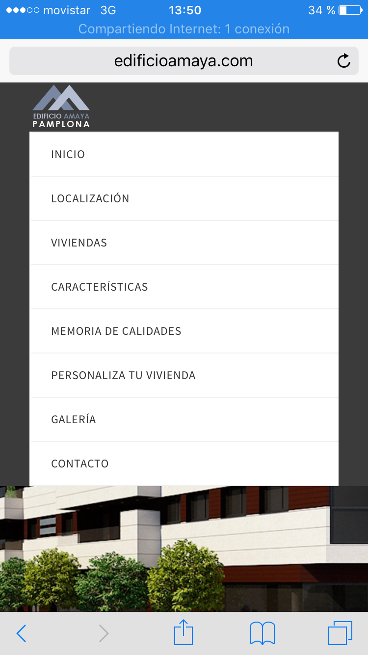
My site is edificioamaya.com. And the problem is menu is expanded, in mobile responsive view, even before clicking menu button. How I said in last chat, this just happens at index page when it has slider revolution gallery. In the other pages works well, but its really odd when people arrive my page in mobile, see the menu expanded and they cant see the slider…I hope you understand my problem…
I’ve checked with iphone. I didn’t see any issue like this on your site. If you want, you can see my screenshot in this link http://i.imgur.com/o7PTgCZ.png?1
Please share the screenshot of your problem with us. And also, tell us the device’s name. I hope we will provide you with a perfect solution.
Thanks
Thank you for your answers..here you can see my screenshot http://edificioamaya.com/screenshot.PNG Iphone 6 portrait view
Thank you for informing us about the problem. We are trying to solve it as soon as possible and will let you know after we get any solution
How can I have login-2.html with a slider background? Thank you
Sorry for the late reply. You can use “Backstretch jQuery Plugin”. http://srobbin.com/jquery-plugins/backstretch/
We haven’t added anything like this with our template yet. Hopefully we will bring something like this on our next update.
Thanks
Hi, I’m not sure if you missed my original question as it was posted 3 weeks ago but… Is it possible to have both the header and topbar sticky when scrolling ? example page being: menu-top-bar.html
I thought about cut-and-paste the topbar section within “header” but in style.css there are a lot of height settings which have an effect. for example, one being header.sticky
Thanks
Cordially apologizing for late reply. What your are asking for right now is not possible. We’ll add this feature in next version.
Thanks
