
38438 comments found.
Hi, I´m customizing a child theme and, I saw this:
http://themeforest.net/item/salient-responsive-multipurpose-theme/4363266/comments?page=737&filter=all#comment_11479470I´m having problems with the header images, sometimes they are dark BUT sometimes they are light, so i really need to change the logo/menu/toggle from light to dark manually. Is it possible? Is there a easy way adding css to the page?
Thanks in advance, lovely theme!
Hey – the next update will be bring an option for selecting light/dark schemes on an individual page header basis
Hi, Is there a way to change the font on the on the portfolio thumbnail fullscreen layout? I can’t seem to find a font in the typography page that relates to it? (markglenister.com)
Thanks!
Mark
Hey,
That’s controlled by your heading 3 selection in the typography options tab
Cheers
Hi, just a quick doubt: do I have any limits with the one-pager layout + eCommerce? Or is it just another element in the menu I link to? Thanks
Hey,
there shouldn’t be any limitations but the cart/checkout/single product pages will indeed still live on other pages by default
Cheers
i got a doubt, can i make a layout page to repeat on other pages, of course without having to insert everything, I mean something like save the design of my page like a layout performed, if it’s posible tell me how can i make this, cause until now i’ve been making the same design like 7 time in different pages and it’s making very annoying, please tell me there is a way to make it easier. Thanks.
whoa!!! you got it!! solve all my problems, from here to the future this will make easier my job. thks!!
You’re welcome ")
I’m not quite sure, but I think I just had a wordpressgasm.
Doesn’t happen that often any more, but I don’t spend too much time looking at templates on themeforest anymore, either. But holy crap. I might have to buy this. My only concern is… I’ve spent the last 2 years getting super accustomed to the Qode Interactive backend platform, and prior to that the MySiteMyWay platform.. and each time I buy a template from a new developer, I’ve learned there is always a learning curve and it’s sometimes quite daunting to adapt to the new WP platform.. But seriously… If I was able to learn how to work with your platform, I think I might feel like a web designing goddess. You’re taking it to the way next level.
Truly… Wow.
by the way – I’m assuming that the “600+ Available Fonts” are all the Google Fonts integrated into the template? Or are there other fonts that come packaged w/ it besides the basic Google fonts?
thanks for creating such a jaw-dropping eyegasm of a WP theme!!! Jeez. I’m 99.9% sold….....
Hey, thanks so much for the kind words!
1. Salient also uses Visual Composer to manage pages/posts so it’ll feel pretty familiar – you can take a look at this tutorial in regards as well to get a better feel https://www.youtube.com/watch?v=N4mt0lOJ888
2. Yes those are all Google fonts with the exception of one called “lovelo”
Cheers
Sweet! checked out the youtube channel.. good to see the backend & page builder is very similar to Bridge. Looks great!
Thanks!
Is it possible to have on the portfolio, the pictures that don’t link, open or have text? I don’t want the front page pictures to open. Thanks
Hey, add this into the custom css box in the Salient options panel:
.holme .work-info > a {
  display: none!important;
}
Is there a way to add a text widget to the header?
Hey – as of now that would take some custom work unfortunately
Hey again…
Is there any way to add a LinkedIn icon to the same place where the search button appears on the header?
Currently I tried to add the icon by creating a custom link on > Appearance > Menu. Then, as the theme supports FontAwesome I added the shortcode for the LinkedIn icon I need. The only problem is the size and positioning that I’m unable to control…
Is there a better/cleaner way to add the LinkedIn Icon? It doesn’t seem to be correct to input html code where I am supposed to add just a link…
Thanks in advance, Geiras
Hey, I could help with the styling if you can share your URL – the only other way to get it in would be to add it into the header.php file
Hey… I solved it using media queries to handle different resolutions. Thanks for the help, awesome customer support… You guys rock…
You’re welcome
My logo is set to the size of the actual image but it is still blurry. I see in previous comments that you mentioned chrome and safari showing that way and disabling “the effect” in options. Where in options and what’s the name of the effect? can’t seem to find it
Hey – could you please share your URL so I can take a look at your setup?
www.smileservicesdc.com. also, I have found that some of my elements are out of proportion when scaled to a smaller size, like the background behind the staff member and the dividing banners.
Hey,
1. i’m not seeing it blurry on my end, are you viewing it on a retina screen? If so, I can see you don’t have a retina version of the logo uploaded
2. The column padding you have set scales down with % so you’d need to increase the value for mobile devices to work with the setup you have or change it to a pixel value:
@media only screen and (max-width: 1000px) and (min-width: 1px) {
body .wpb_row .span_12 > .col.padding-3-percent, body .wpb_row .span_12 > .col.padding-4-percent, .wpb_row .span_12 > .col.padding-5-percent {
    padding: 9%!important;
}
}
no, wasn’t on a retina screen. It’s blurry in comparison to when I view in firefox.
with the other issue, how can i link the divs so that when the background/column resizes, the elements within them do to as they normally should. I copied the code you gave which works great when my phone is horizontal but becomes distorted again in vertical. I know a solution is to use your responsive option but I am afraid of the composition across all screen sizes. Please let me know how I can keep it consistent. here are links to my screenshots.
my screen full size (15 in. monitor) http://smileservicesdc.com/wp-content/uploads/2015/11/Screen-Shot-2015-11-15-at-3.22.16-PM.png when I change the size of my window on my computer http://smileservicesdc.com/wp-content/uploads/2015/11/Screen-Shot-2015-11-15-at-3.13.25-PM.png horizontal cell phone, samsung note (larger screen) http://smileservicesdc.com/wp-content/uploads/2015/11/Screen-Shot-2015-11-15-at-3.17.37-PM.png vertical cell phone view http://smileservicesdc.com/wp-content/uploads/2015/11/Screen-Shot-2015-11-15-at-3.21.51-PM.pngI am having a similar issue with the “book appointment” and social media icons in the nav. At first I floated each one right but it put the social icons after which i did not want, i prefer them before. So i did a margin with percentages but it doesn’t stay in position together. Those are the only two issues I am having. everything else is turning out great:)
I’m using masonry portfolio with title over zoom. I’d like to use slightly longer titles on the single-view page primarily for SEO reasons, but I find that unless I have very short, 2-word titles, the portfolio grid page doesn’t look good.
Is there any way to use a custom title on the grid page and a longer title on the single view page? Wish we had the title & subtitle type header options like we have on normal pages…
Hey,
As of now that would take some custom development but i’ve noted the idea
Cheers
Hi there,
I have created image gallery on my home page and on another page using the same settings however they appear differently when viewed vertically on an ipad.
If you look at the slider at the bottom of this page you will see it stays in a normal landscape photo format: http://jimparkerphoto.com
However the slider on this page changes to fit the shape of the screen and becomes portrait which crops off the sides of the image: http://jimparkerphoto.com/weddings/The settings are the same so I’m not sure why the one on this page (http://jimparkerphoto.com/weddings/) would pick up these attributes that I dont want.
I hope you can help, many thanks. Jim
Hey,
Could you please open a ticket in regards with your admin credentials so I can take a further look at everything? https://themenectar.ticksy.com
Cheers
Hi, I recently updated the theme and I have troubles with the portfolio which doesn’t appear any more : http://www.atelier-masala.com/portfolio. The loading icon goes on spinning and nothing more happens, although the html seems to be complete. Thanks in advance, Vincent
Hi, it’s ok, I had messed with js & php files… all is fine now. Very nice theme by the way !
Hey – glad you sorted it
Can you please tell me how to get a certain look that is on the “agency demo” without importing that demo and changing the look of the main header? And is this only possible in multiple pages setup.? Im looking to use two items: 1) The big text in (about us) Magic Has A Formula Simple & Memorable Is The Motto We Live By, text – “Aliquam” erat volutpat. Phasellus tortor velit. TEXT 2) The “Eric Jördis “Aliquam” erat volutpat. Phasellus tortor velit, ornare at ullamcorper at, ultrices et diam at nunc.” text in the my story tab. 3) The menu in the right hand corner that when clicked, displays pages and social networks.
Hey,
1/2. The fonts used for those headings are:
font-family: Montserrat;
    letter-spacing: -1px;
    font-size: 50px;
    line-height: 50px;
    font-weight: 700;

    font-family: Playfair Display;
    letter-spacing: 0px;
    font-weight: 400;
    font-style: italic;
3. That’s an option in the header options tab https://www.youtube.com/watch?v=VzsSTnmGYAQ
Cheers
Hi, is possible create a floating menu with anchors for go to the each section of the web (one page)?
Like this: http://gsg.it/en/companyHey not as of now unfortunately but the idea is indeed on the wishlist
Something very weird is happening on the checkout page for woocommerce. I can’t figure out why the checkout page is all spaced weird. I haven’t changed the css and it is very teired. Any ideas? https://ondemandworkout.com/checkout/
Hey – it looks like something is setting the line height for your elements off, have you verified no plugins are causing it?
No, checked all the plugins and not working. I do not see a problem with the line height. The parent divs are all huge and I see no reason for it.
Upon further inspection I can now see the reason this is happening is due to a pre tag that’s wrapping the woocommerce container div – this is not something Salient is adding though, If you’re sure no plugins or mods you have is adding this please open a ticket in regards with your admin credentials so I can take a further look https://themenectar.ticksy.com
Hey…with the client carousel, I use it specifically for client logo’s. On desktop it looks great, but it doesn’t scale well for mobile. When I pull up the client carousel on a mobile device the client logos are the same size as on the desktop which makes them look very large in comparison to everything else.
Is there a way to get the client carousel images to scale down when viewing on smaller screens? I’ve tried the responsive options for that row, but don’t see any effect.
Hey, could I take a look at your setup so I could better assist?
sure…you can check out the demo at http://foremark.platinumseoservices.com
You’ll see that as the screen size drops, instead of the images scaling down similarly, they stay the same size, but the number of images shown on the carousel drops until there are only 2 client logos displayed which with them at there original size looks quite odd. I’d much prefer them to scale down in size so that we keep the same number on the page regardless of screen size.
Hey – add this into the custom css box in the Salient options panel:
media only screen and (max-width: 690px) {
html body .clients.carousel > div {
    width: 70px;
}
}
That’s much better…had to add !important to the width declaration to get it to function. There is only one small issue now. Likely not a deal breaker, but a bit annoying.
If you check out the demo site again at a resolution that kicks in the @media rule above you’ll notice that the logos scroll across, but then jump back one, then scroll across, then jump back one.
Anyway to correct that?
Hey,
you’ll need to change this line in the init.js file located in the js folder
if($(window).width() < 690 && $('body').attr('data-responsive') == '1') { columns = 2; $(this).addClass('phone') }
Cheers
Hey guys. I would like to always use the transparent header logo as the starting log irrespective of whether the page header is transparent or not. Using the transparent option works well for most of the site but then I have a few pages like a shop page where I can’t use that and then I get the other logo. The reason I want to do this is because the starting logo is slightly more intricate than then smaller logo once you scroll. Having a larger version of the simple logo looks weird I have looked through the header file and played around with the part starting with:
//starting logo if($activate_transparency == ‘true’){ ...
but did not manage to force the starting logo to always be the ‘transparent’ one. Maybe some CSS I’m missing. Any thoughts?
Hey,
Add this into the custom css box located in your Salient Options panel:
@media only screen and (min-width: 1001px) {
#header-outer[data-transparent-header="true"].transparent #logo img, #header-outer[data-transparent-header="true"] #logo .starting-logo, #header-outer[data-transparent-header="true"].light-text #logo img {
    opacity: 1!important;
}
#header-outer[data-transparent-header="true"] > header #logo img.dark-version, #header-outer[data-transparent-header="true"].light-text > header #logo img.dark-version {
    opacity: 0!important;
}
Cheers
Alas doesn’t work. You were missing a brace at the end which I added but still no luck. Did a hard refresh and added the code to the Salient CSS box as well as the stylesheet in the child theme. Any other suggestions?
Hey, kindly share your URL in regards so I can take a further look at it for you
First, long time fan of you theme. Now, a quick question, what is the css to change the color of the blog page’s title and subtile text color? I’ve tried several things to no avail. Thanks!
Hey, that’s awesome to hear
Are you talking about the single post pages? If so there’s an option for this at the bottom of every edit post page
Cheers
I am unable to delete items through Visual Composer when in Chrome. In Firefox i don’t seem to have the issue. I also can’t seem to change a text block from p to h1/h2/h3/etc through VC either.
Hey, could you please open a ticket in regards with your admin credentials so I can take a look at what’s going on themenectar.ticksy.com/
Cheers
Hi buddy! Loving this theme more and more. Amazing work! You’re making me look good 
I’m almost ready to launch, just a few more minor issues I’m trying to work out (probably user error on my part):
1. Styling the ContactForm7 “send” button I tried following the comment thread with “abovesound” on this page from a year ago, so I inserted the code like here (http://postimg.org/image/zfho8pcnr/ ) but it looks like this on my site(http://postimg.org/image/lg0aicpoz/). It’s not exactly like the other buttons on my site so I’m missing something small I think. Not sure what edits to make – and ideas?
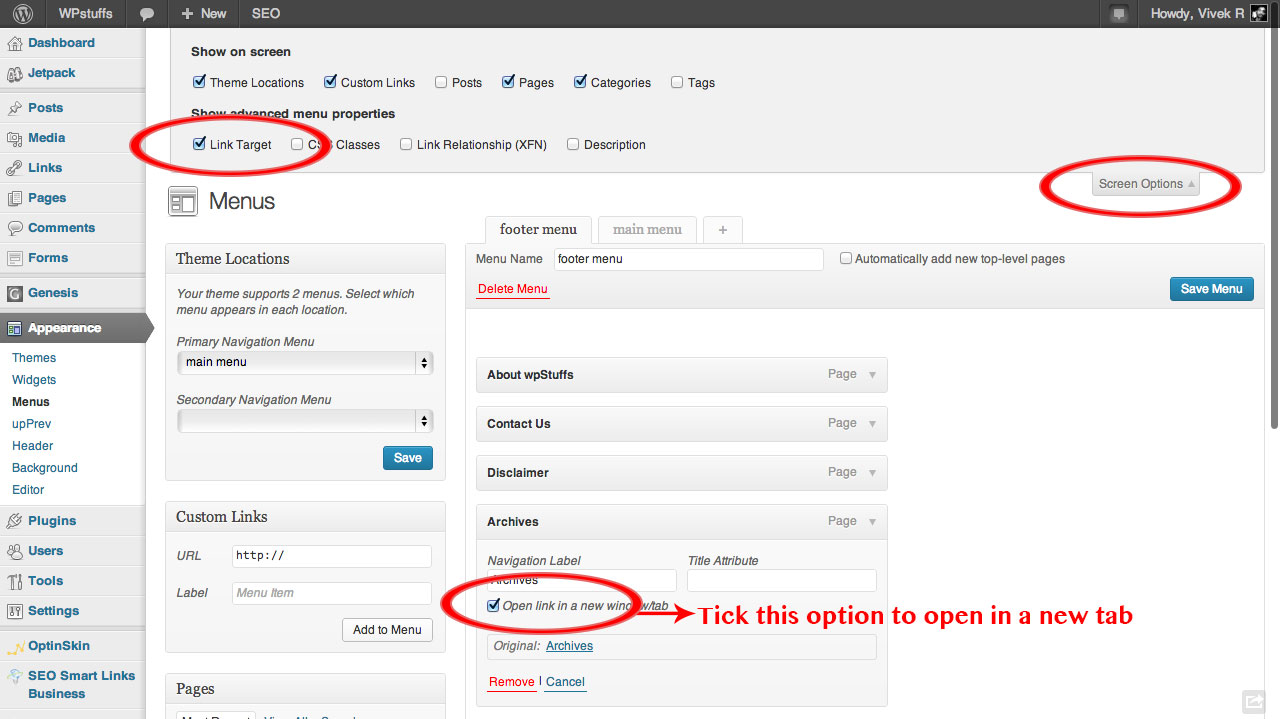
2. Have main menu item open in new tab How do I open a main menu link in a new tab? (I only have one of the six menu items I want to open in a new tab because it sends the visitors to a third party site where they can manage their account. All other links keep them on my site so of course they should not open in a new tab.)
3. Order of social media icons How can I modify the order that they appear in the footer?
Thanks again!
Hey, thanks!
1. Could you kindly share your URL so I can take a look?
2. Please see this in regards http://www.wpstuffs.com/wp-content/uploads/2012/12/Wordpress-menu-2.jpg
3. You’d need to alter this in the footer.php file as now
Cheers
Great, thanks. URL for button is http://seasonalmaine.com/#Contact. My site was in under construction mode but I just disabled so you could view. Let me know after you’ve seen it so I can enable again!!! Thank you!
.wpcf7-form input[type=submit], .wpcf7-form button[type=submit], .wpcf7-form input[type="button"] {
    background-color: transparent!important;
    border: 0!important;
}
div.wpcf7 img.ajax-loader {
    display: none;
}
Added that (like here: http://postimg.org/image/iihc9qtx9/) but no success yet. Should I grant you access via some private method so you can login and play around? I’m sure lots of other people are also trying to match the button style to the other buttons on their site, just not sure how! As always, thanks very much!
Hey, remove the pre tags that were pasted in with the snippet
