
1370 comments found.
Hi there,
I use the left sidebar version, how would I go about adding a site-wide margin of 35px around all of my content in the page? (just sides). I appreciate any help!
Kind regards, Reid
Hi there,
Sorry but it won’t work with side navigation template even you add the margin around the content, this is not in the template design so you couldn’t add space around the page at all.
Hi,
Thanks. I figured perhaps you could do custom CSS that simply added a margin/padding to the pages site wide? It works to do it for elements in visual composer, however for things like external plugins that create their own pages – I cannot adjust the margin. Any methods or not?
Thanks again
Hi,
You can add your custom CSS as follows:
1. For global settings (all pages), you can add your custom CSS to Theme Options -> Advanced -> Head Content as the sample code below:
<style type="text/css">
body{
margin: 35px;
}
</style>
2. For individual page, you can add custom CSS for each page in page settings window in Visual Composer tool bar, see the image below:
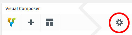
Add your custom CSS into Custom CSS field like the code below:
body{
margin: 35px;
}
Hello im experiencing some technical difficulties where my slider revolution does not auto play.
Oxiestudios.com
I didn’t touch the rev slider and my video section no longer auto-loops itself, can you help me fix the problem?
Thanks.
Hello,
Seems like this issue has been resolved since I see the slider on your site is working now, it can auto play and auto loop.
However, you can see this issue when you have YouTube video on sliders since there is a bug with YouTube API on Slider Revolution plugin in previous versions, you should update the theme to receive a new update of Slider Revolution, it can also fix this problem.
Cheers.
Is there a setting to allow more text to be shown of the title of a blog post? I’m using the blog grid… on one page with 3 columns and 4 columns on another page, but the title is being cut short. Any solution? Thanks!
More than 2 lines of title on blog posts can mess up the blog grid layout.
However, if you’d like you can add the custom CSS below to Theme Options -> Advanced -> Head Content to increase the height of title.
<style type="text/css">
.w-blog-posts .post-title{
max-height: 84px;
}
</style>
Hi, I have noticed the Team Member Slider is not showing up on a page, even though it’s there on the back end. The page hasn’t been edited and was previously working – is it possible this stopped working through a recent update? I have tried disabling all plugins (except wyde core ones) and it does not appear to be a plugin conflict. Thanks!
Hi,
We’ve never seen this issue before, it’s working fine on our demo sites. Could you please send us your site URL and admin login credentials in the contact form -> http://themeforest.net/user/wyde#contact so our support can access your site to help you out.
The site just went live so here is the link to the page where the Team Member Slider is published (at the bottom): http://www.boutiqueld.com/what-we-do/.
The carousel slider at the bottom of this page is also broken: http://www.boutiqueld.com/. We wanted to use it the same way that you are using it on your demo site http://wydethemes.com/flora1/ but when I uploaded the logo images, they only appear as a thin line.
Can you advise on how to fix the two slider issues?
Thanks so much, love your template!
I see the custom CSS on your page output, see the image below:

You should remove ”.owl-stage-outer div{height:0}” from the custom CSS so your team slider and carousel slider will work fine.
Cheers.
Hi, My website is www.sensationslife.com. I used the flora theme for developing my site. But the issue is the site is not completely responsive. Why this happen? Can you please solve this issue? Thanking You
Hi,
The responsive column settings are not correct, when you choose “1 column – 1/12” for the “Width on small screen” option in Columns Settings window, it doesn’t mean 1 column in a row. This is a Bootstrap based column ( http://getbootstrap.com/css/#grid-options ) so 1 column in this option means it has the width 1 out of 12 columns and it will be narrowest column. You should edit all columns in the row below “SHERLY REGIMON” to remove the responsive settings or change to “12 columns – 1/1” instead.
Normally, this theme will adjust the width of columns on each screen automatically, you don’t need to set these settings at all.
Also, when working with the grid layout please carefully edit the content because it can mess up this layout.
If it still doesn’t work, please send us your admin login credentials in the contact form -> http://themeforest.net/user/wyde#contact so our support can edit these settings and help you figure it out.
Hi, I’m having incredible difficulty with increasing the font size of the menu items and also being able to make my main logo larger on the header. Can you please advise? 1d41d46a-06f5-4bb3-a8e1-8723c60e55b5 – 9 Feb 2016 REGULAR LICENSE
Hi,
You can change font size of the menu items in Theme Options -> Typography -> Menu. However, this option only affects the first level of menu but it won’t affect submenu items.
In order to increase the logo size, try adding the custom CSS below to Theme Options -> Advanced -> Head Content:
<style type="text/css">
#header-logo img{
max-height: 60%;
}
</style>
I’d like to buy this theme, however I am planning to offer training courses through the “ZippyCourse” wordpress add on. Can I just purchase a regular license, or do I need an Extended License?
Thank you for interesting in our theme. You can purchase a regular license for this.
Cheers.
For the Flora theme, can we make the top navigation stay on the page? Instead of having to click the 3 bars to see it, can it be click the three bars to get rid of it?
Sorry but the top navigation in the main demo is collapsed by default, it will show when you click on the 3 bars but there is no option to change it to show the menu by default. However, this theme comes with 4 different menu styles as you can see on our demo sites, you can use the classic menu instead and it will always stay on the page.
Oh, I didn’t realize that. So if I wanted that page layout, I could choose that page layout with the one page navigation option?
Yes, sure! All page layouts including all navigation layouts from our demo sites can be changed to One Page Site and the navigation will work as the one page navigation.
Hi,
Great theme! Thank you for your hard work.
Is there a way to make the title to support html elements? I need to include a element in one of the page’s element (eq: 21st)
Thank you!
Alexandra
Hi, you can use a Raw HTML to and your HTML elements to the page.
So I am on Flora Options -> Title Area -> Page title: I include a HTML element there “st” and than Update. In the page view the HTML it’s not there anymore… it is just the text with no HTML tags.
Actually, it should display HTML elements. We will fix it ASAP. Thank you for reporting this issue.
You can fix it now by editing the theme in Appearance -> Editor, select Flora theme to edit and edit page-title.php as below:
Line: 183
Replace:<?php echo wp_kses_data( $title );?>With:
<?php echo wp_kses_post( $title );?>
Great! It works! Thank you!
Hi Wyde,
I have got two seperate things that are causing me some trouble. The first one is, when using Safari 9.0.2., my portfolio page sometimes doesn’t load as it should. I am using a single page layout and I have set up my portfolio page to show 4 columns with total of 8 portfolio items all together on the page, but sometimes it loads just 1 row with (first 4 projects) and even this one is lying half way over the next page. Also, when viewing the portfolio page on a smartphone, the categories get stacked up one on top of the other (which is a bit difficult to read) and each portfolio items in one column, which is cool, but the items are displayed really tiny. I have tried on iPhone 5, iPhone 6 and Nokia Lumia 1020 with pretty much the same thing happening. Is there any way to fix this issues?
Thank you for your help and effort. With best regards. Luka The second thing I am trying to figure out is about the slider revolution responsive setup. What resolution settings would you recommend setting up for the slider to act
Hi,
The first one: Sounds like this is an issue with pagination, if your site is running on WordPress 4.4.1, it has a bug with pagination on frontpage so when you click on show more or scroll down to show the next page of your portfolio posts it will display the posts in the first page instead. You need to update to WordPress 4.4.2 to fix this issue.
You can add the custom CSS below to Theme Options -> Advanced -> Head Content to disable the stacked categories on mobile:
<style type="text/css">
@media only screen and (max-width: 599px){

.w-filter li {
    display: inline-block;
}

}
</style>
Regarding the portfolio grid issue on mobile, actually each item should be stretched to full the screen when it’s on mobile but there is a bug in some layouts so they won’t work on mobile, this issue will be fixed in our next update.
Second: When you enable Layer Grid Size for tablet or mobile, you can set different styles (such as varying font-sizes or position of elements) for each screen size, see 4.4 Layers Grid Size on this link -> http://www.themepunch.com/revslider-doc/slider-setup/#slidelayout
Hi Wyde, thanks for replying. I have WordPress 4.4.2. since the day it was released. Please see the attached screen shot to see how the bug looks like. So the portfolio items are covering a part of the next page, instead of being contained in the grey area of their own page. This happens in Safari and not everytime, but often. When I reload, it is okay, but a visitor to my site might not reload it.
https://www.dropbox.com/s/seb4i7a62xexwf1/Screen%20Shot%202016-02-17%20at%2010.10.52.png?dl=0Thank you for the additional link with information. It sure will come in handy. Luka
Hi,
We’ve visited your site many times with Safari on our Mac but we can’t see this issue at all.
However, you can try to deactivate other plugins one by one. If it works, that means you’ve a plugin conflict issue.
Cheers.
hello, we need to have as soon as possible the upgrate of the theme Flora because it isn’t compatible with the last version of wordpress 4.4.2. thanks
Hello,
Our demo sites are currently running on WordPress 4.4.2 and it’s working fine. Try updating to the latest update of the theme. If you’ve any compatibility issues please report them to us.
Is it easy to make the classic top menu/navigation bar transparent and to overlay the menu on top of the Slide area?
You need to enable the Transparent Header option for each page since this option is disabled by default.
When you edit the page, you can enable Transparent Header option in Flora Options -> Header at the bottom of the page.
is it possible to add my own webfonts? How would i go about doing that?
You can add your custom webfonts but they won’t show in the Typography options in Theme Options, you need to define and assign them manually as follows:
@font-face {
    font-family: 'your_font_name';
    src: url('fonts/your_font_name.eot');
    src: url('fonts/your_font_name.eot?#iefix') format('embedded-opentype'),
        url('fonts/your_font_name.woff') format('woff'),
        url('fonts/your_font_name.ttf') format('truetype'),
        url('fonts/your_font_name.svg#your_font_name') format('svg');
    font-weight: normal;
    font-style: normal;
}

/* -------------- Assign to elements -------------*/
body {
    font-family: 'your_font_name';
}

h1, h2, h3, h4, h5, h6 {
    font-family: 'your_font_name'!important;
}
Upload your web font files to “flora-child-theme/fonts/” and add the custom CSS above to style.css in your child theme.
Hi, I just installed the Flora theme and getting this error when trying to install Rev Slider:
Warning: require_once(/home/woodrid3/public_html/wp-content/plugins/revslider/includes/framework/include-framework.php): failed to open stream: No such file or directory in /home/woodrid3/public_html/wp-content/plugins/revslider/revslider.php on line 59
Fatal error: require_once(): Failed opening required ’/home/woodrid3/public_html/wp-content/plugins/revslider/includes/framework/include-framework.php’ (include_path=’.:/usr/lib/php:/usr/local/lib/php’) in /home/woodrid3/public_html/wp-content/plugins/revslider/revslider.php on line 59
Try deleting this plugin folder “wp-content/plugins/revslider” from your host directly. After you delete this folder, you will see a notification message at the top of your WP admin page, click on “Begin Installing Plugins” to install it.
Hi ok did that, still no pop up to install plugin ?
Make sure there is no Slider Revolution on your Plugins page, I suppose this is an issue with your host so you can’t completely delete this plugin from WP admin.
Try to delete it from your host directly, go to FTP or web file manager on your host, and delete folder “wp-content/plugins/revslider” within your WordPress installation folder.
Once you delete this folder, go to your WP admin, you will see a notification message to install this plugin again. If the notification message was dismissed, navigate to Appearance > Install Plugins to see the recommended plugins list.
If it still doesn’t work, please send us your site URL and admin login credentials in the contact form -> http://themeforest.net/user/wyde#contact so our support can investigate this issue and help you out.
Hi, we are trying to add a video background to the title area of a page. We select video background and upload a 3 Mb mp4 file. After doing this the page doesn’t load anymore and we only see the “loading page” icon animation, but it just stays like that. Removing the video and reverting back to an image background resolves it. We tried with 2-3 different videos without success. The videos play in wordpress media library. How can we address this issue?
Hi,
We’re sorry, this is a bug with video background of title area, we will fix it ASAP! Thank you for reporting this issue!
Just checking if this is now fixed…
Hi, in this portfolio http://wydethemes.com/flora1/grid-full-width-3-columns/ I found the magnifying glass a little bit confusing because clicking on it it gives the slideshow of the pictures of the covers of the different portfolio, instead of entering the real portfolio. How do I get rid of the magnifying glass? Thank you
Hi,
You can remove this icon by adding the custom CSS below to Theme Options -> Advanced -> Head Content:
<style type="text/css">
.w-view figure figcaption > span{
display:none;
}
</style>
hi i wanted to purchase the theme but can i check the documentation before i buy
Hi,
We’re sorry but there is no online documentation for this theme, it’s included in the download package.
i just wanted to know if i could create my own home pages using componenets in the theme. wanted to use navigation from one home page demo. slider from one demo. and other elemnts to create my own home page to full fill al l my requirements
No problem! Features from different demos can be combined, settings and content from all demos can be imported.
Hi Wyde,
I am currently working on my Portfolio Items in Flora Theme. I have seen in the theme documentation that it is possible to edit Portfolio Items with Visual Composer, however I cannot see the VC option in the Add New Portfolio section. Also, I want to ask if there is a way to present landscape format photos in portfolio layout templates. If I choose other than the first layout option, photos get automatically cropped to either square, which doesn’t fit with my content well.
Thank you and best regards, Luka
Hi,
Navigate to Visual Composer -> Role Manager, select Administrator if you’re in admin role. In Post types, choose Custom and select wyde_portfolio to enable Visual Composer in portfolio post. You can also select post to enable it in blog post.
This theme displays gallery images as squared preview and displays the full size in lightbox when you click on each image. In order to display the landscape images in the portfolio post, you should select the second layout (Gallery) that will display a landscape featured image as full width at the top. Also, you need to add your landscape images to the post by using the Add Media button instead of adding them to Gallery Options section.
Hi, I have 2 questions. First is, how do I adjust the Custom Heading so that it doesn’t get so tiny on mobile devices? The other question is, how can i get an author’s box on each portfolio post? I’d like to credit other artists on some works. Thanks.
Hi,
1. This issue has been fixed in our latest update.
2. When you add/edit the portfolio post, you can add the author details in Custom Description section.
Great! Should I get an automatic update alert? I’m not seeing one. Thanks.
Me again…my current version is 1.2.3 is this updated?
The mobile site still shows really small custom headings and scrolls to the side when you go down the page. My URL is www.barefoot-creations.com. Please help me with this.
Of course, you have the latest update 1.2.3.
However, if you would like to increase font size of custom headings on mobile you can add the custom CSS below to Theme Options -> Advanced -> Head Content:
<style type="text/css">
@media only screen and (max-width: 599px) {

.w-custom-heading h6 {
    font-size: 50px!important;
    line-height: 35px!important;
}

}
</style>
Regarding the issue about it scrolls to side when scrolling down, I suppose this is bug with team member slider on mobile, it will be fixed in our next update. Thank you for taking the time to report this issue!
If you’d like you can fix it now by adding the custom CSS below to Theme Options -> Advanced -> Head Content:
<style type="text/css">
@media only screen and (max-width: 991px){

body {
    overflow: hidden;
}

}
</style>
Is there anyway to hide the featured image on blog posts?
You can only hide the featured image on blog single post page by changing the “Featured Image Size” option in Theme Options -> Blog -> Blog Single Post to “Hide Featured Image”.
However, you can’t hide the featured image on blog posts (list) grid and masonry layout.
Ah, missed that box, thanks for your assistance.
You’re welcome ")


This item was featured on ThemeForest
Contact the Envato Market Help Team
