
1306 comments found.
Hi, i have a bug when i add a video on vertical portfolio : https://www.brockwayproduction.fr/portfolio/jimbere/
Hi,
Sorry but I’m not sure I understand because everything is working properly as it should be.
Only one issue I can see is the video didn’t play on the lightbox but that’s because your video URL is in HTTP format but your website is HTTPS, so you should use the video URL from HTTPS to solve this issue.
Hi, for me the video is not playing at all, and this is the issue. And in back-end the video link is a youtube link, https link. By the way if it’s help, if you dont define cover image it work just fine… But then you will have a blank image on the portfolio list.
Regards.
Hi,
Seems like this is a bug of the prettyPhoto lightbox plugin, it always displays the video from http.
We’ve fixed this issue in Overlap 1.1 as you can see in the update log. Unfortunately we just updated the prettyPhoto in the recent updates so it happened again.
Thank you for reporting this issue, it will be fixed in the next update.
Like you see almost any none of my image have title integrated in pages, but in my back end they does… Maybe it’s more an issue with VC ?
It would be just amazing to have the possibility to activate such function in theme options. It would boost your buyer SEO, and hopefully your sales too ")
I already recommend your theme to so many people because of it’s cleaness and seo capabilities, it would really be for me all people i recommended it the ultimate themes if such functions were built-in.
Hi,
1. Internal Links Missing Anchor or ALT Text: I’ve checked the code of those pages on your website but all images already have ALT text. Also, for the links missing anchor issue, I’m not sure but I think that some links on the page such as a “Back To Top” button have ’#’ as the URL so you have the notice that the link missing anchor. Please don’t worry, every websites also have ’#’ as the URL of the button since they will call JavaScript when you click and work as a button instead of a link.
2. An issue with text title: The title attribute will show the tooltip text when you hover on an image. This is for an accessibility purpose only. Of course we didn’t add this attribute to some images because it is not necessarily useful. As you know, it’s not good if you have a tooltip when you hover on any images on the page.
3. Regarding the Schema.org Microdata: Of course this theme doesn’t support microdata, we will add this feature in the future.
1- Like you can see by url listed and number of pages that the problem occurs, it is not that. it’s for example previous and next article links, that is fixable and they should have alt.
2- i dopnt see cases where it would be design bereaking, but i found this article to fix that myself. Not sure if Title really up your seo, i will test it with and without once i rrank myself high enough to see the difference. http://crunchify.com/how-to-add-html-title-field-to-all-wordpress-post-images-automatically-for-mouse-hover/3- On that i found this article really usefull : https://premium.wpmudev.org/blog/schema-wordpress-seo/ So i will test that myself maybe, but it would be much cooler that it be theme integrated.
4- Also for every of your theme i translate everytime the front end lines in French, since po files dont adapt from themes to another i do that for all your theme already. It would be more cooler if you just send me all the front end line, and i will translate them for you ") So you can include french translation in your theme It would probably please some customer
So you can include french translation in your theme It would probably please some customer
Hi. any ETA on the fixing of bug i report ? Did you have time to check the links i told you too (prev/next)?
Regards.
The bug of the video in the lightbox has been fixed in the new update that will be released in a couple of days.
Regarding the ALT of the previous and next article links. As stated in the suggestions of the report, “An internal link that uses an image for the user to click on but has no ALT text doesn’t tell search engines….”. This refers to the ALT text of the image. However, I tried to check the HTML output of your blog and portfolio pages, all images on these pages have alt attribute. So I’m not sure what’s the actual problem and don’t know how does that tool work?
Also, actually the images of prev/next links on blog page will display ALT text automatically when you set the ALT Text field of the image in Media on your WP admin.
Hi, I just purchased this great looking theme. Is there a manual or handbook for it? I had one for all other themes I bought which was very helpful, so it would be great to have a manual for this also. Thank you! Awarei
Hi,
Of course, our documentation is included in the main downloaded package. When you choose to download “All files & documentation”, and then extract the zip file to see all package contents inside.
Hi again,
I’m having trouble with the phone and Ipad versions of my website. The content, shifts all over the place once you view it on either of those.
Is there a way to callibrate all the views. To ensure that all version are the same? Because I have no clue how to reformat all the information for phone and ipad format.
And in reference to my question about sound. Is it possible to have sound as a background element rather than a link. So for instance as you enter a page the sound would play instantly?
thanks
Hi,
Actually, all elements in the theme are responsive elements and they will display on any screens properly automatically. You don’t need to set up the content for each screen.
Could you please PM me your site URL: https://themeforest.net/user/wyde#contact so I can see if there was something wrong.
Also, you can customize the styles of slider for each screen by enabling the Custom Grid Sizes option, see more on Custom Grid Sizes here: https://www.themepunch.com/revslider-doc/slider-setup/#custom-grid-sizes
Regarding the sound, to set it as a background, you will need to set it as the audio background on the slider, see more here: https://www.themepunch.com/revslider-doc/audio-layers/
The Sound Player in this theme couldn’t display as a background. If you’d like to set it as the background of the page outside the slider I’m not sure but I think you will need to install the third party plugin instead.
Hi, I am a happy user of the Overlap Theme… BUT I have a problem now. I purchased Thriveleads plugin. It’s a plugin to create opt-in forms for newsletter subscribers. But there is a conflict with the WYDE CORE plugin and I was wondering if you guys could fix that…?
If I use their plugin and I try to change an image… Normally the medialibrary has to pop up in front of the page… But there is a conflict with the WYDE CORE plugin, if the wyde core plugin is activated, the media library pops up underneath the page where it is unable to scroll to. And changing images is a big deal for making a pretty opt-in form…
Do you think you can fix the bug? Or contact Thrive leads to fix this problem together? I think it’s important that all these plugins support each other…
Please contact me ASAP, because if this is a problem that can’t be fixed, I need to undo my purchase of the Thrive leads plugin within 14 days (only 11 days left now)
THANKS A LOT!
website: www.kantienkarolien.com (in a private email I can provide my login details, if needed)
Hi,
Thank you for contacting us!
Could you please PM me your admin login details: https://themeforest.net/user/wyde#contact so I can investigate this issue and help you out.
Hi, a simple question. to change the menù bar background color and font color we need to customize the CSS or there is some options in the theme setting panel ? I can see only DARK or LIGHT style and no font or background color option. Thanks
You can choose between Dark and Light for both background and text color of the main menu.
You can change the menu background color in Theme Options -> Navigation -> Top Navigation. And you can change the menu text color for each page in the Header -> Foreground Style in the Overlap Options when you edit the page.
There is no custom color for the main menu. You will need to add custom CSS to change it to custom color.
Hello,
I did the latest update and now my site is all messed up. Certain pages are not visible on mobile devices now. The logo section has completely disappeared and my logo has been replaced with the overlap logo. I can’t even find where to change it out. Is it possible to get some assistance on these items?
Please make sure you’ve updated all bundled plugins to the latest update too.
Regarding the logo issue, please navigate to Theme Options -> Navigation. Click on the Header Logo option to disable and enable this option to see if it works. After you toggle this option, you will see the logo settings so you can set your logo to replace the default Overlap logo.
If it still doesn’t work, please PM me your site URL: https://themeforest.net/user/wyde#contact
Hi again,
I’m having trouble with the phone and Ipad versions of my website. The content, shifts all over the place once you view it on either of those.
Is there a way to callibrate all the views. To ensure that all version are the same? Because I have no clue how to reformat all the information for phone and ipad format.
And in reference to my question about sound. Is it possible to have sound as a background element rather than a link. So for instance as you enter a page the sound would play instantly?
thanks
Hi,
Actually, all elements in the theme are responsive elements and they will display on any screens properly automatically. You don’t need to set up the content for each screen.
Could you please PM me your site URL: https://themeforest.net/user/wyde#contact so I can see if there was something wrong.
Also, you can customize the styles of slider for each screen by enabling the Custom Grid Sizes option, see more on Custom Grid Sizes here: https://www.themepunch.com/revslider-doc/slider-setup/#custom-grid-sizes
Regarding the sound, to set it as a background, you will need to set it as the audio background on the slider because the Sound Player in this theme couldn’t display as a background. If you’d like to set it as the background of the page outside the slider I’m not sure but I think you will need to install the third party plugin instead.
Hello, I have just update the latest themes which is Version: 1.2.4. After that my slider revolution is not working in the homepage, can you please check what happen on the plugin? Here’s the website : http://showoff2gether.com/ao/
Btw, can I know which way to update wordpress 4.7 is the safest way? Because previously, after I update to the latest version of wordpress, it’s lost all my data. Please advise.
Thanks!
Regards, CM.
Hello,
The slider on your website is working fine on my end, it’s now playing properly.
Also, updating WordPress won’t affect your data, if you update it manually, please keep the folder “wp-content” so your uploaded content won’t be lost.
Hello, it’s suddenly work again! Lol! One more question, I have set my slider layout as “Full Screen”, but why the height is not full screen ? You can try it in http://showoff2gether.com/ao/ After I scroll down, the slider is longer than the browser height. Please assist. Thank you so much !
Hello,
Sorry but I couldn’t access your website, it says “Error establishing a database connection”.
If the height of full-screen slider is higher than the browser height, try to check if you’ve set the option to increase the height for your full-screen slider.
Edit your slider settings, scroll down to the options at the bottom. Remove any value from the last field that says “Decrease/Increase height of Slider. Can be used with px and . Positive/Negative values allowed. Example: 40px or 10 ”. No.4 in below image:

Also, if you’re logged in as admin, you will have the admin bar at the top, this will increase the height of full-screen slider so it will higher than the browser height. Don’t worry, this won’t affect your visitors, only you can see this. If you’d like you can try to logout from your website to see how other visitors see.
Hello, I have set the same setting with the image that you show and I log out and try to view it, it still looks the same, have to scroll down only can see bullet points, and also the navigation arrows also not in the center. You can have a look again, www.showoff2gether.com/ao. Thanks
Hello,
That’s because you have the main menu at the top. You should set it as transparency so it will overlay on the slider.
Edit your home page, scroll down to the Overlap Options at the bottom, select the Header tab and then change the Transparent Header to “Enable”.
Hi,
I need to make same-page-anchors with smooth scrolling along with top margin in order add space from the top menu. What should be the best practice?
The smooth scrolling feature is available on the links in the main menu and the buttons in the slider.
When you’re using the One Page site, all links in the main menu will work as smooth scrolling along with the top margin from the top menu automatically.
I don’t believe you have understood me correctly. I do need to create my own custom anchors to link to other sections on the same page and preferably, make use of smooth scrooling. Would you be able to assist me with that?
Sure you can use the Link Button to link to custom anchors, this element comes with Smooth Scrolling when you set the link to custom anchor on the same page.
To create custom anchors to link to the sections on the same page, please follow these:
1. Edit the row to set the Row ID field as an anchor of the section (i.e. permanet-make-up, paramedical-procedure, etc.)
2. Add a Link Button element to the page, and then set the URL as #permanet-make-up so when you click on this button, it will bring you to the “Permanet make-up” section.
Hope this helps!
Hi, Since i have updated my site the slider doesnt show and it now says that the upload max. file size should be 32 instead of 20 M. Before the update my slider was working but was slow… Is 1,3 M for a picture in the slider too big? How do I get my slider working? Thanks in advance! Marjoleiin
Of course, 1MB is too large to use on the website, a picture should be less than 1MB.
As you can see on our demos, the image in the slider is just 200KB.
The size is now 800 kb but my slider still is not working after the update… What should i do? Any tips?
Could you please PM me your site URL and admin login credentials: https://themeforest.net/user/wyde#contact so I can investigate this issue and help you out.
Hi the problem was all the big picture files…Changed them all …Thanks for the help Everything is working fine now!
Glad to here that it has been resolved
Hi Team Wyde,
We have used your theme on our website but there is a problem with the slider revolution, 1) Image loads very slow 2) Adjusting elements position for mobile and tab is fine but for desktop and Mac/large screen devices.? please help..
Also, can you share the email for writing directly to you so I can share links to you directly, rather in an open forum?
Hi,
1) The slider displays all background images as you uploaded. You should resize your images before uploading, images should be smaller than 1920×1080px and the file size less than 800KB so it can take a short time to load.
2) If you’re adjusting the position of elements in the slider, you can enable Custom Grid Sizes option so you can adjust the styles of elements for each screen size, see more here: https://www.themepunch.com/revslider-doc/slider-setup/#custom-grid-sizes
You can contact us via the contact form: https://themeforest.net/user/wyde#contact so we can replied directly to your email.
Hello,
I have done the page with visual composer (web version). But when using my phone to view it, some of the spacing is incorrect, can I know how to edit responsive design layout? Thank you.
All elements in the theme are responsive elements, they will automatically change their styles in different screen sizes.
However, you can build the layout for different screen sizes by using the Responsive Options in the column settings. When you edit the column, you will see the Responsive Options tab that allows you to set the width of the column on each screen size. You can also hide the column for specific devices there, see more here: https://wpbakery.atlassian.net/wiki/display/VC/Responsive+Settings
BTW, in order to set the size of the space on mobile to be different size from desktop, you should use the Empty Space element. And then you will need to add one more Empty Space element for the mobile as below:
1. Normally when you’d like to create the space, you have to simply add only one Empty Space element and set the height of that element but if you’d like to set it different on mobile, you should add 2 Empty Space elements.
2. Set the height of the first Empty Space element to fit properly on mobile screen.
3. And then set the height of the second one so when display both, the space should fit properly on desktop.
4. Add custom CSS class named ‘hidden-xs’ into the Extra CSS Class field of the second one to hide it on mobile.
5. When the page display one desktop, you have 2 Empty Space elements but only one on mobile so you have different size of space on mobile.
Hello, thanks for the quick response. I watched the video, but it’s with Visual Composer frontend editor. But in the theme only with backend editor, can I know how to enable frontend editor? I think that’s more easy for me to edit different layout with different screen size. Thanks!
The Frontend Editor is not available in this theme as stated on the theme features. We recommend you to use the Backend Editor instead.
Even you’re using the backend editor, you can edit the column so you will see the Responsive Options tab in the column settings window and it works the same as the frontend editor.
Actually, the mobile preview in the frontend editor is just only for preview, it doesn’t allow you to customize your website and save settings for individual screen at all. So you can done it with the backend editor like we did on our demos.
Hello, I have 2 questions here,
1. if i want to edit the spacing between slider and text content in mobile version,
2. if i want to switch the text and image in mobile version
can I know how to edit it? Because current the spacing gap is too big.
Please advise.
Below show the image. Thank you.
Hello,
1. To set the different size of space on desktop and mobile, please follow this:- Set the Vertical Padding Size of the row to Middle. - Add an Empty Space element to the top of the image, set the height of the element to 45px, and then add an extra class named 'hidden-xs' into the Extra CSS Class field so this element won't appear on mobile. - Clone the Empty Space element from above to add it to the top of the text too.2. To move the image to the bottom of the text on mobile, please follow this:
- Edit the column container of the image.
- Add an extra class named 'xs-last' into the Extra CSS Class field.
If it doesn’t work, please PM me your admin login details: https://themeforest.net/user/wyde#contact so I can help you out.
Hi, I tried installing a couple times with the Creative Agency demo. It installs fine except that it is not including the “Team Member” elements either on the home page or on Elements -> Interactive -> Team Member. How can I get this demo content?
Sounds like you have a timeout error while importing demo content so the demo haven’t been completely imported yet. The importing process depends on your server performance, if you couldn’t import all contents at once, please try to import them one by one.
Select only Pages and then click on the demo thumbnail to import. Repeat this for other options one by one.
Also, please made sure you have set the PHP configuration limits on your server as we provided in our documentation.
Hi! I am a recent downloader of your Overlap template and Im excited to get started – with the new update in Wordpress, the instructions are a bit contradictory sadly. I have the zip files all in my finder, took the CSS into the CSS space and am seeing no change – Can you help?
Ideally Id like to be able to plug-and-play off the demo content for a simple space, but the Add New button on the Wordpress Plugin selection isn’t even an option
Thanks! I appreciate any help you can provide!
Hi,
Even you’re using the latest update of WordPress (4.7), the Plugins page and all functions are still the same as the previous version in our documentation.
After you extract the main downloaded zip file, you will see our documentation and the demo content plugin there.
Please follow the instructions on how to install the theme and demo content.
Also, please make sure you have permission to install any plugin on your WordPress site.
If it still doesn’t work, please PM me your site URL: https://themeforest.net/user/wyde#contact
Hi! I just wanted to know if you could instruct me on how to implement the updated versions of the Overlap theme without losing information. Thanks!
Hi,
We provided the instructions on how to update the theme in our documentation.
Both manual and auto update we provided won’t affect your current data and settings you made changes on your website.
Please follow the step by step guide in there.
Hi There. just a question. does this theme support sound? can you add sound to pages? Whats the options for being able to incorporate this?
Thanks
Hi There,
Of course, you can add sound and any audio files from the audio major sites such as SoundCloud by using the Video Player element from Visual Composer. Add the URL of your audio from SoundCloud to the URL field, here’s some demos of the audio player from SoundCloud: http://wydethemes.com/overlap/elements/video-player/
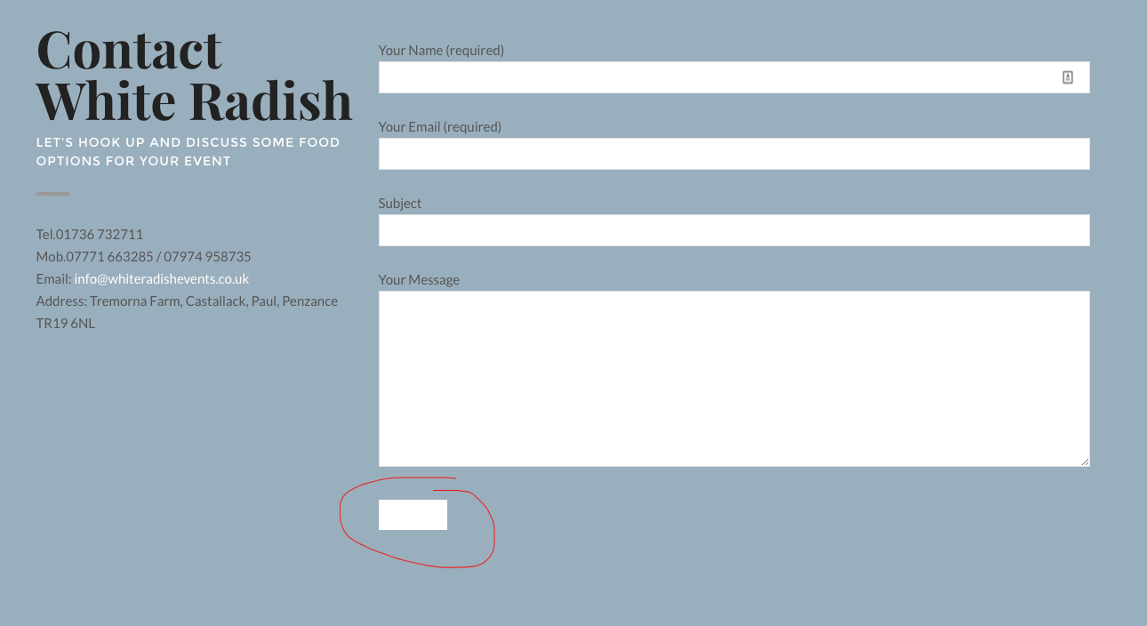
Wyde (and sorry for all the questions),
Since my background colour is white, how do I change the submit button colour on my contact page (see attached)?
http://www.whiteradishevents.co.uk/wp-content/uploads/2016/12/Untitled-1.jpgThanks.
Try to add custom CSS to Theme Options -> Advanced -> Head Content as below:
<style type="text/css">

button,
input[type="submit"],
input[type="button"],
input[type="reset"] {
color: #000;
}

</style>
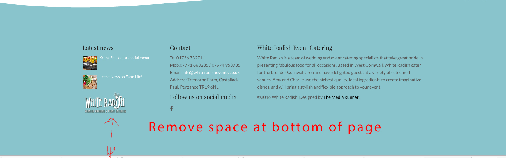
Wyde,
How do I make the space at the bottom of the page narrower? I’ve turned off the footer, but there is still quite a space (see attached).
http://www.whiteradishevents.co.uk/wp-content/uploads/2016/12/Untitled.jpgThanks.
You have to change the Vertical Padding Size of the last row on the page to change the height of the space.
Wyde,
I’d like to create a footer with recent posts, contact etc like on this website: http://www.jennywrenweddingsandevents.co.uk/
for my website here: http://www.whiteradishevents.co.uk/
However, I can’t make the section separator big enough, and I can’t seem to add the widgets – there’s no footer area?
Thanks,
Nigel.
You should set the settings of the row container of the section separator as below so it displays your section separator in the full-width section without space.
Content Width: Full Width
Vertical Padding Size: No Padding
And then set the Padding Size for the column to “No Padding” too.
That’s great – but how do I add widgets to the footer like on here: http://www.jennywrenweddingsandevents.co.uk/
I can’t seem to find a footer widget area?
I’ve sussed out how to do the footer – it’s in the page itself.
However, I’ve got a small gap on either side of my ‘wave’ despite using your settings above – can you help?
Actually, I’ve sussed this as well…
Great job! Glad to hear that you figured it out.
Also, when you import demo content you will receive the footer pages too.
Hi Wyde,
How do I change the font colours on the main navbar / menu?
Thanks,
Nigel.
Hi,
You can change from between Dark and Light text colour. When you edit the page, scroll down to the Overlap Options at the bottom, change the Foreground Style in the Header tab.
To change it to custom colour, you have to add custom CSS into Theme Options -> Advanced -> Head Content as below:
<style type="text/css">

.w-transparent.w-text-dark:not(.w-fixed) .dropdown-nav > ul > li > a, .w-light .dropdown-nav ul li.megamenu>ul>li>a,
.w-transparent.w-text-light:not(.w-fixed) .dropdown-nav > ul > li > a, .w-dark .dropdown-nav ul li.megamenu>ul>li>a{
color: #0a99e2;
}

</style>
