
1306 comments found.
Hi, the “my account” page on my website (using woocommerce) is displaying accounts details (dashboard, orders, downloads etc) across the screen, rather than vertically. When the screen is minimised (to mobile device size), it displays fine. Can you suggest a fix or a setting change for this please?
It seems like you’ve edited that page by using the page builder. It inserts the WooCommerce shortcode into the Text Block so you have a plus icon in front of each menu item on the account page.
The “My Account” page is a predefined and reserved page, you shouldn’t edit it. This would make it couldn’t work properly. Also for other WooCommerce pages e.g. Shop, Cart and Checkout.
However, if you’d like to edit it, you will need to remove the Text Block from the WooCommerce shortcode before saving changes.
All you have to do is:
1. Edit the “My Account” page.
2. Switch from Backend Editor to Classic mode, then change from “Visual” to “Text”.
3. Replace:[vc_column_text][woocommerce_my_account][/vc_column_text]with:
[woocommerce_my_account]
4. Update the page, please DO NOT switch back to the Backend mode before updating.
Perfect. thanks.
Hi there, just following up on this as I have another site with the same problem, however, all the settings (as advised above) seem correct. It’s still displaying the menu items across the page, rather than vertically. Is this a theme glitch? Can you comment please?
We are sorry but that is a theme design. On desktop, it displays the menu items horizontally at the top of your Account page, rather than vertically. This will make you have bigger space to show the order details.
Hi there, I’d like to have a vertical image overlap the row (above) but the way I currently have it laid out means my text in the row underneath the vertical image is pushed down and has lots of empty space above it. I need to move all the text up up but not sure of the best way to achieve this… Help please?
You should enable the Overlap option of the column instead of the row. If you do it in the row, it will move the whole section to the top, you will have empty space at the bottom of that row.
Also, you can reduce the gap by changing the bottom padding of the row in Design Options to 0.
If it doesn’t work, please give me the link of that page.
Hi, I recently purchased this theme, and I love it, but I have a couple questions. I want to be able to have the light header/top nav on some pages, and a dark one on others. I know there’s an option at the bottom of each page, but when I select light or dark, it only changes the logo color, it doesn’t change the top bar background color.
Could you please tell me what code I need to insert into the custom CSS to have a dark header on certain pages?
Thanks so much!
Lily
You can choose only text color (foreground) of the top menu for each page. The background color is included in global settings in Theme Options -> Navigation, you always have the same background on one site, couldn’t choose different colors for some pages.
To achieve this, you will need to add custom CSS like the one below to the Custom CSS settings in the Page Settings window so it will change the top menu background color of that page:
#header:before {
    background: #003eff;
}
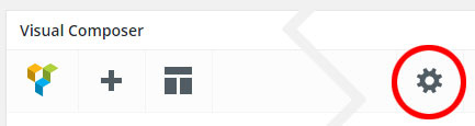
You will find the Page Settings in the right top corner on the WPBakery Page Builder toolbar, see the picture below:
That worked perfectly, thank you! I have a couple more questions, if that’s OK.
1) How can I make the top nav bar a little bit shorter?
2) Also, I want to lighten up the text color on the dark menu bar, because right now the text is a little too dark. I saw the code that you gave someone else earlier in these comments, but that also changed the hover color… I want the hover/active color to remain as it is (the accent color.)
Thanks so much again!
lily
Never mind about number 1, I figured it out!
First of all please ensure that you’ve set the Foreground Style in the Overlap Options to “Light”.
And then add custom CSS below to Appearance -> Customize -> Additional CSS to make it lighter:
/* Make it lighter */
.w-text-light .dropdown-nav a {
    color: #fff;
}
Hi, how do I remove background colour from showing either at the top or bottom of a row? Also, I have some weird white space between two rows (not an empty space) which I can’t work out how to close up. Help please? Happy to send link/login details..
Try to set the Vertical Padding Size of the row to No Padding to see if it works. If it doesn’t work, please give me the link of that page so I can take a closer look.
Hi, thanks for the reply.
I’ve tried that solution but it hasn’t resolved the problem. I’ve managed to solve everything else I mentioned, apart from one ‘section’ of grey (#f5f5f5) that appears on the home page (under the first four images and between the next, full width row (with background image). I just want to remove that particular strip of grey but everywhere is fine.
Please feel free to login and take a look. Where can I send you login details?
Thank you for the details! I have the link of your site, you don’t need to send it again.
You’ve set the Background Style to “Center Center”, the background image will always be placed in the center vertically so you will see the background color (#f5f5f5) at the top of the row.
If you’d like to set the Background Style to “Contain”, you should change the Background Position to “Center Top”. Otherwise, change the Background Style to “Cover” instead.
that seems to have fixed the problem. thanks.
Hi, I’d like to remove all the animation on icon box settings (its currently set to no animation), however, the icons and text still do a little sideways ‘wiggle’ when hovered over, which I don’t like and want to remove. Help please?
The animation option in the settings window of the Icon Box (including other content elements) is just to define the transition of that element when loading the page.
The animation of the icon and text when you hover is according to the Size of the Icon Box, as you can see in our demo below: https://wydethemes.com/overlap/elements/info-box/
You can change the Size to Medium if you wouldn’t like the animation of the icon and text.
However, if you’d like to remove the animation from the Large, you will need to add custom CSS below to Appearance -> Customize -> Additional CSS:
.no-touch .w-info-box.w-large .w-content,
.no-touch .w-info-box.w-large .w-content > *,
.no-touch .w-info-box.w-large .w-content > :not(h4){
    opacity: 1;
    -ms-transform: none;
    -webkit-transform: none;
    transform: none;
}

.no-touch .w-info-box.w-large:hover .w-icon,
.no-touch .w-info-box.w-large:hover .w-content,
.no-touch .w-info-box.w-large:hover .w-content > h4,
.no-touch .w-info-box.w-large:hover .w-read-more > a{
    opacity: 1;
    -ms-transform: none;
    -webkit-transform: none;
    transform: none;
    -webkit-animation: none;
       animation: none;

}
Hey, Can you help: what ist the “Overlap 5” – Theme in Wordpress? I install it but the Theme Names in wordpress are not the same like in themeforest description.
Thanks ") The Wanderer
The Wanderer
All demos are the same theme named “Overlap”. Once you’ve installed the Overlap theme, you can import demo content in Theme Options -> Home so you will receive all demos including the “Overlap 5 (Travel Blog)” exactly the same as our demo sites.
You can find more details on how to import demo content in our documentation.
Hello! I have a few questions that I am trying to troubleshoot:
The food stylist page does not seem to exist, can you please let me know how I can find/access it.
Image size – couple issues: I do not understand how I can control image size, within WPBakery, the options are only predefined, I dont see how I am able to custom control the size. I have looked it up on WPBakery, but what they show vs what is on the site with the Overlap theme is different.
Additionally, it seems quite often that when I add an image to a background or slider revolution, or other areas within the theme, it is zooming in on them, even though I have made sure the image size is exactly the same as the example and have not changed any settings. Please advise.
Is there anyway in the current theme to create image hover effects or do I need to get the image hover effects add-on?
Thank you Jessica
1. The Food Stylist is a One Page demo, you can import it in Theme Options -> Home, choose “Food Stylist” under the One Page section.
If you’ve already imported Multi pages demo, you will need to import the Food Stylist to receive all pages from Food Stylist demo.
2. By default, you will need to put the image size manually when using WPBakery Page Builder e.g. thumbnail, medium. However, when you put custom size for instance 240×200, it won’t resize or crop the image into that size but load the original image file, then set the height and width to it. That means, the browser still loads the original file (that might be very big) to display on the page.
In our themes, we have predefined sizes, when you choose those sizes, it loads and displays the cropped/resized thumbnail with the certain size instead of the original file so it takes shorter time to load.
If you’d like to use custom size, please choose “Original” so it will automatically resize to fit within the column container. If your image is too big, I recommend you to resize it before uploading to your site.
Also, you can set the Paddings and Margins in the Design Options tab of the Single Image Settings to make the image smaller than its container.
3. By default, the size of background image is set to Cover so it will stretch to fit its container. If you’d like to display it without zooming, you should change the Background Style to “Contain”. For the Slider Revolution, you will need to change the Background Fit to “Contain”, see more here: https://www.themepunch.com/revslider-doc/main-background/#image-sourcesettings
4. Unfortunately, we don’t have a hover effect for the Single Image, it is only available for Image Gallery. If you’d like you can try the third party plugin below:
https://wordpress.org/plugins/image-hover-effects-visual-composer-extension/Hello,
Thank you so much for your support earlier. I am writing today because I am still having the same problem with the blog. When the blog settings are set to Masonry, Wide layout, and right sidebar only 2 blog columns appear. The screen size is relatively normal on my 15” macbook pro using GoogleChrome.
When I resize the screen slightly smaller or larger all 3 columns appear, but then they settle back to only 2. You can view my blog page here: http://aw3.3f4.myftpupload.com/blog/
I would love to get it to work using these settings, though I would be okay to change to boxed layout, but then another problem occurs – the text for the 1st post is too long and overflows off the top of the background box and also over the next entry.
Do you have any other suggestions on how I could fix either of these problems with the wide layout, masonry, and dark sidebar preferred?
Thank you so much for all you do and this great theme that you have created!
Hello,
After inspecting this issue, it actually is a bug of the masonry jQuery plugin on a full-width layout with sidebars.
Thank you for taking the time to report this issue, it will be fixed in the next update of the theme.
Regarding the issue with the text for the first post, we will also fix it in the next update. In the meantime, you can add custom CSS below to Appearance -> Customize -> Additional CSS to work around this:
@media only screen and (min-width: 1200px) and (max-width: 1440px){

    .main-content.full-width:not(.no-sidebar) .w-blog-posts.w-masonry .item-0 .post-summary {
        display: none;
    }

}
Also, you can set custom excerpt for the first post so you will have shorter text to show. You can find more details on how to set custom excerpt in “1. How to Add a Custom Excerpt in WordPress (Default)” in the link below:
http://www.wpbeginner.com/plugins/how-to-customize-wordpress-excerpts-no-coding-required/Thank you!
Hello,
This is such a great theme! Thank you!
The client I am building this site for, was wondering if there are any other options for bullets than the cross? I personally like it and wouldn’t change a thing, but am asking for my client.
Thanks so much!
.w-text-block ul > li:before {
    font-family: 'fontawesome';
    content: "\f105";
}
You can find more icons here: https://fontawesome.com/icons
Header is currently set to transparent on load. Hi, I don’t want any opacity on my header after scroll (just solid white with dark text). How do I set this please?
#header.w-fixed:before {
opacity: 1;
}
Hi there, my button that links to the shop (“shop range”) changes on hover, but text disappears. Where can I set the colours for hover and non hover state?
Hi there!
The hover color is only available for the Outline style of the link button. When you change the Style to Square Outline, Round Outline or Rounded Outline, the Hover Color option will show up.
If you are using other styles, the text color shouldn’t change when you hover. However, after inspecting this issue, it actually is a bug of the theme when you set the background color for the button.
Thank you for reporting this issue, we will fix it in the next update of the theme.
In the meantime, you will need to remove the Background Color of the button to work around this.
At the moment all photos in single portfolio pages show up as squares. As a photographer I would love people to see the full resolution already before clicking the photo. Is there any way to get this?
It displays squared thumbnails in a grid to make sure your photos will be fit perfectly in the grid layout.
If you’d like to show photos without cropping, you will need to choose Vertical layout as you can see on our demo site: https://wydethemes.com/overlap/portfolio-item/portfolio-1/
Another way to show all photos in full resolution is, adding them to the content instead of the Gallery Options. You can insert photos into the portfolio content (text editor) directly so you can choose full size to show.
Ah OK, vertical is only possible if you have 4 photos or so. I sometimes have 20. Is it possible on this Portfolio layout https://wydethemes.com/overlap/portfolio-item/portfolio-12/ to have an icon on the big photo on top when you hover? So it becomes more clear that it is clickable? I managed to give it a colored overlay while hovering, but an icon would make it a lot more obvious…?
You can add custom CSS below to Appearance -> Customize -> Additional CSS to add an icon to the picture when hovering:
.portfolio-gallery .post-media:hover a:before {
    position: absolute;
    z-index: 10;
    left: 50%;
    top: 50%;
    font-family: "overlap";
    content: "\e832";
    font-size: 40px;
    color: #fff;
    width: 50px;
    height: 50px;
    margin-left: -25px;
    margin-top: -25px;
    text-align: center;
    line-height: 50px;
}
Thanks, that worked!
But when I click the photo the lightbox image format is very small. The setting is already on ‘original’. Is there a way to choose what size it the lightbox image format is (in pixels) etc.?
You can choose the image size of the lightbox in Theme Options -> Portfolio -> Portfolio Single Post -> Lightbox Image Size.
I already did. But it doesn’t seem to affect the size?
It is important that the photo keeps it full aspect ratio. But just shows bigger than it does now. It now only shows like 25% of the size when in the lightbox
It sounds like that is a bug of the lightbox jQuery plugin. If you’re using the latest update of the Overlap theme that comes with the new lightbox plugin. The maximum height of the new lightbox is smaller than the old one so your image will look pretty small.
However, we will fix it in the next update. Thank you for reporting this issue.
When can we expect this update?
Is it also possible to remove the “categories” widget on the portfolio pages but still keep the description? So remove the space where the categories widget is, but keep the description?
.portfolio-category-widget { display: none; } just removes the categories part, but keeps the ‘description’ part on the same place, is it possible to move the description part more to the left, where the categories part used to be?
.portfolio-gallery .post-description .col-3 {
display: none;
}
I have the Overlap theme on my website. I updated my plugins this morning.
And there is a problem with the Wyde Core plugin.
When I load my website, it keeps loading and nothing appears. When I de-activate the plugin (wyde core), then it loads, but obviously not correctly, because the plugin is obviously needed.
Can you help me out?
Thanks. Kinda urgent. I’m in a launch.
Try to update the theme and Wyde Core plugin including other bundled plugins to see if it works.
Also, if you’re using the latest update of the Overlap theme with WooCommerce, you will need to update WooCommerce to 3.3 or greater.
If it still doesn’t work, please give me your site URL so I can take a closer look.
Hi,
thanks for the quick reply. Everything is updated and it was after the update that everything went KABOOM.
website: http://kantienkarolien.com
All my pages won’t load except one. http://www.kantienkarolien.com/betaalinfo-overschrijving/this page does load , but there is a Thrive-leadcapture box on this page that won’t load. I’ve already tried to de-activate the thriveleads plugin, but it doesnt work. And I absolutely need that plugin as well…
Thanks for helping me solve this mysterie.
Karolien Hermans
Thank you for the links!
All pages are working great on my end. I guess that it might be a browser caching issue. Try to clear your browser caches to see if works. You can press Ctrl+F5 (or Command+R on Mac) to force the browser load all resource files from server instead of caches.
Hi support. I have something strange happening with my footer. It shows perfectly on one page but is missing info on all the other pages (is missing instagram feed) and then changes the title heading text (in the footer) on my shop page. As far as I can tell, the pages are all supposedly calling the same footer to display so I’m confused as to whats happening?
Help please?
I guess that Instagram plugin loads its script before the footer or with an incorrect way so it doesn’t work properly. However, try to check the settings of that plugin to see if there is any option to force load the script on every page. If it’s available, try to enable it to see if it works.
Regarding the heading text in the footer on your shop page, this is a CSS conflict issue, we will fix it in the next update. Thank you for reporting this.
Hi, i’m having this issue with a new website (footer heading text displays differently than the rest of the site)...has this conflict been addressed yet (and an update released)...if not, how do I amend in the meantime? Thanks and regards
It has not been fixed yet, you may need to add custom CSS below to work around this:
#footer h2 {
    text-transform: capitalize;
}
Hi, so I’m revisiting a former ticket regarding logo size. I have used the css snippet provided but have increased the css for the logo size to 140% (not 95%) as it works better for my site. However, it also increases it for mobile. Can I add css to deactive this upsizing for mobile devices? Or display logo on mobile devices at 95%? Regular size of the logo is very small. Regards
/*For mobile menu */
#header-logo img {
max-height: 95%;
}

/* For desktop */
@media only screen and (min-width: 1080px){

    #header-logo img {
    max-height: 140%;
    }

}
thanks!
Hi, I think a recent update may have possibly stopped this css working? Can you check please?
Also, it displays larger on mobile after scroll. I want it to display the same size before and after scroll on mobile (the after scroll size seems correct). Not sure if I’ve missed something in the settings or a recent update has affected the css settings? I thought it was working ok until I spotted it today. Can you please check this!
#header.w-scrolled .container,
#header.w-fixed .container {
height: 85px;
}
With:
#header .container,
#header.w-scrolled .container,
#header.w-fixed .container {
height: 85px;
}
Hi, I don’t have that css (as suggested) in my additional css. I had code in my theme options> advanced>head content which I have replaced as above, but it doesn’t seem to have made a change. I’m not sure I’ve done this correctly or in the right place?
actually, it does appear to be working correctly so I must have placed it in the right place. Thanks for the solution.
Hi, I’ve got some questions regarding the theme setup for typography/headings and using the elements “title” and “custom header”.
“Title” doesn’t seem to bring across the changes set under the typography section, ie the font is larger or smaller than what has been set in typography. So I have changed all my “title” elements on the home page to “custom headers”. However, neither seem seem to respond correctly for reduced screen size (text covers image rather than wrapping within its text box) and they don’t seem to resize for mobile (size remains the same). So, on mobile, my subheading is as large as my main heading (displaying differently to desktop).
Also, the testimonial widget header doesn’t seem to be using the template’s set typography? However, it appears to be resizing correctly for mobile.
I’ve left in place both styles of headings (title and custom) and would appreciate your advice on how to best work with this theme and create the titles I’m after?
Each title type has its own text style and size as you can see here: https://wydethemes.com/overlap/elements/heading/
So, the Typography settings in Theme Options would not work with the Title and some content elements. Those settings are available for the text and headings you input or add to the post or page without having specific font size and font styles.
The Title including other headings won’t response to the reduced screen size, they will work properly on major device screens like large desktop, medium desktop, tablet and mobile, this is what a responsive design works. Sure, they will be resized on mobile. I have no idea why it doesn’t work on yours but I just tried your site with my iPhone, it seems to work fine.
Also, you’re using H1 tag as a title, it’s too big for that column. You can have only one H1 on one page. Please choose H2 instead, as you can see in our demo site: https://wydethemes.com/overlap/home/home-creative-agency/
You should choose the right heading type and size for each part. The Title is suitable for the page or section title to separate each section. If you’d like to put just a heading, choose Custom Heading instead.
Hi I’d like to customise all my call to action button to ensure they’re the same across the site…is there a setting for this in the theme? Otherwise, can you give me a css snippet. I want them all to be H3 text. Thanks.
sorry ignore this, I missed it under the typography…
hi, the text on my icon boxes is a little hard to read due to the overlay/background transparency…where can I adjust these settings? Regards
You can change the text color in the column settings. If you’ve a light background, you should change the Text Style to Dark or choose Custom to set custom text color. Also, you change the background color of the column in the Background tab.
ok, thanks. when i change the text to custom, it applies it to all text including the read more. can i exclude the ‘read more’ or specify a different colour (I think the theme’s black text with different coloured ‘read more’)
in relation to the above, i’d also like to link the text ‘read more’ to my shop category and change to ‘shop category’ or something similar. how/where do I set this?
1. Unfortunately, when you choose custom color, it will apply to all text including links. So, you will need to choose “Dark” for the Text Style if you wouldn’t like to change the color of the read more.
And then you will need to add custom CSS below to Appearance -> Customize -> Additional CSS to increase the opacity of the text and make it stand out:
.no-touch .w-info-box.w-large .w-content > :not(h4) {
opacity: 1;
}
2. You can change the link and text of the read more in the URL (Link) option when you edit the Info Box. Put the link of your shop category page into the URL field and change the Link Text field to replace the text ‘Read More’.
Hi, there, regarding the link and link text, the above instructions don’t seem to change the text on the front end? On hover, it shows my link “shop range” but the text on the site still reads “read more”...
My apologies! Indeed, it doesn’t work with this theme. I’m sorry it is only available in our new themes. The read more text can be changed in Aoraki theme and newer. We will fix it in the next update.
Hi, thanks for the reply. How soon will this be updated? The “read more” is unsatisfactory for my site…
We will release the next update in a couple of days.
Hi, I’m just following up on this ticket as I am waiting to effect change for my client. Has this been updated yet? Thanks.
We’re sorry, we haven’t released it yet. There are some issues need to be fixed.
Anyway, we will release the new update ASAP!
Hi, in the overlap theme, on the contact page, there are some social media icons. The facebook one seems to have no change on hover, whereas the instagram one does change. I would like to have them all set to no change on hover – where do I set this? Regards
Actually it does but you’ve set the icon color to the same as the hover color.
When you choose “None” for Icon Style option, it will change the color to black when you hover.
So, you will need to change the color of Facebook icon to others or clear the value to use default color scheme.
Ah ok, thanks. So can I change the hover colour from black to a colour of my choice?
Unfortunately, the hover color option is not available for the Icon Block.
You will need to add custom CSS below to Appearance -> Customize -> Additional CSS to change it:
.w-icon-block.w-none:hover a > i {
color: #e51212;
}
perfect. thanks!
Hi, my google map doesn’t seem to be displaying correctly, the map marker is off the bottom of the map instead of centering the map within the row? Is there a zoom setting somewhere?
Happy to send link to page via private message…
You can set the marker position, and make it center including changing the zoom setting on the Maps preview in Google Maps Settings window when you add and edit it.
ok great, thanks!
