
1306 comments found.
Sorry one more, on the portfolio detail pages, is there any way to get the client, categories and skill fields into one row, three columns, vs all down the line in one column?
You may need to edit the single portfolio template file in your child theme as below:
1. Please ensure that you’ve installed the overlap-child-theme.zip on your site.
2. I would recommend you to edit the “Gallery” layout because it displays the Clients, Categories and Skills below the portfolio content so it is easier than others. You will need to open a cPanel File Manager or FTP to copy the template file from your Overlap theme “wp-content/themes/overlap/templates/portfolio/single-gallery.php” to your child theme “wp-content/themes/overlap-child-theme/templates/portfolio/single-gallery.php”.
3. Edit that template file in your child theme as follow: Replace:
<div class="post-description row">
            <div class="col col-12">
                <div class="col-inner">
                <?php overlap_portfolio_widget('meta'); ?>
                </div>
            </div>
            <div class="col col-3">
                <div class="col-inner">
                <?php overlap_portfolio_widget('categories'); ?>
                <?php overlap_portfolio_widget('skills'); ?>
                </div>
            </div>
            <div class="col col-8 col-offset-1">
                <div class="col-inner">
                <?php overlap_portfolio_widget('clients'); ?>
                <?php overlap_portfolio_widget('fields'); ?>
                </div>
            </div>
        </div>
With:
<div class="post-description row">
            <div class="col col-4">
                <div class="col-inner">
                <?php overlap_portfolio_widget('meta'); ?>
                </div>
            </div>
            <div class="col col-4">
                <div class="col-inner">
                <?php overlap_portfolio_widget('categories'); ?>
                <?php overlap_portfolio_widget('skills'); ?>
                </div>
            </div>
            <div class="col col-4">
                <div class="col-inner">
                <?php overlap_portfolio_widget('clients'); ?>
                <?php overlap_portfolio_widget('fields'); ?>
                </div>
            </div>
        </div>
Hope this helps!
Hello. I cant seem to see how to create a listing item within the woocommerce shop. I dont see examples from the demo. Please let me know.
Hello,
The product demos are included in the WooCommerce plugin, you can import them in the Products screen on your WordPress admin.
You can find the instructions on how to import products in the link below:
https://docs.woocommerce.com/document/product-csv-importer-exporter/#section-3You will find the sample products in the WooCommerce plugin zip file. Once you extract the file woocommerce.zip, you will see the file “sample_products.csv” in the folder “sample-data”.
Also, you can download the sample products file directly from GitHub in the link below:
https://raw.githubusercontent.com/woocommerce/woocommerce/master/sample-data/sample_products.csvRight click on that page, select “Save as…” and then save it as “sample_products.csv”.
Choose the file “sample_products.csv” in the Import section on the Products screen.
Dear Wyde Team,
my one page site is still under development. Shortly before switching to the tablet media screen, my seventh menu point pops below the navigation bar. There should be enough room left to support at least one more menu point.
Any ideas on changing the width of the navigation bar so a seventh and eight menu point would still fit within?
Regards
.center-nav #top-nav .top-menu {
    padding-right: 120px;
    padding-left: 120px;
}
However, I would recommend you to use a short title menu and move some menu items to the sub menu (dropdown) so they can display on any screen sizes correctly.
As always, your code works just fine! Thank you very much.
Brilliant! Glad to hear that it works ")
Hi there I have a question about my site when view on mobile. One of my categories seems to display with a glitch of some sort? I’m viewing on an iphone 8 and I wondered if you’d take a look and check it. Here’s the url: http://www.jillystea.com.au/product-category/black-tea/. There’s a large empty gap in the left hand column (near the bottom). All other categories seem to be displaying ok and I can’t see any glitches on landscape mobile viewing or desktop… Thanks in advance…
Hi there,
When you display 2 columns of products on mobile, you may need to add custom CSS below to fix the grid layout if some products have 2 lines of titles:
@media only screen and (max-width: 599px) {

.products.w-grid-space .product:nth-child(odd) {
    clear: both;
}

}
Hey thanks, that seems to have done the trick!
Glad to hear that it has been solved
Dear Wyde-Team,
can you help me with the one pager navigation?
I want the parent site (in my case “home”) to match the other menu links. Currently it has a other color. I assume, that’s standard since it’s the main site. The mobile navigation burger icon also takes the same color as my home link.
What it looks right now:
No idea how I make the images work, sorry.
1 – The highlight menu color will always be the same as the theme color scheme. So, you shouldn’t set the menu background color to the same as the theme color scheme.
However, if you’d like to change it to different color from the color scheme, you may need to add custom CSS below to Appearance -> Customize -> Additional CSS:
#header #top-nav li:hover > a, #header #top-nav li.current-menu-ancestor > a, #header #top-nav li.current-menu-parent > a #header #top-nav li.current-menu-item > a, #header #top-nav li.current_page_parent > a, #header #top-nav li.current_page_ancestor > a, #header #top-nav li.current_page_item > a, .vertical-menu li.back-to-parent:hover > span, .vertical-menu li:hover > a, .vertical-menu .current-menu-ancestor > a, .vertical-menu .current-menu-item > a {
    color: #fff;
}
If it still doesn’t work, you may need to send me your site URL so I can help you out.
2 – Like the one above, the color of mobile menu icon (hamburger menu) is always the same as the theme color scheme, you shouldn’t set the menu background to that color.
However, you can change the hamburger menu color by adding custom CSS below to Appearance -> Customize -> Additional CSS:
#header .container .mobile-nav-icon > .menu-icon, #header .container .mobile-nav-icon > .menu-icon:before, #header .container .mobile-nav-icon > .menu-icon:after {
    background-color: #fff;
}
3 – To provide images or screenshots, you don’t need to insert an image tag, just put the link of the image so I can click on the link to see it. For example: https://imgur.com/WsTqgij
Works just fine, thanks!
Glad to hear that it works
Hi there, I’m having trouble with the overlap blog style. When I add the sidebar, it cuts off the copy and/or white section behind the copy. And if I make it full width, it won’t show the excerpt at all.
My preference would be to have the full-width blog style with 50-100 words of the post there in the white section. Help?
Hi there,
When you add the sidebar to the blog page with the Overlap layout, there may be no enough space to show the excerpt for the post.
You will need to change the Page Layout from “Boxed” to “Wide” if you’d like to have a sidebar.
If the excerpt won’t show up when using the “Wide” page layout (full-width), try to update the theme to see if it works.
If it still doesn’t work, you may need to give me your blog page URL so I can take a closer look.
However, when using the Overlap blog layout, you will need to reduce the number of the Excerpt Length setting because there may be no enough space to show many words on small screen devices, the recommended length is 20 (words).
Hope this helps!
My Overlap theme is suddenly running very slow. Has anything changed?
First of all, please ensure that you have updated your WordPress site and the theme including all plugins to the latest update. I would recommend you to upgrade your server PHP to 7.0 or greater, if possible.
If you have any other plugins, try to deactivate them one by one to find the problematic plugin.
Also, you may need to install a cache plugin so it will improve your server performance and reduce the download times.
If it still doesn’t work, you will need to give me your site URL so I can take a closer look.
Hi there,
I have a question regarding the woocommerce settings and I’m wondering if you can help or point me in the right direction.
Under my shop page, there is a dropdown option to filer products by popularity, average rating, newness etc. Is it possible to add an option, “filter by category” which then displays category headings or something similar.
I have included a category filter in the sidebar but it may be missed by some shoppers and I’d like to make the site as user friendly as possible.
Please let me know. Look forward to hearing back.
Regards Carrie
Hi, Just waiting on a response please?
Hi there,
Sorry for the delayed response!
That dropdown is a built-in product sorting option from WooCommerce plugin, it is just to change how products should be sorted in the catalog/shop page. It couldn’t filter product by category and couldn’t display category headings either.
If you’d like to show category headings, you will need to create a custom shop page and use the Product Category element to show products from each category in each section, as you can see in our demo below:
https://wydethemes.com/overlap/shop/shop-home/Hi, I’d like to reduce the size of the text in the bottom footer section (footer bar) – I’m using layout 2. Where do I adjust this please? Thanks.
Hi, just waiting on a response please?
Here’s CSS snippet to reduce the font size in the footer bar:
.footer-v2 #footer-text {
    font-size: 13px;
}
I need support but when I press the support link nothing happens. Where can I email to get the support I need with this theme?
Thank you
You can post a comment in the Comments page below (all comments are public):
https://themeforest.net/item/overlap-high-performance-wordpress-theme/15344205/commentsOr send a private message in the contact form in the right hand side on the profile page below, we will reply to your email directly:
https://themeforest.net/user/wyde#contactDear Wyde Support Team,
every time I try to activate or use the Live-Preview of the Overlap-Theme I get a ”HTTP ERROR 500“ from Chrome. Any idea on fixing this issue?
Regards Florian (Designer at the koeppel agency)
Ok, after some testing i figured that the error would appear after activating the ”WPBakery Page Builder“.
Same counts for the ”Slider Revolution“ plugin. Both are apparently needed for the theme to work.
We have never seen this issue before. There may be plugin conflicts on your site. If you have any other plugins, try to deactivate them to see if it works.
If it still doesn’t work, please give me your WordPress login details so I can take a closer look. You can send a private message in the contact form on the profile page below:
https://themeforest.net/user/wyde#contactAlso, it might be a web server issue:
1. Make sure your site is running on PHP 5.6 or greater, PHP 7.0 is recommended.
2. Please ensure that you have set the PHP limits on your web server to the minimum as follows:max_execution_time = 300 memory_limit = 128M post_max_size = 32M upload_max_filesize = 32M max_input_vars = 5000
Thanks! I updated the PHP files. Works just fine now.
Glad to hear that the problem has been solved
Hi guys I’m wondering if you can help with how to achieve a certain layout:
I would like a specific height row, with background image. I have inside that row, two columns, one of which I want to overlap the bottom of the row, but I don’t want the column to actually move down by 100px, I just want it to “spill over” the bottom of the row. I can send screenshot to better demonstrate what I’m trying to achieve if that helps. Not sure how or event if this can be achieved?
Regards
Thank you for the detailed question!
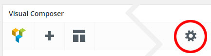
You may need to set the height of the row, here is a step-by-step guide:
1. Put a class name below to the Extra CSS Class field of that row:custom-row-1
2. Click on the gear icon at the top right corner of the page builder’s toolbar to open the Page Settings, see the picture below:
.custom-row-1 {
    height: 200px;
}
HI, I need to centre a link button on a specific page…there doesn’t seem to be that option in the actual button settings. Can you provide css snippet please? Thanks.
Hi there,
You can set it in the column settings. You may need to edit the column container of that button, then change the “Text Alignment” option to Center.
Hi, I’m using the icon box with content (icon set to top)...when the icon is small, the text and icon are centred. When I change it to a different size, they are left justified (with no apparent option to change layout). Can you please advise if this is how the template is set to operate? If so, can you provide a solution so that I can set the icon, heading and text to be centred. Thanks.
Hi there,
The Icon Position option is only available for the “Small” and “Medium” sizes of icon. You won’t be able to change this option if you’re using a “Large” icon, it will be always at the top.
However, you can change the “Text Alignment” option in the column settings to align the text and icon.
You will find all available styles of the Info Box here: https://wydethemes.com/overlap/elements/info-box/
Hi there I’m finding a couple problems working with your theme that don’t appear to be documented. The first one is an FYI: 1. Your demo is currently filled with 404 errors in the portfolio posts 2. I am unable to find a means to display the Instagram feed as you have in your demo: https://wydethemes.com/overlap/elements/social-stream/ 3. How do I add remove icons/links in the Social Share Buttons on a single portfolio post?
Please advise,
Hi there,
1. That is a permalink caching issue, all you have to do is to visit the permalink settings screen on your WordPress admin page, Settings -> Permalinks.
2. The Instagram Feed has been added to the latest update of the theme, please ensure that you’ve updated the theme to version 1.4.4 and Wyde Core plugin to version 3.7.7.
Also, you have to setup the Instagram Access Token in Theme Options -> Instagram Feed before using the Instagram Feed on your site.
3. You may need to add custom function to functions.php in your child theme to add or remove icons/links in the Social Sharing Buttons.
Here’s the sample code to remove and add icons/links:
function overlap_get_post_share_links( $links ){

    // Remove Google+
    unset( $links['ol-google-plus'] );

    // Add Pinterest icon
    $links['fa fa-pinterest'] = sprintf('http://pinterest.com/pin/create/button/?url=%s&description=%s&media=%s',
            urlencode( get_permalink() ),
            urlencode( get_the_title() ),
            urlencode( get_the_post_thumbnail_url( get_the_ID() ) ) );

    // Add Tumblr icon
    $links['fa fa-tumblr'] = sprintf( 'https://www.tumblr.com/share?u=%s&t=%s&v=3',
            urlencode( get_permalink() ),
            urlencode( get_the_title() ) );

    return $links;

}
add_filter( 'overlap_post_share_links', 'overlap_get_post_share_links' );
Hi, Regarding #1 I was referring to your actual demo site. All your portfolio posts are giving a 404 error Is it just me?: https://wydethemes.com/overlap/portfolio-item/portfolio-13/ For #2 I have Theme 1.4.3 and Core 3.7.5 not good enough?
Hi there,
1. My bad! Thank you for reporting this, it has been fixed now.
2. You will need to update the theme and Wyde Core plugin to the latest update because the Instagram Feed has been added to the Overlap theme 1.4.4 and Wyde Core 3.7.7, as you can see in the changelog: https://themeforest.net/item/overlap-high-performance-wordpress-theme/15344205#item-description__update-logHi there, can you direct me to (perhaps a link?) best way for me to update the theme and core? Sorry, I’m new…
I recommend you to install the Envato Market plugin to enable the automatic update feature so you can download and install the new update from your WordPress admin page.
You can find the instructions on how to update the theme by using the Envato Market plugin in our documentation.
Ok. Everything is updated and working well. Thanks.
HI, can you please advise the correct size for the footer logo (I can’t seem to find it in the documentation). I have currently uploaded at 227 and 454 (retina) but these sizes are too large… Regards Carrie
Hi there,
The logo size varies depending on the footer layout that you’re using.
If you’re using the first layout (Center), you can upload any sizes for the footer logo.
Also, here are recommended sizes for other layouts:The second layout (Small): 30px tall (60px for the retina version) The third layout (Medium): 50px tall (100px for the retina version)
ok thanks. That’s great.
Quick question, how do I adjust the spacing between elements/rows, for mobile specifically? While a layout may look ok on desktop, some are coming up with much more empty space between them when on mobile. Thank you!
There are 2 ways to hide the content element on mobile devices.
1. You may need to add an Empty Space element into different column from other content elements. There are Responsive Options in the column settings, you can hide the column container of that Empty Space on mobile devices.
2. You can put the CSS class below to the Extra CSS Class field in the Empty Space settings window to hide it on mobile devices:hidden-xsAlso, here are other classes to hide it on other screens:
hidden-sm   = Small screen (tablet)
hidden-md   = Medium screen (laptop)
hidden-lg   = Large screen (desktop)
Hello, We contact you to ask about the theme Overlap. We have purchased and installed the theme correctly, and we love how our website is running. The query is about the language of some features of the theme, such as the search, the “all” category of the portfolio and some “read more” buttons. We would like to know how we can translate these elements into our language, because we need them not to appear in English. Thanks in advance, a warm greeting.
Hello,
There are 2 easy ways to translate the theme.
1. Using POEdit, you can find the instructions on how to translate the theme by using POEdit in the Translation section in our documentation.
2. By using the Loco Translation plugin: https://wordpress.org/plugins/loco-translate/
You can install that plugin on your site, and then translate the theme on your WordPress admin page directly.
Hi, what’s the best way to achieve a full width row (with coloured background) but not stretched or full width content within that row? I’m looking to place a contact form inside a row with the background colour going from edge to edge of website. Thanks!
You don’t need to set the row to full width. When you set background color for the normal row (not full width), you will have the full width background color but the content won’t be stretched.
So, all you have to do is, to change the Content Width of that row to “Default” instead of “Full Width”.
Hi, how do I set the colour of the menu text for after scroll? It’s showing as white before scroll but changes to grey after scroll – I want it to remain white). Cheers
I have no idea why you’d like it to remain white after you scroll. Once you scroll down, the menu background will be white, if you change the text color to white, you won’t see it.
If you’d like to change the menu text to white, I would recommend you to change the menu background to black instead. You can change the menu background in Theme Options -> Navigation -> Top Navigation -> Header Background.
Hi thanks, I think you’ve maybe misunderstood my question. I have already changed the menu background to black, however, my text colour also changes to grey on scroll (instead of remaining white). I want to change the text colour for after scroll to white (which will show against my black background) Where do I set this please?
My bad! I thought that you’re using a white background menu.
Anyway, here’s the CSS snippet to change the text color of the sticky menu to white:
.w-text-light .dropdown-nav a {
    color: #fff;
}
Also, please ensure that you’ve set the Foreground Style in the Overlap Options -> Header on the page edit screen to “Light”.
