
1306 comments found.
Hello,
First of all, thank you for your overlap template, I really like it.
I do not understand the portfolio grid. I’d like to change links and image in the grid I’ve choosen, but I can’t see how, where? I have the impression that my WPBakery Editor doesn’t have the option to change it.
Thanks for your help Laure
The portfolio is a custom post type, it works like a blog post. You can change the link and image of the portfolio under the Portfolio menu. Edit each item in the portfolio list to change its Featured Image and Permalink. You can find more details here: https://wydethemes.com/overlap/documentation/#create-a-portfolio-post
Hi, Sorry, I understood this portefolio. I will try another explanation:
If I choose Portfolio Grid Full Width. Then choose a new element . I choose Portefolio Grid element. In this element, it links to Portefolio 11, Portefolio 13, Portefolio 4… I would like to change this links to pages I want, but keep the layout. Is it possible to change links of the element?
Yes, you can choose specific items to display in the portfolio grid element.
In the Portfolio Grid element settings, click on the “Build query” button in the Custom Posts option. Then you can put specific portfolio categories, skills and tags into the “Taxonomies” field to filter the output. Or enter the item title into the “Individual Posts/Pages/Custom Post Types” field to choose specific items by titles.
Excellent, thank you very much.
On my Website I found a error:
2021-07-20T14:57:47+00:00 CRITICAL Uncaught Error: Call to undefined function cbs_get_weekdays() in /var/www/wilfego/public_html/wp-content/themes/overlap/mp-timetable/theme/column-events.php:9 Stack trace:
0 /var/www/wilfego/public_html/wp-content/plugins/mp-timetable/classes/class-view.php(155): include()
1 /var/www/wilfego/public_html/wp-content/plugins/mp-timetable/classes/models/class-column.php(186): mp_timetable\plugin_core\classes\View->get_template(‘theme/column-ev…’, Array)
2 /var/www/wilfego/public_html/wp-content/plugins/mp-timetable/classes/models/class-column.php(178): mp_timetable\classes\models\Column->append_events()
3 /var/www/wilfego/public_html/wp-content/plugins/mp-timetable/classes/class-core.php(192): mp_timetable\classes\models\Column->render_column_metas()
4 /var/www/wilfego/public_html/wp-includes/class-wp-hook.php(292): mp_timetable\plugin_core\classes\Core->append_post_meta(’’)
5 /var/www/wilfego/public_html/wp-includes/plugin.php(212): WP_Hook->apply_filters(’’, Array)
6 /var/www/wilfego/public_html/wp-inc in /var/www/wilfego/public_html/wp-content/themes/overlap/mp-timetable/theme/column-events.php in Zeile 9
it looks like something is in conflict with the theme right? How can I fix it?
Looks like you’ve modified the theme. Actually, the theme doesn’t originally include that file (“mp-timetable/theme/column-events.php”).
We don’t recommend editing any file or adding a new file into the theme folder directly. Your changes will be lost when you update the theme.
If you’d like to modify the theme, please do it via the Child theme instead.
To fix this issue, I recommend you to re-install the Overlap theme to make sure it will be working properly.
You need to move the files you’ve made in the theme folder directly to the Child theme first because when updating the theme, it will replace the whole theme folder. Your files will be lost.
I did not modified anything on the theme. I also installed the current version of the theme a couple of days ago. But the error persists.
We’re sorry but the error is from another plugin. Try to deactivate your plugins one by one to find the problematic plugin. As seen in the error message, it should probably be the one related to the timetable and event.
After deactivate those plugins, I recommend you to re-install the theme to make sure there are no additional files added to the theme folder.
I’m having problems displaying the shop in the desktop view. Here the products are only shown to a width of 25%. But that is not on all devices. It looks correct on my low resolution laptop. In the css file “shortcodes.css” I found the part ”.col-3 { width: 25%; }”. However, if I remove this or set it to 100%, the product overview no longer looks nice. Here are the two links:
https://www.wilfego.de/produkt/bachata-fuer-anfaenger/ https://www.wilfego.de/produkt-ategorie/tanzkurse/This theme displays products in one column on mobile, 2 columns on tablet and 4 columns on desktop. That seems to be working properly on all devices, as you can see on our demo site: https://wydethemes.com/overlap/shop/shop-home/
You shouldn’t remove that CSS. Removing it will make the products display 1 column on desktop.
If your site is not working this way. There may be plugin conflicts on your site, try to deactivate your plugins to see if it works.
I currently still have version 1.4.9. I would like to update to the latest version. What is the best way to do this? What do I have to consider?
An automatic update function would be desirable for the future.
You need to install the Envato Market plugin to enable the automatic update so you will see a notification message with the link to update the theme under Appearance -> Themes.
You can find the instructions on how to update the theme in the documentation here: https://wydethemes.com/overlap/documentation/#update
Hi Wyde! Same Problem (and some new) as i had in the past: When editing a page, editing the theme options at the bottom of the site has no effect. For example Site Layout: Boxed or wide. Boxed is activated by default (but demo conten site is STILL wide), changing to wide let’s is switch back to boxed when saving – site is still wide. New to me: ALL these theme options disappear after a while from the whole site. Brandnew wp-install, no other plugins installed. Any idea? Thank you.
There seems to be a bug with the recent update of the Wyde Core plugin. We’re working on it and will release the new update ASAP.
Thank you for reporting this issue!
Seems to be solved. Thank you for releasing the update so quickly! ")
Glad to hear it has been solved!
I need help with the Team Members functionality. We are using it and love it. BUT we want people to be able to select and copy text from the bios to paste elsewhere. Right now you can’t select the text and copy. How can I make this possible?
It’s working fine on our demo site. I can select and copy the text from the bios in the lightbox. You can try it here: https://wydethemes.com/overlap/elements/team-member/
Please ensure that you’ve updated the theme and all bundled plugins to the latest update.
If it still doesn’t work, it might be disabled by some plugin. Try to deactivate your plugins one by one to find the problematic plugin.
Hi there,
I am very interested in purchasing the Overlap Theme, but have 3 remaining questions:
- are you working on making it compatible with Gutenberg? - will all pages built with Overlap need such a long loading time and showing a loading time display – as I can see in the Demos? - If I have a German and an English version of my website – do I have to purchase 2 licenses?
Thanks for your answer.
Lisa
Thank you for your interest in our theme!
- We’re sorry but this theme was built with WPBakery Page Builder. All elements and demo content are based on that page builder so we recommend using the WPBakery Page Builder with this theme instead.
- When the Loader option is enabled, it will display the loader while loading the page (until everything is loaded). You can disable it so you will see the content immediately when visiting the page.
- Of course, one license is only available for one website (one WordPress installation). If you’d like to use it in 2 sites, you will need to purchase 2 licenses for them.
Hi, on your demo site https://wydethemes.com/overlap/home/home-creative-agency/
I see in a number of photos that they are full wide with a text block in it, and while you scroll down, the photo rolls along.
I already have my pages set to full wide and not boxed. How can I make this on my website?
Best regards
You have to set the row background image and enable the parallax background.
In the Row Settings window, select the Background tab choose your background image and then change the Parallax setting to Simple Parallax: https://wydethemes.com/overlap/documentation/#section-background
Thank you for you’re respons! Is there a code to make it the same hight at you’re website? My background image is very small, i would like to make it a higher if this is possible?
Best regards
It is based on the height of the content inside the row. If you don’t have any content inside it or would like to make it higher, you may need to add an Empty Space element and set the height as you wish.
Hello! Each time I do some changes in Overlap Option like change the Header or background and then Update the page, all the changes in Overlap Options reset. Is there a way to maintain the changes?
The page maintains the changes, but in Overlap Options everything is reset.
We’re sorry but we’ve never seen this issue before. Please ensure that you’ve updated the theme and all bundled plugins to the latest update. You can find the changelog here: https://themeforest.net/item/overlap-high-performance-wordpress-theme/15344205#item-description__update-log
If it still doesn’t work, there may be plugin conflicts on your site. Try to deactivate your plugins to see if it works.
I have compatibility issues with the plugin Ultimate Member 2.1.6. The issue is described in detail here: https://wordpress.org/support/topic/ultimate-member-2-1-6-theme-menus-breaking-changes/
Do you have any idea, how to fix this?
I just tried the theme with the Ultimate Member 2.1.20 and everything seems to be working fine. I couldn’t find any error when editing the menu.
Please ensure that you’ve updated the Flora theme and Wyde Core plugin to the latest update. You can find the changelog here: https://themeforest.net/item/overlap-high-performance-wordpress-theme/15344205#item-description__update-log
Also, it might conflict with another plugin, try to deactivate other plugins to see if it works.
If it still doesn’t work, you may need to send me your web address with the login details so I can check it. You can send a private message through a contact form on our profile page here: https://themeforest.net/user/wyde#contact
Hey, there when I import all media it doesn’t import all media and I am missing some pictures in the layout!
max_execution_time = 300

memory_limit = 256M

post_max_size = 32M

upload_max_filesize = 32M

max_input_vars = 5000
However, this also depends on your web server performance. Some web hosting plans provide you with limited web server resources so it might not be able to download several files at the same time.
If other options have been imported successfully. Then, you can select only “Media” to import all media again.
If it still doesn’t work and some of images couldn’t be imported, you may need to upload your images to replace them manually. You can skip the “Media” option and then import the “Settings” so your site will look like the demo site.
Hi I like this theme, but I’d like to see a click-through gallery (like lightbox) where the closeups can be clicked through in sequence without having to click away and reselect a new image to view in closeup. Do you have this capability? Also, I’m assuming the ‘overlap’ text has the option to change the background color so the text is visible on top of the photo?
Thank you for your interest in our theme!
Here’s a click-through gallery in this theme: https://wydethemes.com/overlap/elements/image-gallery/
It also comes with various types and layouts with a couple of hover effects.
Of course, the ‘Overlap’ option is included in ‘Column’ element of the page builder which has the option to change the background color. You can add a text and any other content elements into the column then move it to overlay another column.
I am almost done with my website, but want to translate from EN into DE. How do I do this? I installed already Loco, but it seems that this does not work for Overlap. What do you recommend, to translate my website? Thanks Silke
Actually, this theme is working with the Loco Translate plugin. You can use it to translate the theme. Try to change the translated files location from “Custom” (languages/loco/themes) to “System” (languages/themes) to see if it works, please check out this link: https://localise.biz/wordpress/plugin/beginners#add
Also, please ensure that the languages folder (wp-content/languages) on your web server is writable so the plugin will be able to save the translation files.
Another way is, use the POEdit to edit the POT file and upload to your child theme folder directly. You can find more details in the documentation: https://wydethemes.com/overlap/documentation/#translation
Thanks for your reply. I still have the feeling, that I am looking for something different. The Theme is already available in DE and EN. If I change the default language to DE I see the wordpress application UI already in DE. What I am looking for is the translation of my website content, that I created in the different pages – like Start page, about me, services etc. Is that really what Loco will offer? Thanks again, Silke
Sounds like you’d like to create a multi-language website. You will need to install a multilingual plugin like WPML ( https://wpml.org/ ).
Yes that is what I wanted to do. Thanks a lot. I will try it
Hi guys, I’m having a theme issue when I view a single product woocommerce, preloader just loads for ever and nothing comes up – console shows 500 internal error. Doesn’t happen if i switch theme to 2021, can you please test and advise.
Everything is working fine on our site. There may be plugin conflicts on your website. Try to deactivate your plugins to see if it works.
If it still doesn’t work, you may need to send me your web address so I can check it.
I am using your (child) theme specifically for as a blog at https://tableauxblog.com. I’m close to getting everything to look and function as I like but am running into problems with the following…
1) I have two “Primary Navigation” menu items but they do not display on the mobile menu. When I open the mobile menu it is blank with none of “Primary Menu” links displayed?
2) I modified the mobile menu so it opens from the right side, but is it possible to make it so the mobile menu opens from the top down?
3) I figured out how to move the hamburger menu to the right side when viewing on mobile, but I cannot figure out how to move the logo from center to the left side of the header?
4) Is there a way to resize the hamburger menu icon so it is smaller? Not just width, but height as well?
I would appreciate your help with css and/or style in the header to make the above work!
1) The menu items are still there behind the header menu bar. There are overlaid with the header menu bar.
If you’d like to increase the height of the header menu bar, you will need to add following CSS snippet to Appearance -> Customize -> Additional CSS to increase the space at the top of the menu items too:
@media only screen and (max-width: 1079px) {

    #side-nav {
        padding-top: 140px;
    }

}
2) Try adding the following CSS snippet to Appearance -> Customize -> Additional CSS to see if it works:
@media only screen and (max-width: 1079px) {

    #side-nav {
        transform: translate3d(0,-100%,0);
    }

}
3) You will need to add the following CSS snippet to move the logo to the left side:
@media only screen and (max-width: 1079px) {

    #header-logo {
       margin: 0 auto 0 0;
   }

   #header-logo img {
       margin: auto 0;
   }

}
4) We’re sorry but it is pretty hard to change the height the hamburger menu to make it smaller. You will need to change the position of each bar to make them closer.
However, the easiest way is, scale it down by using CSS transform below but it might look a bit blurry on Chrome:
.mobile-nav-icon {
    transform: scale(0.75);
    backface-visibility: hidden;
}
Thanks for the response.
I added the first three css suggestions you made above but unfortunately none worked. Perhaps some existing modifications are conflicting?
Below is a copy of my entire CSS mods and below that is a copy of the styles added to the header
CSS
header.w-light:before {
background: #5C7387; }
header.w-dark:before {
background: #5C7387; }
header .container {
height: 124px; padding-left: 30px; } #header.w-scrolled .container, #header.w-fixed .container { height: 124px; }
.title-wrapper.w-size-s .title { font-style: normal; font-family: “Julius Sans One”, sans-serif; font-weight: 700; padding-top: 30px; }
.post-title { font-style: normal; font-family: “Julius Sans One”, sans-serif; font-weight: 700; padding-top: 0px; float: left; }
.main-content:not(.full-width) .page-content { padding-top: 80px; }
.main-content { background: #F3F5F5; }
.page-content { max-width: 1550px; }
.w-blog-posts .readmore-link a { display: inline-block; border: 0px solid #8accff; background-color: #C7C0B0; color: #ffffff; padding: 8px 20px; margin-top: 20px; { }
@media only screen and (max-width: 1079px) {
side-nav {
transform: translate3d(0,-100%,0); }
}
@media only screen and (max-width: 1079px) {
side-nav {
padding-top: 140px; }
}
@media only screen and (max-width: 1079px) {
header-logo {
margin: 0 auto 0 0; }
header-logo img {
margin: auto 0; }
}
Header Styles
<style type=”text/css”>
.mobile-nav-icon{
    left: auto;
    right: 15px;
}
@media only screen and (max-width: 1079px){
#header #top-nav {
right: auto;
left: 0;
}
}top-nav .ex-menu{
right: auto; left: 15px; }
.dropdown-nav > ul > li.menu-item-search > .live-search-button{
    padding-left: 0;
}<style type=”text/css”>
header #top-nav li > a{
color:#ffffff; font-weight: 800; }
header #top-nav li:hover > a,
header #top-nav li.current-menu-ancestor > a,
header #top-nav li.current-menu-item > a{
color:#AFB8BC; }
</style>
<style type=”text/css”>
@media only screen and (max-width: 1079px) {
side-nav {
max-width: none; -ms-transform: translateX(100%); -webkit-transform: translate3d(100%,0,0); transform: translate3d(100%,0,0); }
}
</style>
The CSS I provided was overridden by your custom CSS above. You may need to remove it to make the one I provided work.
That’s not really a solution because I need that other CSS. Is there a specific part of the CSS that is in conflict?
I deleted some of my CSS and was able to use yours to fix the first issue above. I still cannot get your other css to work, but number 3 above (keeping the logo on the left side in mobile) is really the one I’m most concerned with. I even tried deleting all of my other CSS and just using that, and it did not work.
Any other suggestions on how to keep the logo on the left in mobile?
@media only screen and (max-width: 1079px) {

    #side-nav {
        max-width: none;
        -ms-transform: translateX(100%);
        -webkit-transform: translate3d(100%,0,0);
        transform: translate3d(100%,0,0);
    }

}
With:
@media only screen and (max-width: 1079px) {

    #side-nav {
        transform: translate3d(0,-100%,0);
    }

}
3) I couldn’t find the CSS I provided to align the logo to the left in your site. Please check out the CSS in #3 of my first reply and make sure you’ve add it correctly to your site.
However, I’m sure where you put your custom CSS. If you put it after mine it will override mine so it won’t be working.
The easiest way to make it work is, put mine after yours so it will override yours.
OK, we’re getting close. I got everything working except now the mobile menu drops down from the top-down left side, I’d like it to drop down from the top-down right side.
I think part of the problem I had/have is confusion about where I should add the CSS. Should it be added in “Theme Options” > Advanced > Head Content, OR should it be added in Appearance” > Customize > Additional CSS?
Here is what I have in the Theme Options > Advanced > Head Content now:
<style type=”text/css”>
.mobile-nav-icon{ left: auto; right: 15px; }
header #top-nav {
right: auto; left: 0; }
top-nav .ex-menu{
right: auto; left: 15px; }
side-nav {
transform: translate3d(0,-100%,0); }
.dropdown-nav > ul > li.menu-item-search > .live-search-button{ padding-left: 0; }
side-nav {
transform: translate3d(0,-100%,0); }
header #top-nav li > a{
color:#ffffff; font-weight: 800; }
header #top-nav li:hover > a,
header #top-nav li.current-menu-ancestor > a,
header #top-nav li.current-menu-item > a{
color:#AFB8BC; }
</style>
And I have the following CSDS in the Appearance > Customize > Additional CSS” section:
@media only screen and (max-width: 1079px) {
header-logo {
margin: 0 auto 0 0; }
header-logo img {
margin: auto 0; }
}
header.w-dark:before {
background: #5C7387; }
header .container {
height: 124px; padding-left: 30px; }
@media only screen and (max-width: 1079px) {
side-nav {
padding-top: 140px; }
}
.page-content { max-width: 1550px; }
.main-content { background: #F3F5F5; }
.main-content:not(.full-width) .page-content { padding-top: 80px; }
.w-blog-posts .readmore-link a { display: inline-block; border: 0px solid #8accff; background-color: #C7C0B0; color: #ffffff; padding: 8px 20px; margin-top: 20px; { }
So if you could tell me how and where to put CSS so the mobile menu will open from top-down right side, I should be set!
My apologies for the late reply!
I recommend adding all custom CSS into Appearance -> Customize -> Additional CSS. And make sure you add the CSS I provided after yours.
Q1 – How does one get the “Red More” button to display on the main Blog page just like it is on the Category pages?
Q2 – How does one add space under the Read More button that is displayed on the Category pages? Depending on the screen resolution, the button sometimes overlaps onto the next post entry. I tried adding the following css but it is not responsive (only works on some screen resolutions):
.w-blog-posts .readmore-link { padding-bottom: 50px; }
It may be that the issue is with the “post-content”?
Nevermind, I figured this out. I did post other questions in a separate comment.
My apologies for the late reply!
Anyway, glad to hear you’ve figured it out.
Hi!
We bought the theme while back and we were looking to use the slider revolution feature but it is asking for a License key. How I get one for the slider? I’m using the one for the theme but is not working at all.
Thanks in advance.
The Slider Revolution plugin is included in the theme. You can normally use it without using a license key. You don’t need to register/activate the product key, it is for direct customers to enable the automatic update feature and to download premium slider templates from the plugin.
Hello. I bought the theme, did all the installation, but WPBakery Page Builder is not working. I tried uninstalling, removing and reinstalling the plugin and it doesn’t work. I also disabled all other plugins and the problem continues. What I can do?
Would you mind giving me your web address with the login credentials so I can check it? You can send a private message through the contact form on our profile page: https://themeforest.net/user/wyde#contact
Message sent. Thanks
Thank you for the message!
Everything seems to be working now. I can edit your page with WPBakery Page Builder. You can check out the screenshot in your email.
Hello. I am interested in buying your theme, but I want to know if it is possible that the text does not overlap the image (demo overlap2 creative studio).Thanks
Thank you for your interest in our theme!
Of course, the overlap option is included in the element settings. You can easily turn on/off it for specific elements in the page builder.
Hi. I have an issue in mobile view when I use overlapping items editing a page (text blocks plus an image in a row with two columns for example). Desktop view shows all correct, but mobile view skips out items in the left column of that row and I cant set anything else in row options-responsive options but activating a reverse order which doesn’t help out. Any suggestions?
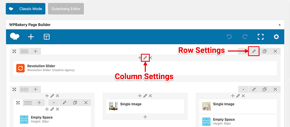
Try checking the Responsive Options under the Column Settings of the left column and make sure all checkboxes in the “Hide on device?” are unchecked so it will appear on both mobile and desktop.
To edit the column settings, click on a pencil icon at the center top of the column:
If it still doesn’t work, you may need to send me your web address so I can check it.


