
1303 comments found.
Hi there, i’d like to ‘turn off’ the animation for the large button (ie moving right with arrow when hovered over)...how is this achieved please? TIA
Hi. I am in the admin and it appears that the pages edit view is no longer pulling from the bakery page builder but using blocks. Please advise
Try checking the current version of the Overlap theme on your site. If it is 1.4.5 (the latest update), you may need to delete the WPBakery Page Builder plugin from the Plugins screen on your WordPress admin. After you delete it, you will see a notification message to install that plugin. Click on “Begin installing plugins” to install it. This will install the new update of that plugin. Please don’t worry, deleting that plugin won’t affect your current data and settings.
If it is lower than 1.4.5, you will need to update the theme so you will get the latest update of WPBakery Page Builder plugin (5.6) that is compatible with WordPress 5.0.
Thank you! I will give this a try today.
Hi,
after upgrading to WhooCommerce 3.5.2 my shop doesn’t work anymore. Will you support the new version of WhooCommerce in the near future?
Best Regards Daniela
Our demo site is also using the latest update of WooCommerce (3.5.2), everything seems to work correctly: https://wydethemes.com/overlap/shop/
Please ensure that you’ve updated the theme and all bundled plugins to the latest update, you can find the update log here: https://themeforest.net/item/overlap-high-performance-wordpress-theme/15344205#item-description__update-log
If it still doesn’t work, there may be plugin conflicts on your site, try to deactivate your plugins to see if it works.
Hi, I’d like to hide the title text but still retain the image and the gradient scroll effect. I tried with this css snippet from another ticket but it didn’t seem to work:
.title-wrapper:not(.w-size-s) .title:after{ display:none; } Can you assist with this? Regards
That snippet will hide the line below the page title. Here’s CSS snippet to remove the page title:
.title-wrapper .title {
    visibility: hidden;
}
I just upgraded WordPress to 5.0 and I am unable to work on the theme, will you be doing an update soon?
Actually, the latest update of the Overlap theme is compatible with WordPress 5.0 as you can see in our demo site that is also running on WordPress 5.0: https://wydethemes.com/overlap/
However, the current version of WPBakery Page Builder plugin that’s included in the theme is not compatible with WordPress 5.0.
After you update your site to WordPress 5.0, it will force you to use the Gutenberg editor instead of the page builder, then you won’t be able to edit the post and page with the page builder.
All you have to do is:
- If you’re using the Overlap theme 1.4.5, you will need to delete the WPBakery Page Builder plugin from the Plugins screen on your WordPress admin. After you delete it, you will see a notification message to install it, click on the link “Begin installing plugins” to install it again. This will install the latest update of WPBakery Page Builder so you will be able to use it with WordPress 5.0.
- If your Overlap theme is older than 1.4.5, you will need to update the theme, it includes the latest update of WPBakery Page Builder that is compatible with WordPress 5.0.
If it still doesn’t work, there may be plugin conflicts on your site, try to deactivate other plugins to see if it works.
Ok I did what you suggested and it works now. Thank you
Glad to hear that it works.
Thank you
What’s the best method for extending the bundled CMB2 with CMB2 Grid to make in-line text inputs? I’ve tried the plugin method but it wont init since CMB2 is bundled.
I just installed CMB2 plugin on our demo site, I couldn’t find any conflicts with the theme and CMB2 plugin.
Try updating the theme and Wyde Core plugin to see if it works, see more details in the changelog: https://themeforest.net/item/overlap-high-performance-wordpress-theme/15344205#item-description__update-log
Hi there guys I’d like to increase the vertical height of the header before and after scroll. Is this possible please? Probably at least half as big again? Also want to remove the opacity of the header so that its white, before and after scroll. Regards, and TIA
sorry, found a css snippet from another previous comment for the opacity question (so don’t worry about providing that)...just need an answer for the vertical height of header. cheers.
/* Before scroll */
#header .container {
      height: 120px;
}

/* After scroll */
#header.w-scrolled .container,
#header.w-fixed .container {
    height: 95px;
}
hi thanks but that hasn’t seemed to change anything?
Where did you put the CSS snippet? You may need to put it into Appearance -> Customize -> Additional CSS to make sure it will override default styles from the theme and other plugins.
yep tried it there..
If it still doesn’t work, you may need to send me your site URL so I can take a look.
yep, happy to send URL, how do I do that privately…
You can send a private message in the contact form on the profile page below:
https://themeforest.net/user/wyde#contactHi, I have sent you details for logging in. TIA
I’m sorry for the delayed response!
There is CSS snippet on your site that overrides the one I provided. You will need to remove the snippet below from Appearance -> Customize -> Additional CSS to fix this issue:
#header .container,
#header.w-scrolled .container,
#header.w-fixed .container {
height: 90px;
}
ok sure, and so now I’ve removed and increased height to 160px for before and after…does this sound right? Thanks!
can I also increase the logo size though, within the new sized container?
#header-logo img {
   max-height: 80%;
}
perfect! thank you!
actually, if i want these settings to only affect large screens, what css do I need to add? Am noticing the size and position isn’t right for mobile…
@media only screen and (min-width: 1080px) {

#header-logo img {
   max-height: 80%;
}

}
Hi thanks, So I’ve added that css for a bunch of things (header height, before and after scroll etc) so that my desktop version looks nice. However, on mobile, the logo is now very small and the header height needs increasing a little (when I didn’t have the css snippet in, the menu was hidden because the header height was too much, and also because the logo was too large, the shopping cart was also hidden… everything is now showing well but just too small). just wondering what snippet to add now so as not to conflict with what I’ve already got. Here’s the code I’ve added:
/* Before scroll / @media only screen and (min-width: 1080px) { #header .container { height: 150px; } } / After scroll / @media only screen and (min-width: 1080px) { #header.w-scrolled .container, #header.w-fixed .container { height: 150px; } } /logo size desktop*/ #header-logo img { max-height: 80%; } TIA
hi, just following up on the above?
My apologies for the delayed response!
Anyway, here’s the CSS to increase the header height on mobile devices to 85px:
@media only screen and (max-width: 1079px) {

    #header .container,
    #header.w-scrolled .container,
    #header.w-fixed .container {
        height: 85px;
    }

}
Hope this helps!
thanks!
hi just returning to this please. wanting css snippet to increase the size of the mobile logo display both before and after scroll, without hiding the menu… TIA (actually, never mind, I think i have resolved it with this code: /logo size mobile/ @media only screen and (max-width: 1079px) { #header .container { height: 100px; } #header.w-fixed .container { height: 100px; } #header-logo img { max-height: 90%; } }
sorry, your reply above (from 7 mths ago) didn’t show when I checked this ticket this morning so apologies for asking again. I see it there now. Regards,
No worries.
Hi guys,
I’d like to edit the style of the ‘media player’. I want to use a self hosted Mp4 and it shows black lines above and below the video. Also i chose to have the video start automatically and not to show controls. This doesn’t work.
Hope you can help me.
- Eva
We’re sorry, the Media Player uses a built-in Video Shortcode from WordPress to embed a self hosted mp4 video. Unfortunately, you couldn’t hide the controls for the video, this option is not available for WordPress default video. Also, it looks like there is a bug with the Media Player so the video shows the black lines and doesn’t play automatically.
Thank you for reporting this issue. We will look into this, and it will be fixed in the next update so you can hide the controls and play the video automatically.
Allright thanks, any idea when this next update will be live?
We will release it in a couple of days.
Hi guys, thanks for the update. It seems that the media player looks better now! But it’s not responsive. Would it be possible to edit it and make it responsive somehow?
Thanks! - Eva
It seems to work well on our demo site. It looks good on desktop and mobile devices. Would you mind giving me the link of your page so I can take a look at it?
Hi team,
What is the CSS code to change to font color of the main menu?
Looking forward to your reply.
Thanks, Chantal
Hi Chantal,
Thank you for contacting us!
The font color of the menu can vary depending on what type and current state of the menu. So, I would recommending choosing the Foreground Style under Overlap Options -> Header between Dark and Light to make it work properly for each page.
However, if you’d like to change it to other colors, you may need to add CSS snippet below to Appearance -> Customize -> Additional CSS:
#top-nav .top-menu > li > a {
    color: #000;
}
Yes, Great… Much appreciated!
Hi guys,
Thanks for the theme. Got some questions: 1. I’m using the overlap portfolio style and i noticed that the first photo in the top left corner isn’t very crisp. Even when i upload a higher resolution the photo looks blurry. Is there a solution for this?
2. I’m using a portfolio grid to show all projects and using the overlap hover style. Is it possible to change the font color and style of the hover style?
Thanks! - Eva
Hi,
Thank you for contacting us!
1. The Overlap portfolio displays the first photo in 960×960px, please ensure that your photo is bigger than that size so it will be cropped to fit perfectly in the portfolio layout.
However, if you’re using a full-width page layout, the size of image can vary depending on the screen width. If you’re using a large screen e.g. 4K or greater, the photo will be blurry, I would recommend using the boxed page layout to work around this issue.
2. It’s pretty hard to edit the style of the hover effect. I would recommend choosing other hover effects that fit your needs instead.
However, if you’d like to change the font color of the Overlap hover effect, you may need to add CSS snippet below to Appearance -> Customize -> Additional CSS:
@media only screen and (min-width: 1200px) {

    .w-effect-overlap figure h3,
    .w-effect-overlap figure p{
        color: #fff;
    }

    .w-effect-overlap figure p:before {
        background: #fff;
    }

}
Hi!
1. I’m using a 15 inch retina screen + high res. photo’s. And not using the boxed version on the ‘overlap portfolio theme’ > also don’t think that this exists. See your own demo: https://wydethemes.com/overlap/portfolio-item/portfolio-6/ Can you give me a workaround so the photo won’t be as blurry? See one of my examples here: https://franklee.nl/werk/rainproof-lift-activaties/
2. Thanks, that works!
Hope to hear from you. - Eva
Hi,
Just because you’re using a retina screen so the image would be blurry. I’m using a full-hd screen, it looks great on my end.
When using the Overlap layout for the single portfolio, it displays the featured image in full-width size. By default, the full-width image size is 1280px wide. If you’re using a retina screen or bigger than 1920×1080 px (Full HD), the image would be blurry.
To work around this, you will need to add the code below to functions.php in your child theme to change the featured image size of the Overlap layout to original size as uploaded:
function overlap_portfolio_single_image_size( $image_size = '', $layout = '' ) {
    if ( '' === $layout ) {
        $image_size = 'full';
    }
    return $image_size;
}
add_filter( 'portfolio_single_image_size', 'overlap_portfolio_single_image_size', 10, 2 );
I don’t really understand, you’re saying 2 things:
1. it does not look blurry on your end.
2. it is blurry on your end ‘cause it’s blurry on every normal retina or higher screen.
So if 2 is true, it’s a bug in the theme. Then it would be strange if i had to install a child theme to workaround the problem i think.
I’m sorry but I think you misunderstood my answer. I’ve visited your site and it was NOT blurry on my end (Full HD screen). I meant that it might be a bit blurry when using retina screen.
Anyway, the full-width image size in this theme is 1280px wide. This size is suitable to use on the web and it looks great on standard screen and other Full HD screens (1920×1080px).
This is not a bug of the theme, if the theme displays the full size of image, it would be very large and this can slow down your site. To make the full-width image look great on retina screen, the image would be bigger than 2500px wide. This size is not suitable for the web, it’s very large. The large image can slow down your site and reduce your site speed scores and SEO scores.
If you worry about the retina screen, you may need to choose other portfolio layouts such as “Grid” ( https://wydethemes.com/overlap/portfolio-item/portfolio-11/ ) or “Vertical” ( https://wydethemes.com/overlap/portfolio-item/portfolio-1/ ) to work around this.
However, if you’d like to display full size of image to make it look great on retina screen, you may need to add the code I provided to your child theme to work around this.
Hope this helps!
Ok thanks!
Hi there, I’ve recently gone live with a site and noticed that my product link (shop page in the menu, directing to individual product and renamed with the product title) simply will not load. I don’t remember it being like in development and I really have no idea where to start to figure out why it won’t load. The link seems correct, it’s not throwing an errors or page not found, it just won’t go to the product page. I’ve just checked it now and its FINALLY loaded the page, but this is after about a 5 mins loading time – completely unacceptable for my client! Any chance you can login and check my site, particularly whether any custom css could be causing the issue?? Thanks so much, in advance!
Further to the above, I’ve now changed my menu so that its directly to a custom link: https://www.muuv.com.au/product/muuv/ rather than that linking through the menu/s system to the individual product. When trying to link to the product (as in my original support question), it linked to the following URL: https://www.muuv.com.au/product/muuv/#, but had no pricing or product details and then none of the menus could be accessed. I don’t really understand the issue!
I have the site working better and properly now, but I’d still prefer to link directly to the product, as designed via woocommerce, rather than using a custom link. Thanks for your attention on this – look forward to hearing back from you.
Hi there,
Thank you for contacting us!
Actually, it doesn’t matter if you’re using a product link or custom link. Both of them are the same link, and work in the same way.
Also, I just tried adding a product link to the main menu on your site but I can’t see any difference between clicking on the product link and custom link. Both of them bring me to the product page that displays the same result.
However, it takes several seconds to response and load the product page. This might be a server issue or a plugin issue, you may need to check your plugins. Some plugins can slow down your site so sometimes the product page couldn’t be loaded correctly then you might see different results.
Hey there,
i want to change the style of the counter value. From 0 to 3400, the theme shows the value with a comma. Can we change the comma to a point? From 3,400 to 3.400.
Thanks for your help, Sebastian
Hi there,
We’re sorry but you couldn’t change the number format for the counter box in this theme. The format option is only available in our new theme called “Aoraki” and “Ivery”
However, we will look into this, then add this option in the future update of the theme so you can set the number format for the counter box.
Hi,
It might be a small solution, but I’ve spend quite some time on trying and have no idea what to do.
I’d like all the links on my site to have a black color so I added: a { color: #000 !important; }
Except for my footer, that one has a black background. And I would like the links to be white. I’ve tried to add css just to the footer page and I’ve tried this css to my whole website: .page-id-3816 a { color: #fff !important; }
Unfortunately that’s not working, I can’t seem to make a difference between the links on the pages and in the footer.
Any suggestions what to do?
My website is: https://geboortecentrum.a10.hosting
Thanks! Wietske
#footer a {
 color: #fff;
}
On our website the portfolio images are not linked. This is just on the mobile screen.
Where can we make a link on the pictures? The text at the bottom of the image is linked.
Is there a solution with CSS? Or is this a theme bug?
Best regards, Sebastian
On mobile, you will need to tap the portfolio title to go to the portfolio details page.
However, we will look into this, then add a link to the image in the future updates so you can tap the image too.
Hey there,
my vimeo video isn´t working with sound. Is this a browser bug, or a revoultion slider/theme bug? http://umbau.itp-freiburg.de/Thanks for your help, Sebastian
It looks like you’ve set the video as a slider background. This is a limitation of the browsers, the video background will be muted automatically.
As you can see in the FAQs page of the Slider Revolution plugin: https://www.themepunch.com/faq/video-not-showing-up-on-mobile/
IMPORTANT NOTE: New Browser/Device restrictions for Autoplay Video Videos with sound are no longer allowed to autoplay in Chrome, Safari and mobile devices. Because of this, Slider Revolution will automatically mute videos in these cases.
When a video is added as the slide’s main background:
1. The video will ALWAYS autoplay
2. The video will be MUTED automatically in Chrome, Safari and mobile devices
3. The video will NOT have user-controls by default (but they can be added manually)
If you’d like to play a video with sound, you will need to add it to the Video Layer instead.
Portfolio 404 Error, slug suddenly doesn’t work. It has been working perfectly fine. Yes the portfolio slug (gallery) and the portfolio home page (portfolio) are different and there are no other use of the slug name. I’ve tried other combinations no luck. Only way for it to work is the default Wyde-Porfoltio
Try clearing the permalink caches on your site to see if it works. Go to Settings -> Permalinks, select “Post name”, then save changes to regenerate the permalink rules and clear the permalink caches.
Hope this helps!
Hi guys,
Thanks for the theme ") Couple of questions:
Couple of questions:
1. My header is white (i don’t think i can choose the color..), but my FA bars are aswel, so i Can’t see them until i start scrolling. Then they change to grey. How can i change the color of the FA bars? And is it possible to change the color of the header aswel?
2. The mobile menu uses a different font than the desktop menu. I want the mobile menu to show the same font as desktop.
3. Is it possible to use a different menu on mobile? So the same page but other menu.
4. Is it possible to change the responsive breakpoints?
Thank you!
1. You can choose between Dark and Light text color for the header menu under the Overlap Options -> Header -> Foreground Style on the page/post edit screen.
2. You may need to add CSS snippet below to set the font for the mobile menu:
#vertical-nav {
  font-family: Oswald, sans-serif;
}
3. We’re sorry but it couldn’t display different menu on different page. You may need to use the third party plugin to adjust this.
4. The responsive breakpoints of this theme are from the WPBakery Page Builder that based on the Bootstrap grid system. If you’d like to change those breakpoints, you will need to adjust this via CSS in your child theme.
Hi guys,
Thanks for the theme. I’d like to change the background color and size of the text, client & categories area on portfolio pages > I am using layout ‘Overlap’ and this shows a grey boxed text. I want to change the color and size of this box.
This is the example page: https://wydethemes.com/overlap/portfolio-item/portfolio-6/
Hope to hear from you soon.
Best, Eva
.portfolio-overlap .post-content {
  background: #fff;
  font-size: 16px;
}
.post-description .widget h4 {
font-size: 20px;
}
Thanks! And could you also tell me how to change the font color of the heading/title?
And would it be possible to change the background and title color on differrent pages? Thanks in advance
.post-description .widget h4 {
  font-size: 20px;
  color: #ff0505;
}
2 – To change those styles for different pages, you will need to add CSS snippet I provided to the Page Settings instead of the Appearance section. Here’s a quick tip:
1) You will need to edit the portfolio with the WPBakery Page Builder, if it is not enabled there, you can enable it under WPBakery Page Builder -> Role Manager, choose “Custom” for the Post types, then select “wyde_portfolio”.
2) When you edit the portfolio by the page builder, you will find a gear icon in the right hand side of the toolbar, see the picture below:
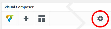
3) Click on that icon, put the CSS snippet to the CSS Settings in the Page Settings window.
Hi, thanks for the answers.
I meant the title of the portfolio item, not the ‘client’ etc. So the name i gave to this particular portfolio item/page. Can you help me with this?
Thanks
Never mind; i changed the color to he H2
.single-wyde_portfolio .post-title {
  font-size: 20px;
  color: #ff0505;
}
Great thanks
Got another question on the same portfolio page; I’d like to use the left side area (next to the textbox) to put other text in with links and styled differently than it is now. So this is the text that i enter in ‘Entry 1’ etc. Could I enter HTML somehow there?
Thanks again!
In our demo site, we’re using plain text in the Custom Description fields so they will be in the same format as the main content.
However, you can enter custom HTML into those fields if you’d like.
For example:<strong>Text 1</strong>:<span style="color: #ff5c57;">Text 2</span>
Awesome thanks! Could you provide me with some CSS to make that same text not slanted/italic? Would be great!
Also i’d like the ‘Project URL’ on the portfolio page to open a new window. Can i choose this somewhere..? Thanks again.
.portfolio-overlap .custom-fields-widget.widget {
font-style: normal;
}
2 – You will need to edit the portfolio template to make it open a new window/tab. Here’s a quick guide:
1) Install and activate the child theme “overlap-child-theme.zip” on your site.
2) Copy the template file from the Overlap theme “wp-content/themes/overlap/templates/portfolio/widget-meta.php”.
3) Paste it into your child theme “wp-content/themes/overlap-child-theme/templates/portfolio/widget-meta.php”.
4) Edit that template file in your child theme as below:
Replace:
<a href="<?php echo esc_url( $project_url );?>" title="<?php echo esc_attr__('Visit Site', 'overlap'); ?>" class="launch-project">
</a>
With:
<a href="<?php echo esc_url( $project_url );?>" title="<?php echo esc_attr__('Visit Site', 'overlap'); ?>" class="launch-project" target="_blank">
</a>
Hope this helps!
I’m layering 4 or 5 elements using columns and rows. Whenever I use the top overlap on the bottom elements, it overlaps up correctly but still keeps the blank space height from where the element originally started. This creates big spaces between sections. Any ideas?
That is what the browser works, if you move an element to the top, it still keeps the blank space height from where it originally started.
I would recommend using the top overlap for the columns and only when you have 2 columns or more in one row. If you have one column or use it for the row, you will have the big gap below it.
Hi guys I’m just tidying up a few things for my client on going live with my site. I’ve just noticed the phone number in my side bar is showing as hyperlinked in blue text (I had thought it was showing as white only text (no change on hover) ... but its been a while since I worked this site. Can you tell me how to remove this for desktop and have it clickable (as well as email) on mobile? Happy to provide login if you want to check my additional css? TIA
actually just ignore this (not sure how to delete the comment) – I think it may have been a caching issue..
Glad to hear that you’ve figured it out! No worries, you don’t need to delete the comment, just ignore it. However, if you’d like to delete it you will need to click on a flag icon (at the top right corner of the comment) to report it to the Envato’s staff.
