
1303 comments found.
Hi, I’d like my menu to be capitalised (rather than all caps)...what’s the css snippet for this or the place to set it? Cheers.
.vertical-menu > li > a,
.vertical-menu .back-to-parent span {
    text-transform: capitalize;
}
Hi support I have a question regarding shop thumbnails – under the Woocommerce, Products settings it has 3 options: 1:1, custom or uncropped, but I’m not seeing any chances to my thumbnails when selecting these options. Would you mind explaining them? Also, what is the size to upload an image (for both main image and thumbnail? TIA
Hi support
I’m wanting to style the buttons on just a single page, not throughout the site to capitalised. What is the css snippet please? I assume I put it in the extra css settings under the button element. Do I need to put it anywhere else? Regards
(I tried this css snippet but didn’t have much luck? text-transform: capitalize)
Thanks in advance.
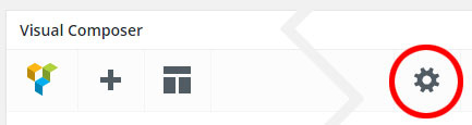
You should add CSS snippet to the Page Settings so it will affect only the elements on that page.
1. Click on a gear icon in the top right of the page builder toolbar, see the picture below:
.w-button {
    text-transform: capitalize;
}
Hope this helps!
Hi, thanks…I am wanting to style it more specifically ie only certain buttons on a page lol (otherwise the above would be great)..Is this possible at an individual button level? Sorry I wasn’t more clear in my original question…
Here’s a quick tip:
1. You will need to add custom CSS class to the CSS Settings as I provided above. For example:
.custom-button {
  text-transform: capitalize;
}
2. Put the class name custom-button into the Extra CSS Class field in the element settings window when you edit the button or any other content elements.
Hi is it possible to add additional images into the product page/post? I have three inserted (as a gallery and using columns shortcodes) but the last image sits lower (although fits alongside) than the other two. Not really sure how to achieve the look I’m after. Happy to send screenshot if needed.
I would recommend using the WPBakery Page Builder to build the product content so you can add an Image Gallery and other content elements like building the page.
If the page builder is not enabled on the product edit screen, you can enable it under WPBakery Page Builder -> Role Manager, choose “Custom” for the Post types, select “product” and save changes.
ok, that’s great. I’ve switched to this method. However, my row is set is ‘full width’ but isn’t showing as full width (is this a shop page template setting?)
Hi again, have switched it all over, the product looked ok on preview but now isn’t showing any of the information (inside the page builder), only the image… not showing the product short info either. Help please?
1. The fullwidth row is not available in the single post template including single product, it always displays as a boxed layout even you choose fullwidth for the row.
2. Looks like you’ve figured it out, everything seems to work well on your product page.
Hi, is there a zoom on hover option available for the main product image? Where do I set this? Regards
We’re sorry but the zoom option is not available in this theme, it doesn’t support.
Hi, regarding shop thumbnails (gallery)...If I want to set them to display within a 150×262 window (original image uploaded at 510×892), what’s the best way to do this? TIA
The size of shop thumbnails is defined by WooCommerce plugin. Unfortunately, it is set as squared thumbnails and always be 100×100px.
Hi,
I have three requests from my clients:
1) We need to modify “Overlap Slider” – need to eliminate bullets on the bottom (we have too many pictures) – need to scale down the big arrow: 1/3 thickness and 1/2 dimension
2) We would like to use “Uranus” arrows in Home page “Slider Revolution”, but we would like to have the possibility to change their color
3) We would like to keep the header fixed without the changing of dimension with mouse scrolling.
Thank you very much for your help.
Also, if possible, the header with an alpha effect…
4) We would like to use “Ares” bullets in Home page “Slider Revolution”, but we do not want the title appears on mouse over the bullet…
Again… thank you so much!
.w-slider-dots {
    display: none;
}

.w-slider-nav a:after {
   font-size: 75px;
}
2) It seems like the color option is not available for the Uranus arrows, only the Background Color is. Unfortunately, those settings are built-in settings from the Slider Revolution plugin, we couldn’t adjust this for you. However, if you’d like to change it, you will need to add CSS snippet below to Appearance -> Customize -> Additional CSS to achieve this:
.uranus.tparrows:before {
    color: red;
}
3) You can change only the height of the sticky header. Here’s CSS snippet to set the height of the sticky header to the same as the normal header:
#header.w-scrolled .container,
#header.w-fixed .container {
    height: 85px;
}
4) Try adding CSS snippet below to see if it works:
.ares .tp-bullet-title {
    display: none;
}
Hi, i’d like to add more padding between my product main image and the product details to the right (it seems a bit squished). Can I adjust this somehow? Regards
@media only screen and (min-width: 992px) {

.product .images {
    margin-right: 80px;
}

}
Great! Thanks ")
Hi, I’d like to hide my product title and the amount/price showing underneath. How is this achieved please? TIA
Try adding CSS snippet below to see if it works:
.products li figure figcaption {
  display: none;
}
Hmm, that didn’t seem to work?
.single-product .product_title,
.single-product .price {
    display: none;
}
That’s perfect! Thanks. Is there a way to also hide the breadcrumb: ‘Shop/Category/Product’... Cheers?
Here’s snippet to hide the breadcrumb on shop and product pages:
.woocommerce-breadcrumb {
    display: none;
}
cheers
Hi there, I’m using the personal portfolio layout (with the menu showing as in hamburger style at right). However, when I change my header to light (under theme settings), the hamburger shows as white (so, not visible) but then shows up in my theme colour on hover. I would prefer it displays as the theme colour (#e20000) OR white but inside a boxed background (in my theme colour #e20000). How can I achieve this? I also noticed that when changing to the ‘light’ header colour, the menu opens up against the theme coloured background (#e20000) when previously it was a dark background. I’d prefer the later…can I adjust this with css?? Thanks and regards
By default, when you choose “Light” for the Header Background under Theme Options -> Navigation, the menu color should be grey (#777), not white. It seems like you’ve also set the menu text color to “Light” then it is white. If the page has a light or white background, you should change the “Foreground Style” in the Overlap Options -> Header on the page edit screen to “Dark”.
Hi, I’m not sure where or how I would’ve changed the menu text colour? In any event, I’ve checked the settings and adjusted but it still doesn’t quite resolve my issue. Setting them as suggested is fine, until I open up the hamburger menu and the background is then shown in red (the set theme colour).. I’d like to keep the setting from the dark header background settings ONLY for when the hamburger menu is opened. Can I achieve this with CSS? Cheers
I’m wondering if another workaround to this would be to use the sliding bar as an option for the menu? Can the sliding bar icon be changed? Do you see any issues with doing this? Presumably the menu could be hidden on desktop and show on mobile and the reverse for the sliding bar?
OR (sorry for so many questions) can I perhaps customise the menu opening background colour and display size (to the size of the sidebar) with css?
body #fullscreen-nav.w-light:before,
body #live-search.w-light:before {
    background-color: #211F1E;
}

.w-light #full-nav .vertical-menu .back-to-parent:hover span, .w-light #full-nav .vertical-menu li:hover > a, .w-light #full-nav .vertical-menu .current-menu-ancestor > a, .w-light #full-nav .vertical-menu .current-menu-item > a, #fullscreen-nav.w-light .social-icons > li:hover a {
    color: #ff0000;
}

.fullscreen-nav.full-nav-active #header.w-light .full-nav-icon:hover > .menu-icon:before, .fullscreen-nav.full-nav-active #header.w-light .full-nav-icon:hover > .menu-icon:after {
    background: #ff0000;
}
2 – Here’s the snippet to change the sliding bar icon on desktop and hide the hamburger menu:
.full-nav-button {
    display: none;
}

@media only screen and (min-width: 1080px) {

    .menu-item-slidingbar .sliding-icon:before {
       content: "\e83c";
       font-size: 22px;
       }

    .fullscreen-nav #top-nav .top-menu {
            padding-right: 0;
    }

}
Hey thank you so much, that first snippet is great! I’ll stick with the menu in this format. Just a small (final) question, is it possible to reduce the size of the opened menu (ie not full screen, maybe quarter screen size, on the right hand side?)
#full-nav {
    font-size: 20px;
}
However, when using a fullscreen menu, it always displays as fullscreen, you couldn’t adjust this by CSS.
Hi, so I’m gonna try the second option then seeing as I can’t make the menu anything different to full screen. Can I change the background colour of the sliding bar then? Also, am I correct in assuming the sliding bar will hide on mobile and the menu will display (as it would normally) on mobile?
I’ve added the main navigation menu to the sliding bar, but its ‘lost’ the icon set in the menu for the shopping cart…any way to ensure that shows up?
1 – The background color of sliding bar depends on the header background you’re using. You can choose between “Dark” or “Light” under Theme Options -> Navigation -> Top Navigation -> Header Background.
2 – The menu widget is a built-in widget from WordPress that’s different from the primary navigation menu from the theme, it displays only menu items. The shopping cart icon is only available in the primary navigation menu (Top and Fullscreen menu).
Hi there, I’d like to clarify the second point. Is it possible to have the classic menu layout showing, (but hide some items on desktop) without those same items being hidden in the menu in the sliding bar?
Also, clarifying the first point, I’d like to set the header background to light, but specify the background colour of the sliding bar with css – the colour I’d like to make it is: #ff0000 with the menu showing in light (white) text… can this be achieved?
We’re sorry but you couldn’t adjust this under the theme options panel and this is not included in the theme design. You will need to modify template files in your child theme to achieve this.
However, the theme modification and customization are not included in the theme support, you will need to do it yourself and at your own risk.
ok, could i get around this then by setting a dark header in navigation, but on a page level setting header to transparent and then specifying the sliding bar colour? (now styled as hamburger menu)
#slidingbar {
    background: #ff0000;
    color: #fff;
}
Hi, i have duplicated a page and recreated a simliar page. I have inserted a rev slider in the new page but for some reason its showing with a thin white gap either side (even though the row is set to full width). The page settings are the same as the original page I duplicated from and the sliders on that page are showing fine. I’m a bit stumped as to what the issue could be? Can you take a minute to check this issue? Regards
You have to set the Padding Size in the column settings to No Padding to remove the gap from both sides of the column. To set this option, you have to edit the column, not the row.
HI, I’d like to specify font size and line height within a specific row (using text block and paragraph style)...what’s the best way to achieve this? Cheers,
The Text Block uses default WordPress text editor to edit the text and headings. Unfortunately, it doesn’t have font size and line height options. I would recommend using the Custom Heading instead. You can change the Element tag to “p” to add plain text and paragraph.
Hi, i have three images (equal size) which I want to display side by side (full width) with no spaces in between – what’s the best way to set this up in this theme? Row with 3 columns (no space between columns? – that option doesn’t seem to be available in the row settings?) or as a gallery? TIA Regards Carrie
I would recommend adding them to a row with 3 columns because when adding to the Image Gallery, it will show the full size in the lightbox when you click on each image.
To get rid of the space between columns, you have to set the Padding Size option for each column to No Padding. This option is in the column settings window when you edit the column.
perfect, thanks!
Hi, I’d like to specify the size of my H4 – that option doesn’t seem available in the theme settings. How do I achieve this please? Thanks
The size of headings is not available in the theme settings because they might have different sizes in different content elements and parts. I would recommend using the Custom Heading element so you can set the font size including other font styles for the headings.
However, if you’d like to change default font size for H4 in the Text Block and the blog post content, you will need to add CSS snippet below to achieve this:
h4 {

font-size: 26px;

}
thanks
Hi support, I seem to be having issues with revolution slider. It works when inserting the slider shortcode via a text element but not when using the Visual Composer Element and selecting the slider alias… I haven’t struck this problem before – do you know if there is a current issue or bug? I downloaded Overlap yesterday so am assuming the Slider Revolution plugin (Version 5.4.7.3) is the latest version. Your help would be appreciated. Thanks and regards, Carrie
my bad. have fixed this. error was my end…lol
Hi there, Just wanting to change the background colour of my contact 7 form text input fields (to #808080 with text colour of #e6e6e6)...how/where do I set this please? Cheers
Hi there,
You may need to add CSS snippet below to Appearance -> Customize -> Additional CSS to set this:
input,
textarea {
   background: #808080;
   color: #e6e6e6;
}
Hi, thanks for the reply. This solution works for me, but I do have a question about the form. It’s using the following code (and the theme seems to have set the input fields to have a white border around them):
[text* your-name placeholder “Name “]
[email your-email placeholder “Email “]
[tel your-tel placeholder “Phone”]
[text your-subject placeholder “Subject *“]
[textarea your-message 40×12 placeholder “Message”]
[recaptcha id:Contact-Us class:contact-us theme:light]
<input type=”submit” value=”Send Your Message” />
My question is: 1. If I wanted to remove the white border, what is the css snippet I’d require? 2. The form indents (left margin, by about 10px)) on my web page and then further indents the “send your message” box. If I want to ensure it’s all flush with the left margin of the visual composer row (and lines up vertically with text siting above), how do I achieve this? Happy to send URL if you need to sight the page. TIA
input,
textarea {
  border: none;
}
2 – I guess that the indents are from the column, not the form. By default, all columns have the gap in both sides, you will need to edit the column container of the contact form and change the Padding Size to No Padding to remove the indents. If this doesn’t work, you may need to send me your site URL so I can take a look.
Hi, thanks for your reply: 1. Perfect, thank you. 2. That didn’t seem to work…can I send the URL in a private message?
You can send a private message in the contact form on the page below:
https://themeforest.net/user/wyde#contactThank you for the login details!
You’re using a column CSS class in the contact form. You will need to edit the contact form HTML in the Form tab on the contact form edit screen to insert the CSS class called ‘no-padding’ to remove the indents from the column so it should be:<div class="row"> <div class="col col-6 no-padding"> ... </div> <div class="col col-6"> ... </div> </div> <div class="col col-12 no-padding clear text-center"> ... </div>
Thanks for the tip! Cheers – problem resolved
Just quickly revisiting the initial snippet… I have changed the background and colour values (the rest of the snippet remains the same) but the label text (ie “email”, “name” etc) doesn’t seem to change colour (the input text seems right) – am I missing something?
That is a placeholder text for the input field, you will need to add snippet below to change it:
::-webkit-input-placeholder {
    color: #fff;
}

::-moz-placeholder {
    color: #fff;
}

:-ms-input-placeholder {
    color: #fff;
}

input:-moz-placeholder {
    color: #fff;
}
Hi, I’m having trouble accessing the site’s live previews and demo content – has the overlap theme been made redundant??
Hi,
It’s now online and we can access the site’s live previews and can import demo content too. This might be an issue with our VPS or CDN, please try it again to see if it works.
Hi support team,
1 – Yes I’m talking about the Slider element https://wydethemes.com/overlap/elements/overlap-slider/The function you gave me is ok, but probably there was a misunderstanding… I’m talking about the fading effect at the bottom, the one that slightly covers the photos to allow you to insert some text: we do not have any text to insert and the photos have to look good, without the fading that lightens them …
you can see this link: https://test2.rivierestyle.it/collection/ and scroll down till the voices “Vassoi”, “Portacenere”, “tazzina”
My bad! I thought that the fade effect of the slider’s transition
@media only screen and (min-width: 992px) {

.w-slide:after {
  display: none;
}

}
Hi, I purchased your theme but I have two problems:
- My client would like to eliminate in “Slider Content Carousel” fade effect. I also bought full licence of “WPBakery Page Builder” but I cannot modify the element…
- My client does not like the theme you used id “Slider Revolution” and would like to change it with one that does not cut pictures but resize theme…
I did not buy the licence for Slider Revolution yet… can you help me?
Hi,
First of all, both WPBakery Page Builder and Slider Revolution are included in the theme package, you don’t need to purchase their licenses individually.
1 – If you’re talking about the Slider element here: https://wydethemes.com/overlap/elements/overlap-slider/
You can add custom function below to functions.php in your child theme to modify the slider options:
/**
 * Updates Overlap Slider options.
 */
function overlap_update_slider_params() {

    // Remove the existing Transition option.
    vc_remove_param( 'wyde_slider', 'transition' );

    // Add new Transition option (without Fade effect).
    vc_add_param( 'wyde_slider', array(
        'param_name'    => 'transition',
        'type'          => 'dropdown',
        'heading'       => esc_html__( 'Transition', 'overlap' ),
        'value'         => array(
            esc_html__( 'Slide', 'overlap' ) => '',
        ),
        'description'   => esc_html__( 'Select animation type.', 'overlap' ),
        'weight'        => 1000,
    ) );

}
add_action( 'vc_mapper_init_after', 'overlap_update_slider_params', 100 );
Also, you can find more details on how to add or remove content elements and settings for WPBakery Page Builder in the link below: https://kb.wpbakery.com/docs/inner-api/vc_remove_param/
However, if you’d like to edit any files in the theme or plugins, please do it in your child theme. If not, your changes will be lost when you update the theme and plugins.
2 – You can edit the slider to change the background settings, you may need to change the Background Fit from “Cover” to “Contain”, so it will resize the background images instead of cropping of them, you can find more on Background Settings here: https://www.themepunch.com/revslider-doc/main-background/#image-sourcesettings
Hope this helps!
Hello, just a few small issues needing help with sorting.
1. I have 3 pages but only 1 item displays on mobile menu. On computer menu displays properly with all 3 pages in navigation. How can I change this?
2. On 2 of my pages the navigation area has a white background, but on one page the top navigation is transparent making it hard to read the menu. I’m not sure why this page displays differently. I thought the navigation area would display the same across all pages the same once set. How can I change this?
3. On my home page I have a section with some writing and icons which looks nice on a computer. On mobile the icons display but the writing does not. It’s not disabled anywhere in that row and I can’t pin point why it displays on bigger screens properly but not on the mobile.
Thanks
Hello,
1. I have never seen this issue before and have no idea why it displays differently. Do you mind giving me your site URL so I can take a look?
2. You can enable and disable the Transparent Header in the Overlap Options at the bottom of the page edit screen.
3. You may need to check the responsive settings to make sure that section is enabled on mobile. Edit the column, container of those icons. In the Column Settings, select the Responsive Options tab and uncheck all boxes in “Hide on device” to show it on any screen sizes.
Hey,
1. my URL is www.junodesignstudio.com The Mobile menu is still not displaying all pages, so strange.
2.I fixed the header on the one page, thank you.
3. I did as you said but there are no boxes checked in the first place, I had already double checked that previous to writing you but I’m unable to figure out why it still does not display on mobile.
Thanks for your time
1. You’re choosing “Custom” for the mobile navigation text color but haven’t set the color yet so it is white by default. This makes the menu items are not visible on the white background. If you have a white background, you should set the Text Style to “Dark”, if you choose “Custom”, you will need to set the Text Color to black (#000000). You can set those settings in Theme Options -> Navigation -> Mobile Navigation.
3. There are responsive settings that hide the column on mobile and tablet. You will need to edit the column, container of the text “Creating a strong first…”, see the picture below:

I’m quite sure that column is set to hide on mobile and tablet. If you edit it but the checkboxes in the Responsive Options are not checked, it means that you just edited a wrong column, try editing other ones.
