
38437 comments found.
Hello. I just noticed a bug in the current version of this theme that causes the Nectar Slider heading, caption, and buttons all to disappear completely when viewed in landscape mode on older iPad mini devices. In portrait mode they all display as intended.
You can view/test this issue on your Classic One Page Demo: Link: http://themenectar.com/demo/salient-one-page/
Please let me know if there are any quick fixes, or if I should hold off for an update.
Also, the nectar slider texture overlay to background feature does not seem to display on any mobile devices.
The following CSS seems to fix this:
body .video-texture {display: block !important;}
Is there a reason the texture overlay doesn’t display by default on mobile?
Thank you.
Hey YVRtom,
Could you kindly let me know what version of Safari you’re seeing that occur on so that I can try to replicate it?
iOS Version 9.3.5 – Build 13G36 – Release date August 25, 2016
Thanks YVRtom, try to add this into the custom CSS box in the Salient options panel:
.swiper-slide .content {
  Visibility: visible!important;
}
Thank you, using this CSS has solved the issue.
Glad to hear YVRtom ")
Hello,
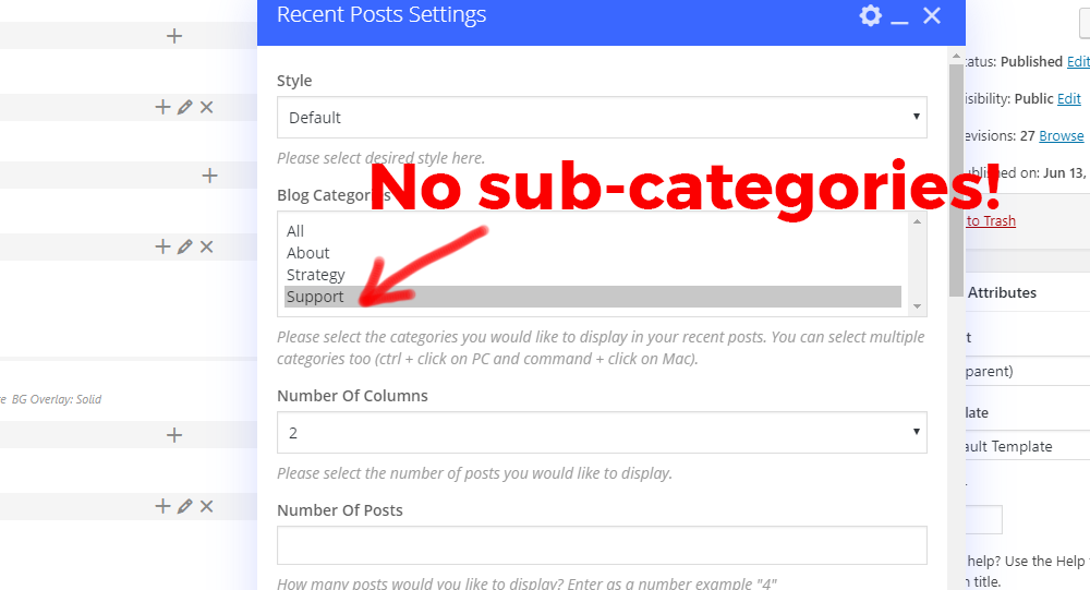
Why is RECENT POSTS widget, not showing up the sub-categories. Same for the Blog nectar widget.
Please see the screen-shot here: http://s3.amazonaws.com/new.ewfiles.com/06-13-19-Support.png
Hey earnware, I can’t seem to replicate that locally. Could you reach out in regards via the contact form on my author page so I can take a look at your setup? https://themeforest.net/user/themenectar
Thanks in advance
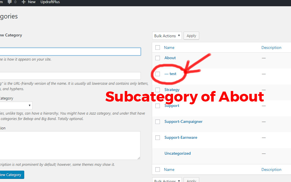
Hey, just make a sub-category, like this: http://s3.amazonaws.com/new.ewfiles.com/06-14-19-Support-2.jpg
and see if it will appear in Blog or Recent Posts. We just updated the theme also, still it doesn’t show-up the sub-categories.
Hey earnware, that is what I tested before getting back to you https://ibb.co/XF4vwn5 – do you have any posts assigned to the category? Since this has not been a known issue, could you kindly reach out in regards?
Thank you, will try that!
You’re welcome
I am using a Raw HTML Element to include a vimeo video using an iframe using the code:
<iframe title=”My Testimonial” src=”https://player.vimeo.com/video/123456” showinfo=”0”; width=”640” height=”360” frameborder=”0” allow=”autoplay; fullscreen” allowfullscreen></iframe>
However, it appears that the salient theme is removing the iframe ‘title’ field when compiling the page. I need to have the ‘title’ field in the code to be ADA compliant for accessibility. Is there a way to make this work correctly?
Thanks for the response. I figured out that the issue was the wp-accessibility plugin that was stripping those titles! It’s a setting in the plugin!
Thanks for letting me know jwebadgility. I’m glad you got it sorted
The “X” to close my mobile menu is right on top of one of my dropdown arrows for a menu item. How do I move the menu items down to have spacing between those two elements?
Hey MikeMurphyINC, add this into the custom css box located in the Salient options panel > general settings > css/script related tab:
#slide-out-widget-area .menuwrapper .menu.menuopen {
    padding-top: 30px;
}
Cheers
I tried this but it didn’t work. Any other ideas? The site is https://www.PrepSOS.com
Hey, change the snippet to the following:
body #slide-out-widget-area .inner >div:first-of-type {
    margin-top: 35px;
}
that worked perfectly! thank you
Glad to hear MikeMurphyINC
Hello! Please make it so that we can choose the height of the header for each entry separately. For example, one record with variable height and meta, and the other full-screen. Thanks!)
Hey AndyRaxxy, I’ve noted the idea for the wishlist
Hey Transparency-One,
the text “No menu assigned” is no longer shown in the Salient theme. It looks like you have a child theme active – do you have custom header.php file in it? If so, it would need to be updated to reflect the current version. Alternatively if you remove that template file or deactviate your child theme, it should fix the issues.
Is it possible to create an element which just shows one portfolio item?
We’d like to create a more manual portfolio area where we pick which specific items are displayed, from a large portfolio.
Thanks
Hey ravenswoodmedia, that would require a custom query unless you could separate the single project into its own category
Hi ThemeNectar,
I am trying to have 2 (Motion + Instagram) of my items in the nav menu open in a new window, however I am unable to find the option to do so.
Previous I know you could choose that option when adding a custom link to the menu but that option doesn’t seem to appear as one of the Salient options.
Site in question: https://neileverosborne.com
If you could look into why this is happening and/or how to fix it I would greatly appreciate it.
Best, Alan
Hey Alan,
Can you confirm that you have the “Link target” enabled in your screen options? https://ibb.co/fqKSBDC
Cheers
That did the trick. Many thanks for your help.
You’re welcome designreborne
It would be great if there were more features for the nectar slider. Positioning of content, text etc. If the slides were built in the same manner a page is using the WP bakery page builder that would be fantastic. As the current nectar slider is quite limited. Thanks
Hey MarcGarner, thanks for the request. It’s possible that eventually we’ll try and integrate a page builder for it, but for now I would recommend using a slider such as slider revolution if you need that kind of control. Salient already offers compatibility with that plugin
Cheers
Hi, is there a way to have my highlighted images from my blog posts to all have the same size? See this url: https://leiderschapvrouwelijkeartsen.nl/inspiratie/ All blog images are different sizes but I tought it would compromize into the frame?
Hey Abbenhues,
If you upload each image at the minimum size which the element is trying to crop at (600×400) then they all will end up the same aspect ratio. e.g. anything over 600×400 would work.
Cheers
It would be good to be able to change the woocommerce quantity -/+ button sizes in the cart, they are much too large for me. Couldn’t find out to do this with CSS.
Hey hill_matthew,
add this into the custom css box located in the Salient options panel > general settings > css/script related tab:
.woocommerce .cart .quantity input.plus, .woocommerce .cart .quantity input.minus {
    transform: scale(0.7);
}
Cheers
Thank you very much. For anybody else finding this helpful, I also added to my CSS this to change the size of the text between the buttons which was also a bit large following the change:
.woocommerce .cart .quantity .text { transform: scale(0.7); }
Hey hill_matthew,
Thanks for sharing that
Cheers
Hi,
Testimonial Slider Multiple Minimal doesn’t resize itself when the browser window is resized. This can lead to overlapping elements: https://imgur.com/f4iwbpg
Hey ctekk,
since that’s not a known issue with the element, could you kindly share your URL in regards so I can take a look?
Thanks in advance
There has been a bug in the Salient Visual Composer for awhile now. I was hoping this would have been fixed in this latest version, but it still exists. Trying to set a width for Desktop doesn’t work because the Salient Style selectors have priority over the Visual Composer selectors.
The problem is that the salient selectors use the class .full-width-content and the Salient Visual Composer doesn’t.
Example from the style.css file in the Salient theme:
.full-width-content.vc_row-fluid .vc_col-sm-6 { width: 50%; }
Example from the js_composer.min.css file in the Salient Visual Composer plugin:
body .vc_row-fluid .vc_col-lg-4 { width: 31.914893614%; }
Here is a page that shows an example of the fix. I have manually added the fixed code into the custom css section of the salient theme. you can can disable my custom fix to see how the theme acts naturally. The layout is supposed to go 3 column, 2 column, 1 column, but without my fix, it goes 2 column, 2 column, 1 column.
https://dev.myvictory.ca/events/Hey cmstew,
we will be reworking the Salient grid system as a whole to use flexbox, which will fix this problem. However, unfortunately that had to get pushed back so that we could meet the Envato deadlines as discussed in this article: http://themenectar.com/docs/salient/important-salient-update-for-new-envato-requirements/ It’s now on the schedule again and should be available this summer.
Cheers
That’s awesome. Thank you for the update!
You’re welcome cmstew
Hello! im trying to use position:sticky, or even the fixed sidebar plugin, but it doesnt work when using fullscreen rows  any ideas how can i enable it? Thanks!!!
??
Hey paulinavargasin, the page full screen rows can’t allow for a sticky element due to the custom scrollbar and absolute positioning of each section. When using that option, the rows basically become a vertical slider, the page is never actually scrolled when moving between sections. You can take advantage of the row option for “Full height row” when disable the global page full screen row option. Setting each row in the page to use that would be similar and allow for fixed positioning, however you would loose the dot navigation and scroll effects.
I would like to have a search icon in my mobile header with the sticky nav. I would like for the icon to look like it does on desktop next to my woocommerce cart icon. How do I do this? I read previous comments and it sounds like a fix was coming.
Hey MikeMurphyINC,
This has been available as the default functionality when using the “Material” theme skin in the Salient options panel > general settings tab. As of 10.5, this is now how all of the theme skins respond on mobile as well.
Cheers
Thank you. I updated the theme and it’s working great!
Glad to hear MikeMurphyINC
Hi ThemeNectar,
I am using a ‘Recent Posts’ template with a grid of images linking to articles. I like the hover effect the recent posts section offers. However I am finding that Posts pages themselves don’t offer enough editing possibilities as a normal Page, so I’d like to setup my articles as Pages instead of Posts. Is there a way to keep the ‘Recent Posts’ section with the same hover effect, but make it so that when you click on one of them it goes to a Page instead of a Post?
Thanks in advance.
Hey marklovin,
there’s no way to override the URL of posts within the blog to go to pages easily without redirects. However, you could use CSS to hide the blog related items (e.g. the post header and comments) if you want to use posts to function the same as pages
Hi there,
I want to use the ‘centered menu’ from salient options, but with only 4 pages on the homepage its actually not centered. I Tried some CSS but can’t find any good solution. Do you have an option/answer?
I uploaded logo icons again and everything looks fine now…strange, but fixed!
Hey ponchovogel, glad to hear you got it working
Any plans for future templates
Hey danzara, yes
We’ve just been focusing on v10.5 to ensure the easiest transition for our userbase. Soon, we will get back to the regular schedule which will include new designs and features.
Cheers
Ok 2 questions: 1. Why is the arrow not working on the mobile menu for sub-menu items? 2. Let’s say header color = black and menu items font = white. When scrolling with sticky header, the sticky header background = white, how to change menu items to black?
And how to change the sticky menu animated underline color on desktop?
Hey picoyellow,
1. Please share your URL so I can take a look at your settings to assist
2+3. In the Salient options panel > header navigation > logo & general styling tab, you can set your “Header Color Scheme” to “Custom” as use any colors you would like.
2. There is no scheme for animated underline for sticky header (so when you scroll down)
2. There is no scheme for animated underline for sticky header (so when you scroll down)
Thanks picoyellow,
1. I confirmed the issue was related to the HTML5 canvas particle header. The fix for it was included in 10.5.3, which came out earlier today.
2. It looks like you have the color set to white, please reach out via the contact form on my author page with a temporary admin account so I can take a look if you’re not seeing that https://themeforest.net/user/themenectar
Cheers
When you add a 3rd level to the menu. In mobile view the parent menu item becomes unclickable.
Eg Menu Item -> Sub Item -> sub-sub item
this results in disabling the Sub Item
Hey sam_lee1985,
I can’t replicate this behavior locally, could you share your URL so I can take a look? Also, do you have the option for “Off Canvas Menu Dropdown Behavior” set to “Separate Dropdown Parent Link From Dropdown Toggle” in the Salient options > header navigation > off canvas menu tab?
On the Nav: Expertise -> Talent Management -> Open Programmes
Works fine on desktop but on mobile “talent management” is un-clickable
Your fix above worked, thanks
Hey sam_lee1985, glad to hear
