
38184 comments found.
Hi ThemeNectar
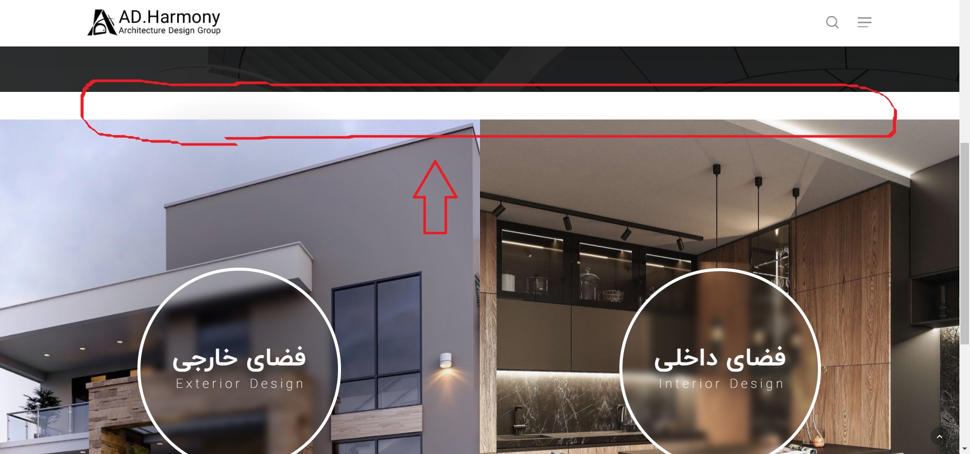
When I activate the “parallax background image scroll” for a column, a blank area appears at the top of that section, But when I disable that parallax effect everything works fine and there are no problems
Where did I go wrong or what is the problem?
https://s4.uupload.ir/files/untitled_oqag.jpg
https://bit.ly/3zI6oCh
Hey Jabbarpour,
That looks like a conflict between the “Reveal Rotate” Column Background Image Animation + the Parallax background scroll options. You can either disable the reveal rotate option in favor of a different one or add in the following CSS: https://pastebin.com/nD3NSzSuHi, tried to translate /portfolio > ‘sort portfolio’ and ‘all’. Checked all .mo files with ‘sort portfolio’ and translated. I think the correct .mo can be found in plugins > salient-portfolio, right? Anyway, WP is set to Dutch and no way I can translate this items. Cleared cache, throwed my laptop out of the window, but still no translation visible.. Not want to install a plugin again for some small words. Do I miss something here?
Hey Mikel2020,
When manually adding .po/.mo files to the plugin, you’ll need to ensure that they’re named as
salient-portfolio-nl_NL.mo
salient-portfolio-nl_NL.po
Cheers
Thank you ")
You’re welcome, Mikel2020
Hi ThemeNectar How can we edit responsive.cc and rtl.css in child theme? Thanks
Hey Jabbarpour,
Here’s the code to add to your child functions.php to enqueue a custom responsive.css/rtls.css file: https://pastebin.com/vrEP5huQ
Kind regards,
Thank you so much
You’re welcome Jabbarpour
Hi Themenectar! Im creating a tabbed section and at some point when I preview the page, im seeing a very weird tab that I did not create myself…”permanent link to…” see here: http://www.bcnuej.org/resources-new/ Why is this happening and how can I get rid of it? Thank u!
Hey anagcan! I’ll need to actually see the page within the admin to see what’s going on.
Please reach out via the contact form on my author page with temporary admin access so that I can take a closer look.
Thanks in advance
i fixed it!
Glad to hear anagcan
Hello, Please provide a method to eliminate unused js and css because even with a blank page and some text on it google page speed says that there is a lot. Atm all the pages are barely on 50% on mobile and this is terrible for a theme with so much sales and reviews. The other developers started to act for this Google Page Speed madness what are you status? Are you planning to rebuild the Salient core ? Thanks.. Ps I saw the changelog but simply this is not enough … please test your website on google page speed. We are using litespeed to achieve better performance. Moreover we need more customization to mobile devices, for ex different headers for pc, tablet phone…You can set same background to desktop and mobile google always the the render blocking time is huge. Thanks and waiting for a detailed answer.
Hey nvr21,
As I mentioned in your previous comment, we’re still actively working on methods to make it easier to get a high mobile score with less effort and will be incorporating those changes this year.
However, even in the current live version it’s definitely possible to score well above a 50 for mobile. Please open a ticket in regards with your actual site URL so that we can take a look at your specific setup:https://themenectar.ticksy.com/
Kind regards,
Hey!
We ran a “Multivariate Split Testing” for a client when assessing their User Experience to tune it better. We got around a hundred responses, and one of the most commonly sighted issue from the Testing Results was “Bad Scrolling Experience when Fullscreen Rows had been activated”.
We saw how first time visitors interacted with the site as a part of our study as the client had requested for a report. First time users almost always had a messy experience with the scrolling of Fullscreen Rows. They would want to scroll down, and it just wouldn’t react in the way they’d have wanted. The same was when the users wanted to scroll back up, it would take too much effort as the users would have to scroll once, wait for the animation (fast) to get done, then give the next scroll input, wait again, then give again etc. If they gave say two scroll inputs at the same time, only one Row would slide. Even though we had Row Anchors activated, from our study only 3% of First time users actually used it.
Second time users were more likely to get used to scrolling in Fullscreen Rows, by using less “wasted scrolls/swipes”, but in their final feedback, around 63% still wrote comments about issues they faced with Fullscreen Rows.
We thought of not using Fullscreen Rows, but the client wants it.
Since our Test had almost 100 user feedback, I do think it is a major issue when it comes to User Experience.
Some users (22% of users) also suggested placing arrows on the page to help users navigate up or down, and another common suggestion (17% of users) was to have a back-to-top arrow appear on the Final Row. Another suggestion (15%) was to have the Arrows above and below the Row Anchors, and to somehow make the Anchors more visible as most of the First time users had missed it completely.
Here are some other implementations that you guys could refer to: 1) https://alvarotrigo.com/fullPage/examples/continuous.html 2) https://www.cssscript.com/lightweight-full-page-scroll-pure-javascript-fullpage-js/ 3) https://www.jqueryscript.net/layout/jQuery-Plugin-For-Fullscreen-One-Page-Scrolling-Websites-fullPage-js.html 4) https://webdevtrick.com/javascript-full-page-scrolling/ 5) https://alvarotrigo.com/fullPage/#page2 6) https://alvarotrigo.com/fullPage/examples/apple.html
We did not run any tests on the above implementations, we only ran the test on Salient’s implementation.
Alvarotrigo’s “fullPage.js” seems to deal with scrolls much better.
We have gotten a lot more insights from this study, and we will share them as we properly document them by extracting the user data.
We hope you guys make the most of our study in further improving Salient!
Thanks!
Hey alberteck,
Thanks for sharing – please post results such as this in the support forum so that they can be properly indexed. This comment area is intended for quick
questions or pre-sale inquiries
Kind regards,
Hi, is it possible to change the sequence of the social icons in my header and the text ‘Frequently Asked Questions’? I would like the text to appear first and the social icons on the right. Thanks in advance.
Hey Abbenhues,
You can use the following snippet for that:
#header-outer #top .span_9 nav {
    flex-direction: row-reverse;
}
#top nav .no-menu-assigned {
    display: none!important;
}
Hi there, I’m having an issue with my menu. See this url: https://yinner.kleidi.nl/. When I click on the hamburger icon and I click on the item ‘IK WIL GROEIEN’ it goes to another submenu with the same items. I would like to just navigate to that page directly. Is this a setting or? Thanks in advance!
Hey Abbenhues,
You would need to change your off canvas menu style to be the slide out from right rather than the fullscreen variant. When using the default slide out from right, there will be an option to select the “Off Canvas Menu Dropdown Behavior”
Please use the support forum when you have multiple questions so that they can get properly indexed – this comment area is intended for quick questions or pre-sale inquiries
Hi there, On desktop I have an image (login icon) as menu item (https://debetekenaar.nl/) but that’s not showing on mobile. How to fix that?
Hey Abbenhues,
In the Salient options > header navigation > off canvas menu tab, select “Display all icons” for the “Off Canvas Menu Item Icons” field.
Cheers
Hi, I would like to add the possibility of inserting more than one gradient from the theme options, which file should I edit to make this addition? And then I would like to know how to extend this modification to all the buttons in the theme and insert it in the child theme.
Hey danieleliotta,
There are two gradient color slots by default in the theme options by default, not one. Are you not seeing that from your side? https://ibb.co/LkbnSjt Unfortunately there’s no easy way in the current state of Salient to programmatically add more via a child theme. It would require edits to various files:
salient/css/colors.php salient/nectar/redux-framework/options-config.php
and then the colors would need to be added as options to the elements themselves in the salient-core plugin.
It would a lot easier to simply use CSS as needed to override the gradient coloring by giving the element/row a unique class name to target it.
Hello. How well will this theme play with social network/community/forum plugins? Would you have any examples or demos of those?
Hey amgchase, we don’t have any demos of Salient being utilized with a plugin like that. In general, we haven’t added any additional integration with one of those plugins, however they should function in their default state.
Kind regards,
Is there a way to 1) have the nav logo sticky and completely flush to the top of the site and 2) have a sticky floating menu button like on this wix site?: https://grocecody.wixsite.com/mysite
Hey cgroce93,
1. You can remove the header padding in the Salient options panel > header navigation > logo & general styling tab by entering 00 for the “Header Padding”.
2. You can have the off canvas navigation display in a similar fashion by enabling the ” Use Transparent Header When Applicable” + “Header Permanent Transparent” option in the Salient options > header navigation > transparent header effect tab. With those two items active, you can then enable the “Force Transparency On Navigation” when editing any page: https://ibb.co/NVPP06V
A background color for the off canvas navigation button link can also be set in the bottom of the Salient options > header navigation > off canvas menu tab.
Kind regards,
Is there any custom CSS to make the background behind the off canvas nav button larger?
Hey cgroce93, can you share your site URL so that I can take a look at your settings to assist?
Unfortunately, I can’t because it’s using Local by Flywheel. I’d also like the off screen nav button be sticky but not the logo/rest of the header.
Hey cgroce93,
1. Add this into the custom CSS box in the Salient options panel > general settings > css/script related tab:
body #header-outer #top .slide-out-widget-area-toggle[data-custom-color] a:before {
    height: 60px;
    padding-bottom: 0;
    width: 60px;
    left: -7px;
}
it may need to be adjusted based on your current settings.
2. Unfortunately there’s no option built-in for to separate a section of header to be sticky while leaving the rest of the header non-sticky.
Hi guys, I’m using woocomerce and I have a problem. “Bottom Thumbnails Slider” has stopped working correctly. When the customer clicks on the image in the thumbnail area, he doesn’t select the image, it only has a drag function, but it’s not clickable. Any suggestion?
By the way, i’m using the latest version of woocomerce (version 5.4.1). But I didn’t notice if it was after this update that the problem started.
Hey leandroota,
Can you please share your URL in regards so that I can take a look to assist?
Kind regards,
Hi, thanks for the reply. The website URL is https://rivacycles.com/product/bike-fixa-riva-basement.
Kind regards,
Thanks leandroota, It looks like the following custom CSS is causing that issue:
.single-product .images .flickity-slider .slide {
   pointer-events: none;
}
Can you check your Salient options panel > general settings > css/script related tab to
see if you’ve added that in there?
Thanks, it’s works!
Glad I could help leandroota
Hi there, Is it possible to change the background position for mobile only? For dekstop I would like center center but for mobile i would like the image to start at the top (so top center f.e.). Hope this is possible! Thanks in advance. See this url: yinner.kleidi.nl
Hey again Abbenhues,
When using the row parallax background effect, you won’t be able to see the difference on mobile from changing the background-position. The image is scaled up using javascript to be able to cover the amount of space needed for the parallax scrolling effect. If your goal is to show more of the images on mobile, change the parallax background image speed from “medium” to “regular” or “subtle”.
Kind regards,
Thanks! Would it be possible to zoom in this first image on mobile behind the slider (https://yinner.kleidi.nl/ik-zoek-mensen/) ? There is no parallax setting in this row. Thanks in advance!
Increasing/decreasing that will change how much the image ultimately gets zoomed in.
Hi there, On this page: https://yinner.kleidi.nl/ I have a background video. On mobile this video is really ‘zoomed in’ so the faces of the video are really big and just lined out in the screen. Is there a way to zoom the video out a little bit more but keep the full screen? The video should be big enough in width and height (see desktop). Thanks in advance!
Hey Abbenhues,
Since your row is set to fullscreen, the video is scaled accordingly to the size needed in order to fill the height of the screen. Since the aspect the ratio of a video (16:9) is quite different than a portrait-oriented smartphone, your video will crop quite a bit. The only way to start zooming out the video would be to disable/reduce the full height option for mobile:
@media only screen and (max-width: 1000px) {
.wpb_row.vc_row-o-full-height,
.vc_row.vc_row-o-columns-bottom.vc_row-o-full-height > .span_12 {
  min-height: 75vh!important;
}
}
Well, that’s a great fix! Thanks again!
You’re welcome Abbenhues
My support is running out, so the only way is to post here. Is it possible to customize/edit single post template in the WPBackery? I tried to edit the default blog page, but there is no option to do so.
Hey piseth,
Unfortunately, you can’t edit the core template using the page builder – It’s only available to handle the content within each post. Modifications to the template would require copying the salient/single.php file into a child theme
Kind regards,
Hi, on Google Pagespeed insights I get the following issue regarding preload key requests. Is there a way of overriding or removing this request? As I don’t believe I am using these on my website (fontawesome webfont files) -
Consider using `<link rel=preload>` to prioritize fetching resources that are currently requested later in page load. Learn more.FCPLCP URL Potential Savings …fonts/fontawesome-webfont.woff?v=4.2(mychefskills.com) 5,760 ms …fonts/icomoon.woff?v=1.1(mychefskills.com) 5,130 ms
Thanks,
Rory
Hey Rory,
You can remove font awesome form your setup by adding the following snippet to your child theme functions.php file:
add_action( 'wp_enqueue_scripts', 'salient_child_dequeue', 100);
function salient_child_dequeue() {
wp_dequeue_style( 'font-awesome' );
}
Kind regards,
site is completely broken suddenly. Warning: Creating default object from empty value in /home/customer/www/website/public_html/wp-content/themes/salient/nectar/redux-framework/ReduxCore/inc/class.redux_filesystem.php
Hey bastinald,
That error would come about if you’ve updated your version of PHP to 7.4 and have not updated to the latest version of Salient yet (v13+). It’s likely that your hosting company updated PHP for you if you didn’t do it. You can read about updating Salient here: http://themenectar.com/docs/salient/updating-salient/
Kind regards
Hi there, I got some trouble again with the tag and (blog) category pages. The style is having some issues. Only 1 small column on the left and lots of empty spaces on the right. Next column also start below instead of next to the other. Checked all custom css but nothing there. Any idea?
Hey Mikel2020,
I’d be glad to take a look to assist if you can share your page URL.
Kind regards,
For ex. https://imediastars.nl/tag/webdesign/ is showing well on mobile but on laptop/desktop it is showing a small column with lots of spaces on the right. Also title is showing 2 x.
Hey Mikel2020,
Have you also tried to disable your child theme and activate the parent theme to ensure it’s unrelated? If so, since that’s not a known issue, please reach out via the contact form on my author page with temporary admin access so that I can take a closer look.
You are right. Something with a child theme file. Thanks for helping me out.
Glad I could help, Mikel2020
Hi, would it be possible to have my hamburger (and menu) on the left side in stead of the right side on desktop? See this website: https://uxcode.nl/ . On mobile it’s on the left and I would like that on desktop as well.
Hey Abbenhues,
The only way to allow that on desktop would be to set your “Header Mobile Breakpoint” in the Salient options > header navigation > mobile header tab to a large number e.g. 5000
Cheers
