
38369 comments found.
Hi there,
Is there a way to disable the gallery lightbox from being triggered on the Image Gallery/ Paralax Image Grid element?
Hey Romanesco,
You can prevent that by adding the following snippet into the custom CSS box located in the Salient options panel > General Settings > CSS/Script related tab:
.wpb_gallery_slidesimage_grid a {
    pointer-events: none;
}
Cheers
Thanks! But sadly, that didn’t work on my end.
Can you kindly share the page URL where it’s not taking effect for you?
Kind regards
Hey guys, I have to bug you just one more time and I believe I this should be done with the list of tweaks I’ve been working on. If someone could assist, you are a hero and should be awarded with a large pizza.
1. Rounded Gallery Corners (simple) 2. Tighter Post Grid Title/Excerpt and Thumbnail Padding (sample provided) 3. Excerpt Font Color Change (simple)
As always, thanks guys.
Page here: https://bit.ly/3kmya3OHey arteest ")
.portfolio-items .col.span_3 .inner-wrap {
   border-radius: 10px;
   overflow: hidden;
}

.category-position-after-title .meta-category a {
  margin-top: 0;
}
.category-position-after-title .meta-category {
    line-height: 1;
}
#ajax-content-wrap .nectar-post-grid-wrap .nectar-post-grid .nectar-post-grid-item .content {
    padding: 15px 0;
}

.nectar-post-grid[data-card="yes"] .nectar-post-grid-item .content .meta-excerpt {
   color: red;
}
Kind regards
Beautiful! Thank you.
You’re welcome, arteest
Hello, does anyone know what is the “Main Wrapper Class of Theme” for this theme? Im using another plugin (RMA by WP Swings) that requires this if “some design issues arises”, which they did
Hey bogdan_stanciu,
You can use.container-wrap
Kind regards
Thank you Mr. ThemeNectar
You’re welcome, bogdan_stanciu
In the portfolio settings, there’s a section called ‘Video settings’. When I add a YouTube link here I can’t see the video anywhere. What exactly is this section for and how do I use it?
Hey MonologueHQ,
Your project will open that video when clicked if you:- Have the portfolio element set to “Lightbox Only” https://ibb.co/4PqnK3N or
- Have set the project to be a “Lightbox only grid item” in the Project Configuration metabox https://ibb.co/Hp6TJz2
Kind regards
Hey guys. Quick blog question for ya. Is there an option/toggle for a blog post to display Site Width? When I post a page, there’s lots of padding on left and right. How do I remove this?
https://bit.ly/3kGTvoUHey arteest,
You can make single post expand to the edges of your container by add the following snippet into the custom CSS box located in the Salient options panel > General Settings > CSS/Script related tab:
.single-post #ajax-content-wrap .container-wrap.no-sidebar .post-area {
    max-width: 100%;
}
Cheers
Hello, I accidentally installed the latest theme but I realized, that the old WPbakery plgin is still installed. The new theme has the Salient Core and Salient WPBakery. This cause that the WPBakery elements are distorted and the webpage looks bad. I would like to delete the new theme and install the old one. Where can I download the older versions of Salient? The one with the standard WPBakery? Thanks
Hey attesosk,
Salient has always included a Tailor version of WPBakery called Salient WPbakery—we’ve never used or included the raw WPBakery plugin with the theme. If you’d like to access any previous version, simply reach out in regards via the support forum or by using the contact form on my author page: https://themeforest.net/user/themenectar
Kind regards
<wpml-config>
  <shortcodes>
    <shortcode>
      <tag>nectar_btn</tag>
      <attributes>
        <attribute>text</attribute>
        <attribute>url</attribute>
      </attributes>
    </shortcode>
    <shortcode>
      <tag>nectar_icon</tag>
      <attributes>
        <attribute>url</attribute>
      </attributes>
    </shortcode>
    <shortcode>
      <tag>vc_column</tag>
      <attributes>
        <attribute>column_link</attribute>
      </attributes>
    </shortcode>
    <shortcode>
      <tag>vc_column_inner</tag>
      <attributes>
        <attribute>column_link</attribute>
      </attributes>
    </shortcode>
    <shortcode>
      <tag>nectar_global_section</tag>
      <attributes>
        <attribute>id</attribute>
      </attributes>
      </shortcode>
  </shortcodes>
</wpml-config>
Hey dimecris,
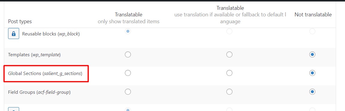
The WPML cache will need to be cleared after altering the wpml-config.php file. However, I would recommend translating the Global Sections within the each global section. If you’re not seeing the option to translate, ensure that you’ve set the post type to be translatable via WPML: https://cdn.wpml.org/wp-content/uploads/2021/12/10252495-Global_sections.jpg
Kind regards
yes i’ve translate the global sections like other post but the problem is that if I use the global section shorcode in a page there is no way to show the correct language.
That is why I have tried to translate the ID, although ideally the page in each language should use the corresponding ID. But it always takes the ID of the original language.
Besides, the shortcode of the visual composer shows me all the languages, that is to say, it gives me the option to put the translation I want on the page, independently of the language.
Hey dimecris, are you able to see the id parameter in the translation editor after clearing the WPML cache now?
No, only in string translation. But there is no way to sync automatically when used as a shortcode within a page with visual composer?
Hey dimecris,
We already apply the WPML wpml_object_id filter for the global section ID—can you kindly also open a ticket with WPML in regards and let us know the ticket ID so that we can follow up with them?
Kind regards
Thanks dimecris! I will follow up with them as well.
Hi we have been asked by my client to look into taking over the hosting of their site.
we have taken a backup and tested it on our local servers to make sure it works with php80 before we move it. But, it comes up with the below error in duplicator pro.
SCRIPT FILE TEST: /wp-login.php
EXCEPTION Attempt to modify property “admin_notices” on null
FILE: /wp-content/themes/proudgroup/nectar/redux-framework/ReduxCore/inc/class.redux_filesystem.php29
—TRACE --
CLASS___: Redux_Filesystem->__construct FILE: /wp-content/themes/proudgroup/nectar/redux-framework/ReduxCore/inc/class.redux_filesystem.php47
CLASS___: Redux_Filesystem::get_instanceFILE: /wp-content/themes/proudgroup/nectar/redux-framework/ReduxCore/inc/class.redux_filesystem.php285
FUNCTION: require_once FILE: /wp-content/themes/proudgroup/nectar/redux-framework/ReduxCore/framework.php59
FUNCTION: require_once FILE: /wp-content/themes/proudgroup/functions.php1501
FUNCTION: include FILE: /wp-settings.php585
FUNCTION: require_once FILE: /wp-config.php97
FUNCTION: require_once FILE: /wp-load.php50
FUNCTION: require FILE: /wp-login.php12
FUNCTION: require_once FILE: /wp-content/wp_test_script_f776a11-24132253.php117
The theme is Salient 7.0.8. on looking at the updates it says it is up to date but on looking at your site it seems like it should be v15.0.8.
Can you shed any light on what we would need to do, it also looks like the developer used a child theme too. Thanks
Hey Luminet,
Yes—the version you’re using (7.0.8) is many years outdated and the current release is indeed 15.0.8: https://themenectar.com/changelogs/salient.html
You’ll need to update using one of the available methods listed here: https://themenectar.com/docs/salient/updating-salient/
It’s also worth reading through this article since you’re coming from such an old version.
Kind regards
Hey, is there a way to make a round button, solid color with a different color on hover? Does this have to be done through css? Thanks
Hey streetjen,
Yes, you can use the “Call to action” page builder element set to “Basic” for the style—there’s color pickers for the hover/standard states.
Ensure that in the Salient options panel > general setting you also have selected “Rounded” for the Button Styling option
Kind regards
I updated to PHP 8.0 and now when I click “Add Element” in the visual composer I’m getting this message at the top of the window…
Warning: Undefined array key “description” in /wp-content/plugins/js_composer_salient/include/autoload/class-vc-settings-presets.php on line 395
Using wordpress 6.1.1, Salient 15.0.8, and Salient VC 6.9.1.
I’ve tried disabling all but Salient plugins, and turned off my child theme. Doesn’t break the theme, just kind of annoying.
Hey veggie_89, That’s a core issue with WPbakery that should only show when you’ve saved custom elements: https://ibb.co/2WybXvb and also have debug mode enabled with WP.
I’ve noted to correct it in the Salient version of WPBakery.
Kind regards
Hey thanks for the reply. I tried disabling debug mode explicitly in my wp-config file but the message still shows up. Looking forward to it being patched in a future update.
Hey veggie_89, if you’d like a quick patch feel free to reach out via the contact form on my author page in regards.
Cheers
Hi, is it possible to change the texture overlay color in the nectar slider?
Hey yannickpeeters,
You can invert the grid to be white instead of black by adding the following snippet into the custom CSS box located in the Salient options panel > General Settings > CSS/Script related tab:
.swiper-slide .active_texture {
    filter: invert(1);
}
Kind regards
Hi , thank you but not a color?
Hey guys, I was wondering if I could get a CSS assist? I would like to assign a dropshadow to a row element.
Next, I would like to position some text at the bottom of its column. Where you see “A Test”, I would like that to be the target. I created a sample for a reference if needed.
As always, thanks guys.
Page here: https://bit.ly/3kmya3OHey arteest
Add the following snippet into the custom CSS box located in the Salient options panel > General Settings > CSS/Script related tab:
#row-shadow .row_col_wrap_12 {
  box-shadow: 0 4px 25px rgb(0 0 0 / 30%)
}

#row-shadow .wpb_wrapper {
   height: 100%;
   display: flex;
   flex-direction: column;
}
#row-shadow .wpb_wrapper h3 {
   margin-top: auto;
}
Cheers
Yeeeeeeahhhh! Thank you.
You’re welcome, arteest
CSS Issue:
When you have an inner row placed inside a column that is a link itself set with in the column settings the z-index is preventing the .column-link element from being clickable.
.wpb_row>.span_12 {z-index: 10;}
is overriding z index for
.column-link {
   position: absolute;
   top: 0;
   left: 0;
   width: 100%;
   height: 100%;
   display: block;
   z-index: 10;
}
Hey FightTheNewDrug,
Thanks for pointing that out—I’ve noted to add a workaround for that in the next minor release to prevent having to specify a different z-index within the inner row settings.
Kind regards
Can you add a My Account or Login on the top header. If yes is there the functionality for it to read LogOut” when a person is logged in
Hey BlueDolphinBusinessDevelopmentLtd,
You can add the user account icon to your header and lead it your account page URL if desired by using the option labeled “Add User Account Button” in the Salient options > header navigation > layout & content related tab.
However, adding another conditional menu item based on when the user is logged in would require a custom snippet from your child theme or the use a plugin at this time.
Kind regards
We’re running the Checkoutwc plugin for improved checkout experience. However we’re getting a display problem with the country field. Could this be a compatibility problem with the salient theme?
Checkout – https://www.foodieflavours.com/checkout/ Screenshot – https://ibb.co/vXY2zXh
Hey MarcGarner, have you tried to disable the “Enable Fancy Select Styling” option within the Salient options panel > form styling tab yet?
Kind regards
Yes that doesn’t fix the problem.
Have you also confirmed that switching to the default theme does correct the issue?
When we switch to a default Wordpress theme the country field displays correctly although it has some odd styling.
Default theme – https://ibb.co/BqKz8Tv https://ibb.co/QfHYw5dThat’s interesting—from looking at the page source code, it appears that the checkout is running in isolation and not loading the any of the Salient assets on the front-end. Unfortunately because of that, any CSS I could provide to fix it that you would add into the custom CSS box in the Salient options also won’t load on that section. I would recommend reaching out to the plugin developer to see if this is something that they’ve seen before.
We’re able to apply CSS specifically to the isolated checkout section, if you do have a CSS fix?
I’ve contacted the plugin developer but will chase up with them.
Hey MarcGarner, You could use:
body .select2-container .select2-selection--single,
body .select2-container--default .select2-selection--single .select2-selection__rendered {
  height: 46px;
  line-height: 60px;
}
body .select2-container--default .select2-selection--single .select2-selection__rendered {
  padding-left: 16px;
}
body .select2-container--default .select2-selection--single .select2-selection__arrow {
    display: none;
}
Kind regards
Hi, how can i add a phone number beside the hamburger menu like in the new architect demo?
Hey Cartman66,
You can add a phone number to your menu by using a custom link: https://ibb.co/BV3KVz3
However, if you’re specifically interested in getting that button style for the phone number, you can use the Salient menu options when editing that menu link: https://ibb.co/xJfPJsQ Please see the following resource on the Salient menu options: https://themenectar.com/docs/salient/header-button-links/
Kind regards
Hi, thank you for the answer i appreciate it. But how do i manage it to have the button next to the hamburger menu not in the off canvas menu. Like in the demo: https://ibb.co/1QFPrSJ
Hey Cartman66,
You would just need to create and assign a menu containing that button link to one of the main menu locations: https://ibb.co/mt7WjvS e.g. “Top Navigation Menu” instead of “Off canvas navigation menu”
Hey guys. Simple question that won’t require much of you brainpower today, lol.
Question is… is there a way to have 2 different header/footer layouts? For example, a dark option and a lite option?
If not… major wishlist request
Hey arteest
Since you would be utilizing a separate set of theme options, that would require the use of a modification from your child theme or a WP Multisite installation.
Kind regards
Bit of an odd one: Is there any way to display a different Global Heading Section based on user role?
For example, I currently have a global header “X” displaying on all Post Pages for my “Subscribers”. I’d like to keep that, however I have a new role called “VIP” and for those users I’d like to show header “Y” on all the Post Pages.
Not sure if this can be accomplished or if there is another workaround.
Hey Andrew_McNelis,
You could handle that through a snippet in your child theme. You would need to unassigned the global section in your theme options panel and add something like this to your child theme functions.php:
https://pastebin.com/fwNGhqFYCheers
Will give it a shot and report back. Thank you for the amazing support (as always).
This worked but threw off the styling. Was able to use a plugin to hide/show WPBakery rows based on role and seems to be working. Only issue is that now there is a break line between the header and global section. Any way to remove this via CSS or other? https://i.postimg.cc/fLbvQmQ9/Screenshot-2023-01-23-at-9-51-59-AM.png
Hey Andrew_McNelis, Can you kindly try updating to the latest theme release and then update your Salient core to the current?
That did the trick. Thanks again!
You’re welcome, Andrew_McNelis
Hi, how do I disable the footer from global section in the blog posts?
Hey djb19,
You can accomplish that by adding the following snippet into the custom CSS box located in the Salient options panel > General Settings > CSS/Script related tab:
.single-post .nectar-global-section.before-footer {
  display: none;
}
Kind regards
Thanks! I used the blog layout but I don’t want the excerpt to show. How do I remove that? I don’t see it in settings. https://tinyurl.com/3f26u4sa
You’re welcome, djb19
Here’s another snippet for that:
.masonry.classic_enhanced .post-header {
  Margin-bottom: 0;
}
.masonry.classic_enhanced .post .excerpt {
  display: none;
}
.masonry.classic_enhanced .masonry-blog-item .article-content-wrap {
  padding: 10%;
}
Kind regards
In single blog posts I want to ad section where is related articles, but I want to choose those articles by myself. It’s a blog about music and this is why i need to choose manually which other posts are related. Is it possbile? I’ve tried WP bakery builder but didnt find a solution with “recent Posts” and “blog”, only could include particular category.
found this function on post grid, all ok now
Hey Justinasmi, I’m glad that you were able to find what you were looking for
