
22334 comments found.
Dear, I have a topbar with content+social and all translated through WPML. I translated all but not the social links, I cannot find theme anywhere. Also I checked in String Stranslation but I cannot find the position. Can you help me forward?
Hi,
This is AJ the theme author.
The theme doesn’t register the social links for translation, I guess I always assumed companies use the same social media profiles for their companies instead of making new ones for different languages.
I just tried registering the Social Profiles for WPML, the problem is that this option is saved as an array and the function used to register custom strings only allows strings. I can’t locate anywhere in the WPML docs a method to register arrays for translations, so I don’t know if it’s possible.
One thought I had was that you could go to Theme Panel > Dynamic Templates and add a new template “part” and insert the social profiles element. Then you can use the shortcode for this template in the customizer for the social alternative field. I made a video to show you how this would work: https://a.cl.ly/mXu47EqA
Unfortunately, I checked and I haven’t made the social profiles element translatable either, so this will require editing the file at Total/wpml-config.php (which I already did for the next update) to add the following:
 <shortcode>
    <tag>vcex_social_links</tag>
    <attributes>
        <attribute type="area" encoding="urlencoded_json">social_links</attribute>
    </attributes>
</shortcode>
This would be added where other <shortcodes> are registered, you can add it after the last one.
The problem is that the translation looks like this in WPML – https://a.cl.ly/llubwzZL – It looks like I will need to add custom code for each shortcode that has a repeater field to properly support WPML like this: https://wpml.org/documentation/support/translating-urlencoded-shortcodes/ – I will do this in the next update. I wasn’t aware that WPML didn’t handle these fields automatically, so thank you for bringing this to my attention.
I should have the next update finished and available by the end of the week (there are a few more features I need to finish first). So that you can easily translate the social links element.
For the meantime what you can do (if you update the wpml-config.php so you can translate the social links element) is copy and paste the text into chatGPT so it can format it for you, then you can edit it and then have chatGPT re-format it, so you can update it in WPML. Example video: https://a.cl.ly/Kou5QLAN – I know this is a hassle but it will work for the meantime. I don’t understand why WPML doesn’t offer an easy UI for url encoded strings…
- AJ
Actually I tried following the WPML guide – https://wpml.org/documentation/support/translating-urlencoded-shortcodes/ – and it doesn’t seem to work, perhaps this only worked with their older plugin version. I did a full search in the plugin files for the suggested filters “wpml_pb_shortcode_encode” and “wpml_pb_shortcode_decode” – and they don’t even exist in the code either. I will need to contact them to see if it’s even possible anymore to render urlencoded values in an easy to translate format.
ps: I wanted to let you know I managed to get the repeater fields in various theme elements working correctly with WPML, their docs were not clear enough so I had to dig through their code to figure out the proper way of doing it. So in the upcoming theme update, these elements can be easily translated like such: https://a.cl.ly/7KulRnZA – this will make it a lot easier to translate the Steps, Animated Text, Social Links and Menu Item elements.
So again, thank you for bringing this issue to my attention!
I’m still looking to see if it’s at all possible to translate the customizer social links as well, no luck so far – just digging through their plugin code.
Hi AJ
I have a site where some images don’t load properly (observed in Chrome – Windows, not tested on other browsers).
For example, on this page: https://shorturl.at/s6Wk4
Sometimes (not always) one of the card images does not show, see screenshot here: https://ibb.co/HTq4WNL7Simply defocusing and then refocusing the browser makes the image appear. So it has been downloaded I think, but something it causing it not to appear.
I suspect this is something to do with the “Fade in” animation I have on the site’s rows, or maybe the fade animation I used between pages, or lazy load?
Any thoughts?
Thanks
James
Hi James,
FadeIn animations or lazy load wouldn’t cause this, in your screenshot also you can clearly see images next to the one missing which are inside the same fadein animation. Plus, if it was an issue with one of these functions the image would always be missing, not sometimes – as the function works the same every time you refresh the page.
More likely what’s happening is the requested image is not being returned by the server.
The only way to know would be if you notice the image is missing, to open the browser console and see if there are any errors. If the image is not returned by the server it will show up as an error in the console.
I tried refreshing the page many times with caching disabled and couldn’t recreate the issue.
Perhaps the server was just having some issues and it’s fine now?
- AJ
ps: It actually looks like you have lazy load disabled on your site (perhaps you disabled it to test? I really recommend enabling it, under Theme Panel > Image Sizes > Lazy Loading). The lazy loading in the theme is just the native browser lazy loading, so it doesn’t use javascript or anything that would cause issues. If there is an issue that would be a bug in the browser itself, but it would likely cause all images on the page to not display if that’s the case.
After replying, I kept refreshing and sure enough I was able to replicate the issue (in Chrome) but as soon as I open the console to inspect, the image shows up. This would imply there is a rendering issue in the browser.
I suspect, this may likely be related to the decoding=”async” attribute added by WordPress a while back to all images. This tells the browser that it can load other content on the site before the image has finished decoding. It’s possible that the image doesn’t get decoded in time for the initial render. Which would explain why opening the browser console causes the image to show up, since it forces a re-paint.
If the issue happens only with specific images (from me sitting here refreshing over and over, it does seem to be the same couple images) – perhaps the images have some issues with their encoding. Maybe reformatting and uploading the images could help.
You can also try disabling async on the site to see if my guess is right. I wrote an article on how to do this with code if you want to take a look – https://www.wpexplorer.com/remove-async-decoding-wordpress-images/ – rather then using a plugin.
- AJ
ps: I guess it could potentially be a conflict with the way the browser decodes async images and the fact that they are hidden on page load and fadeIn. Maybe this causes the browser to now re-paint them when they finish decoding – but I’m not able to find anything online about that. Personally, I find animating content to be extremely annoying and I don’t think any site should use it – it also requires added scripts including jQuery and listening to scroll events which slows down your site and lowers your page speed score without a real benefit to the end user. You could also try disabling the animations and see if that helps.
Hi AJ, hope you are well. I’m trying to create a custom header (custom header is a very cool feature) like this: https://www.hygeiaivf.gr/en/. I created a dynamic template with a row, and in the middle I have a Navigation Bar element. I’m using Polylang for translation and I saw that the plugin options are not working well with the element. I select “Displays as a dropdown” for Polylang in menu, but Navigation Bar shows all languages horizontally. Of course, it’s not an element’s fault, but is there a way to display it like on the website I mentioned ?
Oh, sorry…. I didn’t see this: https://totalwptheme.com/docs/language-switcher-topbar/
This shortcode [polylang_switcher dropdown=true show_flags=true show_names=true] does not display the flags. Generally, it doesn’t display the flags if you use dropdown.
Hi,
You mentioned the navigation bar, this is an older element which uses custom code rather than the WordPress wp_nav_menu function, so plugins that hook into the WordPress Menu won’t work.
Last year I released a new Horizontal Menu element with much more options and an Off-Canvas menu element – https://totalwptheme.com/elements/horizontal-menu/ – I’ve updated the custom header docs recently – https://totalwptheme.com/docs/header-builder/ – these new elements do use the WordPress core menu function with custom walkers, which means that plugins that auto insert code into the menu should be able to auto insert their code into these elements (if that’s what you want).
In terms of the shortcode, it uses the Polylang pll_the_languages() function – https://polylang.pro/doc/function-reference/ – the theme just passes your parameters to the plugin’s code. I just tested the shortcode and I can confirm that the dropdown won’t show any flags, because the plugin displays a standard HTML select element which doesn’t allow anything but text 
Now, I tested with the new Horizontal Menu and Off Canvas Menu elements and the Polylang items get added correctly, unfortunately there is an issue. This is that Polylang filters the value of the menu item title and inserts SVG’s – these get stripped out by the security checks in the theme.
I actually decided to code the theme’s Horizontal Menu and Off-Canvas elements in a way that excludes certain hooks to prevent issues with 3rd party plugins breaking the layout – but I may have to adjust things a bit to allow plugins like Polylang to work correctly, while also preventing issues. It’s going to be a bit complicated but I think it should be possible.
If you want shoot me a direct email to wpexplorer [at] gmail dot com and I can send you the updated Total Theme Core plugin when ready with the edits (if possible). Would be ideal for plugins like WPML and Polylang to work with the horizontal and off canvas menus.
- AJ
Here’s what I decided to do…
To prevent any potential conflicts with customers updating, I added a new on/off switch to the Horizontal Menu and Off-Canvas menu elements so you can enable the core WordPress hooks.
This way you can display the polylang dropdown correctly. I recorded a video to show you: https://a.cl.ly/nOurYL47
But honestly the Polylang dropdown is a bit ugly (the icons are very small and blurry) – perhaps there is a better solution to this…
Anyway, if you want the updated Total Theme Core plugin with these changes shoot me that email and I can send it over so you don’t have to wait for an official theme update.
I wanted to also mention again, that displaying the polylang dropdown will be impossible for the Navigation Bar element so you will need to switch to the new Horizontal Menu and Off-Canvas Menu elements (the later if you want the menu to change on mobile).
- AJ
Sorry for all the replies, but I wanted to keep you posted!
I was testing with the labels next to the flags, which looks better and I had to make some additional tweaks so it would work well with the theme. I recorded a video showing you both the polylang flags on the horizontal and off-canvas elements so you can see the results: https://a.cl.ly/llubz8Z0 (I just made the row that’s intended for mobile visible always so I can easily show both in the video without changing browser width).
Anyway, thank you for bringing this issue to my attention, I am sure many customers will like these changes!
- AJ
Здравствуйте. Была куплена тема Total. Устанавливается пустая без какого-либо шаблона. Как выбрать например внешний вид как у Total Flat? Вот одна из тем, а как её выбрать, не понятно https://totalwpthemedemo.com/flat/
Hello. The Total theme was purchased. An empty one is installed without any template. How can I choose, for example, the appearance of Total Flat? Here is one of the themes, but how to choose it is not clear https://totalwpthemedemo.com/flat/
Please see the docs here: https://totalwptheme.com/docs/importing-sample-data/
Hi, I updated 5.5 to the current version, and updated all plugins – after that all animations stopped working – neither carousels nor any other appearing elements. You can look at https://scientific-tools.org/, the post scrolling is only manual.
Please could you suggest how to fix this and turn on animation to work?
Hi,
This is Aj the theme author.
The carousels and animations are working for me: https://a.cl.ly/L1ulzo2Y
Your site does have proper cache busting, so it shouldn’t be a caching issue, but perhaps you needed to clear your caching plugin and you’ve done so and now it’s all working?
Can you confirm if you are still having issues and if so, can you try clearing your browser cache?
- AJ
Thanks for checking!
The situation is unclear. There is no animation on one computer and 3 different browsers (also in incognito mode that prevent any cashing), even after several cleanings of WP cashing plugin cash. On your video and on my mobile phone the animation is active.
I am not sure but may be there is some problem in how elements are rendering in bootstrap or other libraries. Because if on the computer with no animation I open incognito browser window (to avoid any cashing) and reduce its width to simulate small screen (like on mobile phone), the menu collapses to “three lines” as usual. But the animated elements behave abnormally – I describe this below comparing the appearance on mobile phone screen (where animation works) and on computer (where animation does not work) with narrow width browser window. 1. On mobile phone screen the first slider with services pictures is situated below initial text. On narrow window computer browser the first slider with services pictures is hidden completely and is not shown below initial text; but the arrows for the animation are visible over the initial text on the left and right https://ibb.co/svX9HMCf 2. On mobile phone screen the “News and updates” and “Case studies” sections contain only one post card. On computer narrow window there are two post cards visible https://ibb.co/ynpHPRQx
Dragging window size to wider dynamically change the page layout, but with no active animation.
Please could you check the reasons for this problem and suggest how to resolve it?
Hi,
Ah, ok. I am able to replicate the issue with shrinking the browser window. Ex: https://a.cl.ly/eDupx24Q
The problem is that your first column has been edited so it has a custom width on mobile but the second column hasn’t been edited to match, which causes an issue with floats. If we remove the custom column width for mobile you can see it works: https://a.cl.ly/kpurYBdQ (your server seems to load images very slowly and I often see HTTP/2 errors in the console with images that fail to load).
To fix the issue you want to edit the first column and under responsive settings remove any custom width for small screens – https://a.cl.ly/12um19D4 (one of your settings is currently set to 1/1 – 12 columns).
Whenever you modify the column width at a different screen size, WPBakery makes the column float as it assumes you will be adjusting all the columns to do the same and make them fit on a single line. Although technically, this could be a considered a bug because you’ve set the width to 100% which shouldn’t ever float – but you should also not ever need to set it to 100% on mobile as that’s the default behaviour. I will pass this on to the WPBakery team, to ensure they are not setting a float on the .vc_col-xs-12 class (which is 100% width).
- AJ
Thanks a lot for your detailed responses, and sorry for the delayed reply. I checked column settings, and they are exactly as you indicated at the screenshot. I also cleaned cash, with no effect.
The most relevant issue is lack of animation when I load any page in different browsers – while in your videos the animation is present. In the internal code there is seems no any settings of specific width or settings that impede animation (here is an example of a row): date=”false” excerpt_length=”40” read_more=”true” readmore_rarr=”true” arrows_position=”abs” auto_play=”true” img_border_radius=”rounded-xs” header=”News and updates” include_categories=”52” content_heading_color=”#000000” items=”2” tablet_items=”2” arrows_style=”border” img_hover_style=”vertical-pan”]/vc_column The whole code is surrounded by
– wonder whether it could have any effect on animation?The problem with lack of animation on my computer appeared when I updated 5.5 to the current version. May be there was some change in the slider code that is responsible for the issue?
Please could you suggest how to restore the animation in sliders in order it will be animated on all devices?
Hi,
In one of the most recent updates I added some code to prevent animations when the user has set “Reduced Animation” on their computer. This is an accessibility fix so that the theme respects the user’s preferences. I wonder if perhaps this is the issue you are having, since animations work for me in all browsers when I check your site.
Can you check your computer so see if you have reduced animations enabled?
Instructions for PC:
- Open Settings (Windows + I)
- Go to Accessibility > Visual effects
- Toggle “Animation effects” to On
Instructions for MAC:
- Click the Apple menu > System Settings (or System Preferences on older macOS)
- Go to Accessibility > Display
- Turn off “Reduce motion”
- AJ
Indeed, the absence of animation depends on Windows settings. Congratulations to such high level of accessibility of the theme! Thanks a lot for all you replies and explanations!
Glad it was an easy fix ")
Hey AJ, I’ve been trying to figure out how to use the Post Cards system to display items based on ACF fields. I have entered in the ACF Field Key into the Query Type > Custom Field but it does not work (nothing is displayed). I’m assuming the issue is the formatting of my query but I can’t seem to find any information on the Total documentation that outlines how to format the query correctly.
Ideally I’d like to have the Post Card system display a specific set of items based on 1, or even 2 separate ACF fields (if possible). I currently have this working using custom made post categories as a workaround, but that’s inelegant and cumbersome.
I’m building a website that showcases products that are categorized by both Product Type and Style. And the output of the cards will vary based on those two items.
Thanks!
Hi,
When you use the Query Type > Custom Field what it will do is look for an ACF relationship or post object field to display the posts defined in that field. This is to display related posts to the current post – https://totalwptheme.com/docs/related-items-dynamic-template/ – primarily to be used in a dynamic template – https://totalwptheme.com/docs/dynamic-templates/ – the Custom Field query type can also query custom fields assigned to taxonomies for custom archive templates.
If what you want is to query posts that contain specific fields you would use the advanced query – https://totalwptheme.com/docs/advanced-query-setting/ – simply follow the WP_Query guide to create your string – https://developer.wordpress.org/reference/classes/wp_query/
For example, if you want to query a “property” post type that has the custom field “state” and the value “nevada” you would do so like this:
posts_per_page=20&post_type=property&meta_query[0][key]=state&meta_query[0][value]=nevada
Querying posts via custom fields is something a lot of sites do, let me look into adding a repeater field to the Post Cards element so you can define a meta query. I put this on my todo list for 6.3.
- AJ
Thanks so much AJ, that’s super helpful.
I’ve gotten the page to show posts now, but it’s still not quite right. I need to show posts that satisfy two variables at the same time… the code below only shows posts based on the last meta_query (porcelain from the code below). I need to show ‘products’ that are ‘pavers’ AND made of ‘porcelain’. Right now it is showing all ‘products’ made of ‘porcelain’
I’ve gone through a ton of documentation but I’m not understanding how this should be formatted with multiple queries, nothing seems to work.
posts_per_page=20&post_type=product&orderby=title&meta_query0=product&meta_query0=paver&meta_query0=material&meta_query0=porcelain
Am I missing something?
Actually I think I figured it out… I changed the [0] used in the second meta_query to [1] and that seemed to work. Does that make sense?
posts_per_page=200&post_type=product&orderby=title&meta_query[0][key]=product&meta_query[0][value]=paver&meta_query[1][key]=material&meta_query[1][value]=porcelain
Hi,
Exactly!
Basically you are just creating a query as per the WP docs – https://developer.wordpress.org/reference/classes/wp_query/#custom-field-post-meta-parameters – but because you can’t insert PHP (for security reasons) inside shortcode fields, the array needs to be formatted as a string. When you use the brackets like [0] this would be for the first array and [1] would be a second array.
If you know how to write the WP_Query args as a PHP array but not sure how to convert it to a string, you can actually just ask ChatGTP to do so. I just tested and it works, the text I used was “Provide a query url for this php array” and pasted the array I wanted for me query args.
I mentioned this in my last email, I have added on my todo list to create some sort of method for easily adding a meta query via some advanced field. I’m still thinking about the best way to code this though as it’s complex, especially if I want to support multiple fields and field groups (for example, if you wanted to query posts that have product = paver, material = porcelain and also exclude posts that have rating less than 5 – or whatever…). I really don’t know how I will make it possible for users to define their meta query, so if you have any ideas please share, thank you! I tried looking at the Gutenberg Query Loop block to see if they support custom fields and how they do it, but they don’t support it, probably because it is so complex to come up with a UI for this…
- AJ
Yeah, your instructions in the Total documentation sent me in the right direction, I just wasn’t familiar with writing query arguments. But ChatGPT gave me some hints and I got it sorted out.
You’re right that this is complex. The only comparable thing I’ve seen is how Gravity Forms allows you to create Conditional Logic. You specify And / OR and what fields equal what values. It’s very simple but also very powerful. There’s a link below.
https://docs.gravityforms.com/enable-conditional-logic/Thanks for the link to GF.
The main issue is integrating it into a block/shortcode without causing too much added bloat. I think most customers won’t need multiple AND/OR queries, so I think what I will do is have an on/off switch to enable a Meta Query, then a repeater field to add each meta query. So you can only have a single AND or OR statement – this will keep things not super bloated and work for most customers. Anyone needing something much more complex can then use an advanced query or callback function.
- AJ
Hey AJ, I have one more question. I’m trying to integrate the Search & Filter plugin with the Post Cards feature. I found a reference to this plugin in the Total documentation (that’s why I tried it out) but can’t find any other mention of it in the docs. I’m just not sure how to get the Post Card grid to display the items from the search Search & Filter query. I’ve tried all of the query options but nothing seems to work. I know I’m missing something but I don’t even know where to start looking. Thanks!
Hi,
So it looks like this plugin may have changed how it works more recently – I wasn’t aware.
If you are using the Free version you can’t filter the Post Cards element if it’s on a standard page as the filter only redirects to archives. So it would be used on a sidebar displayed on categories/tags and the post cards element would be added in the category/tag dynamic template – https://totalwptheme.com/docs/category-taxonomy-template/
If you want to use that plugin to filter a custom grid you would need the pro version, here are their docs – https://searchandfilter.com/documentation/custom-query-integration/
So all you need to do is use the Advanced Query Type in the Post Cards to define the search_filter_query_id={ID} parameter, where ID is the custom filter ID. I don’t currently have access to the premium version, but my guess is that the ID would be displayed somewhere in the admin for easy reference.
The pro version used to be much cheaper and was a single fee (not yearly renewals). So I will likely not recommend it anymore, although it should work and it’s likely still a great solution. But I will see if there are any other free or cheaper alternatives out there. Of course FacetWP is another awesome filtering plugin, but it’s very pricey.
Of course depending what you want, coding a custom filter using the theme’s built-in script is quite simple – https://totalwptheme.com/docs/snippets/advanced-ajax-filter-example/
- AJ
ps: I’ve added the new Meta Query settings for the upcoming 6.3 update, this is what it will look like in WPBakery if interested (also supported in Elementor – just looks different): https://a.cl.ly/8LuE7E1D
Thanks so much AJ, stellar support as always. I managed to sort this out through a lot of trial and error. Just wanted to give you a heads-up if anyone else has a similar issue, the query formatting has changed. The query that worked in the Post Card element was search_filter_query_id=1. The query format you mentioned above is probably from the old version of the software. There’s no proper documentation for the new version yet so it was only through trial & error that I finally got it to work. Thank you again!
Glad you figured that out. Thank you for sharing!
- AJ
hi how can i create icon boxes as a carousel in mobile
This is Aj the theme author.
There isn’t a built-in way to convert a section (like icon boxes) into a carousel and it would not be recommended at all. Carousels require extra scripts (CSS and JS) which slow down the page, and the most important thing for mobile devices is to keep your site fast. So converting a non carousel section into a carousel is very inefficient and not recommended for speed or SEO.
Now, if you really need to do this it’s only possible by using the Post Cards element. You would need to add a post type for your icon boxes – https://totalwptheme.com/docs/adding-custom-post-types/ – see the section this article – https://totalwptheme.com/docs/total-theme-cards/ – named “Using Theme Cards for Icon Boxes/Features/Services”
Then when you insert your Post Cards element you can select a carousel. If you only are showing a single row of icon boxes it will hide the carousel arrows on desktop. Example: https://a.cl.ly/E0uB89kW
In general carousels are not good for websites, I wrote an article about this if you are interested: https://totalwptheme.com/docs/why-you-shouldnt-be-using-carousels-on-your-website/
- AJ
Hello and thank you for your excellent work.
I’m having trouble translating some parts of the theme for my store into French. For example, in the mobile menu, my shopping cart displays the word ITEM instead of PRODUIT in French.
I can’t figure out how to translate this. Can you tell me where I can translate all the Woocommerce related elements of the theme please?
Thanks in advance
Hi,
This is AJ the theme author.
To translate the theme and plugins you have 2 options:
1) You can manually translate the .POT files in the theme and plugins and add them to your server. This is more advanced and requires knowledge on how to do this. It will require using a translation plugin like POEDIT and adding files to your server.
2) Using a translation plugin. I recommend loco translate: https://wordpress.org/plugins/loco-translate/ – this is one of the most popular plugins, but there are many other you can use.
For the shopping cart “item” specifically, this is a word added by the theme. By default when you use the default theme header with the cart added inside the menu, it will add this to the mobile menu. You could also change how your site works so that the cart is not added inside the mobile menu like that. Instead you could display the cart in the header. For example this demo: https://totalwpthemedemo.com/bolt/ – this is done by using one of the newer “Flex Header” styles – https://totalwptheme.com/docs/header-styles/ – disabling the cart from the menu and inserting it manually in the aside area like such: https://a.cl.ly/o0ulj6pN
I mention this, in case you do prefer to switch the design and have the icon added in the header on mobile (it generally will work better).
You could also switch to using the Header Builder which will allow this as well and much more control over the header design in general – https://totalwptheme.com/docs/header-builder/
- AJ
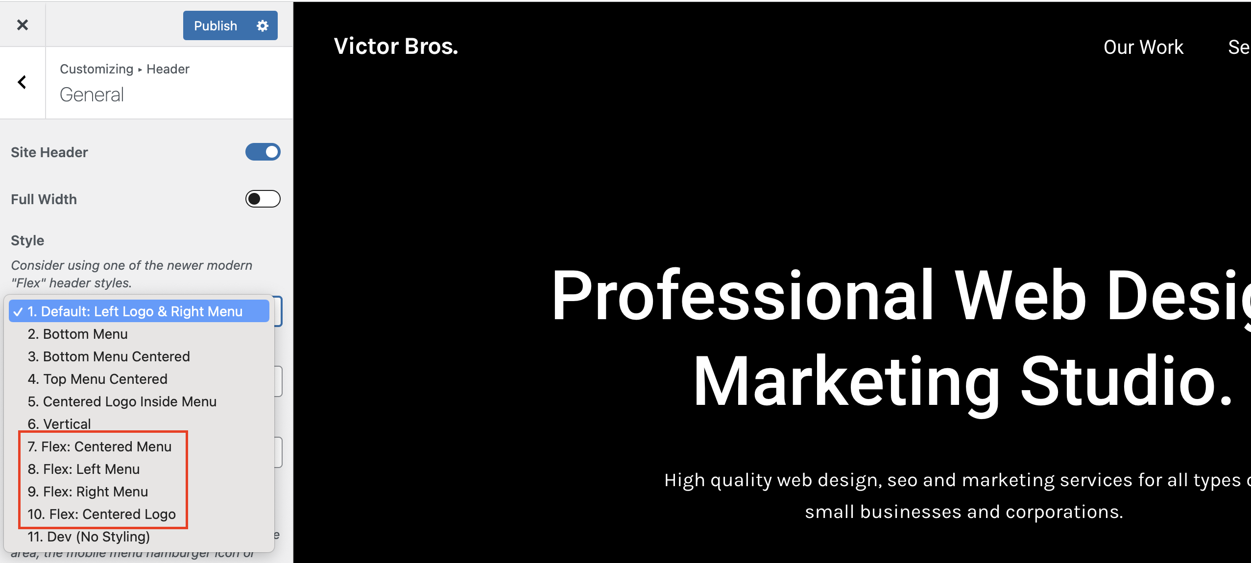
I can use Flex but the only option is left side, no center and more… How to customise this flex header please ?
Hi,
There are various styles for the Flex header (left, right, center, etc) you can choose from: https://totalwptheme.com/docs/wp-content/uploads/sites/51/2015/02/total-flex-header-styles.png
If you want complete control over your header though, you will want to use the Header Builder as I mentioned previously: https://totalwptheme.com/docs/header-builder/ – this will allow you to design your own header exactly how you want it.
- AJ
Hi AJ
This is about Post Types Unlimited.
When creating a new Post Type, the “name” field auto-populates based on the title.
The field caption says “cannot contain underscores” yet the auto-population adds underscores if there was a space in the title.
Should I be amending any underscores? Nothing bad seems to happen if I leave them in.
Thanks
James
Hi James,
I had copied that description from the WordPress register_post_type function documentation which is outdated. Underscores are allowed. I will update the plugin as it should read “Must not exceed 20 characters and may only contain lowercase alphanumeric characters, dashes, and underscores”.
Thanks for the heads up!
- AJ
Hi AJ, I hope you’re well!
I seem to be having trouble getting my website to recognize local time rather than universal time. I’m using a custom query to display post cards: posts_per_page=5&post_type=community_events&post_status=publish&orderby=community_event_day&order=ASC&meta_query0=community_event_day&meta_query0=today&meta_query0=gte&tax_query0=event_types&tax_query0=slug&tax_query0[]=non-uuslo-event
I’ve set wordpress time zone in settings to Los Angeles and I’ve also set the timezone in php on the server to Los Angeles. Yet my post cards disappear when the day ticks over in England, not Los Angeles.
This also happens with just a simple shortcode for the current day. Is there somewhere else I need to be setting the time zone?
Thanks and all the best! Alice
Hi Alice,
Sorry I’m not quite understanding what you mean by “This also happens with just a simple shortcode for the current day” – are you saying that WordPress is not returning the correct time zone?
In the Post Cards Query specifically the “today” dynamic variable is converted to a date using:
date( 'Ymd' )
Which is just a standard PHP function so if it’s not returning the correct date based on your time zone this would imply that it’s not set correctly in the PHP on the server.
How did you set the time zone on the server?
Can you try perhaps using this snippet in your child theme functions.php file or code snippet plugin:
add_action( 'init',  function() {
    date_default_timezone_set( wp_timezone_string() );
} );
Or is that what you did?
If you recently made the changes it’s possible, the query is cached on your server. For example if you are using WPEngine you would need to clear the object cache after changing the time zone.
- AJ
i have a problem not sure if since update – the last order we managed to process was 24/3/25 @9:00 – I updated the theme and core plugin 24/3/25 @15:00 – BUT i usually check we can order – but didnt since then it opens PayPal and goes through the process but does not return to the completed order page – I did make a backup before the update of the entire – site – I also noticed I updated the woocommerce PayPal payments on 24th as well – I have since ruled back – copied using FTP to the OLD version I coped on 24th Would the theme update be an issue – and is it possible to roll back to the old version I have FTP access – but would like the steps to do that
ignore – i think i found a plugin that had an issue – although i had not updated for some time – so will need to investigate further – I disabled – WPbakery, templata , and various other plugins looking for the issue – the shipping quote plugin seems to have caused it – BUT i have not touched this plugin and had orders since last updated – so something not quite right – anyway – but i will reactivate the plugins over the next few days to see if the issue returns, and which plugin causes – THANKS
seems i still have a problem , where PayPal button opens a page but does not connect to PayPal to pay – NOR will it open the card payment window looking to trouble shoot now – maybe the theme ????
i have been working on this all day today and no solution – IONOS who provide the hosting do not implement a cache and i have checked and NO folder called wp-content/cache – so not a cache issue i have deativativated pretty much all the plugins – except – woocommerce , woocommerce_paypal_payements BUT deleted the old updated version in plugins and copied across an older version fromFeb25 – 2.9.6 really simple security – for the SSL
So at a loss now – i did update the theme 24th March 25 and also the total core plugin – i use a child theme
if i wanted to role back to a previous theme – how would i do that I copy the full directory and have a copy form 26th Feb, so I could use FTP and remove the theme and copy across – BUT i have done a lot of work on the theme and worried about all the configuration – I also have twenty-twenty-four theme installed but not activated Maybe i could activate that and test and then activate the child theme
at a loss – done a lot of google searches for PayPal windows open and closes
it works if i log into the WP_admin on a browser and then use a separate windows and i can place the order and pay by paypal – strange
incognito windows also do not work
i have cleared cookies on browser – but same issue on chrome firefox safari, iPhone chrome and safari and another computer
ughhh – thanks
i have contacted PayPal and left a case – but that is still open
what a nightmare this has been – appears woocommerce has changed slightly – didnt upgrade or anything – IONOS did have an outage – maybe a glitch – anyway FYI in case anyone else has an issue – I seem to have a setting to automatically include a user login in woocommerce and not allowed a guest to complete an order – and so when i was using the form autofill and clicking on paypal – it was then at the top of the page asking me to login – thats something new thats changed …… and also may have effected other customers last week – NOT sure – as if they put in there details – it creates an account automatically – I have now reset to allow customers to order as guest – ALSO the “error” if you like , appeared at the top of the page – no red or !!! or anything – just wont let PayPal open and says – LOG INTO ACCOUNT – which i did not even know i had setup , until i say an email – this is new
I would still be interested if i can just activate onther theme to test and then go back to the child theme with no impact
Also these messages at the top of the cart page – i guess are a woocommerce feature and not something i can fix in theme – to go back up to top of page an show in RED
As always thanks for having the support forum ….
- just posting in case someone else has the issue and also if your theme can change that woocommerce checkout template … error information colour text or highlight the missing text box fields
looking into the issues now – it looks like woocommerce update , disabled the allow guests to order and and created an account for them , and then if they forgot to enter a billing address required field, it then had an error and expected people to log in to the account , they did not know the system created – unless they read the email – also the requirement to do that , is at the top of the page and easily missed if you dont scroll up – I had asked woocommerce to change this a while back so the colour of the text or/and change the entry field box colour
i have had a reply from the woocommerce team that the functionality i requested should be part of woocommerce by default – and they sent a video showing it working https://www.loom.com/share/a6aff878629d44a49c36cb2b604d9730?sid=c4b5b65f-ce26-4387-900c-0c63ad86f9b5
have tried with minimal plugs ins activatedWoocommerce / total core plugin / woocommerce paypal payments / really simple security
theme = Total
and it sill does not do as you show as the video – they suggest
this feature should be the default behavior for a WooCommerce site. However, some themes may override this functionality by applying their own styles, and certain plugins used to modify checkout fields can also affect it.
In this case reach out to your theme developer or the plugin support responsible for modifying the checkout field. They would be in the best position to provide assistance.
Hi,
This is Aj the theme author. Thank you for your patience, I hope you are having a good weekend.
I’m having a hard time figuring out what the pending issues you are having are, but I will try and explain a few things and hopefully it helps.
- First of all, the video the WooCommerce team sent you is specifically for the checkout page created with Gutenberg. In this theme (Total) you can create your check out page using either the classic shortcode method or Gutenberg. If you want it to look exactly like the video WooCommerce sent you, then you will need to edit your checkout page and make sure it’s using Gutenberg and their check out block instead of the [checkout] shortcode which was the original way of creating the check out.
Personally I think their classic shortcode based checkout page looks better, but the block based (Gutenberg) checkout page will work with Total. In fact in a recent theme update I added some CSS to the theme to style a few things in their Gutenberg checkout page that didn’t look good.
That said, I checked and it does appear that the theme is not properly making the required/invalid fields have a red border or other way of telling the user which required fields haven’t been submitted. I tested with this demo – https://totalwpthemedemo.com/bryce/checkout/ – I will add some code in the upcoming theme update that makes the inputs have a red outline so it’s obvious to the user which required fields aren’t valid.
If you want a temp fix you can add some custom CSS like this to your site:
.input-text[aria-invalid=true] {
    border: 2px solid var(--wpex-red);
}
Looks like WooCommerce updated how their validation works, so I have to change the CSS in the theme to target the new aria-invalid attributes. I was not aware, so thank you for bringing this to my attention! The fix will be in the next update (I’ve already added it).
- By default Total disables the function in WooCommerce that scrolls back to the top of the page to display notices. This is because WooCommerce is coded in a way that doesn’t properly check for sticky elements (like a sticky header) so the notices can end up beneath the sticky header when it scrolls up. This is a bad design function in WooCoommerce – the notices should really display at the bottom near the submit button or as a popup. You can re-enable the scroll function via the Customizer. Please see the docs here: https://totalwptheme.com/docs/enable-scroll-to-notices-for-the-woocommerce-checkout/ (I added to my todo list for the next update to change how this works so instead of an on/off switch it’s a dropdown with the options, Default/Enable/Disable this way by default the theme can disable it only if a sticky header is enabled – this way it’s dynamic).
I hope this clears some things up, please let me know if you do have any pending issues or questions!
- AJ
ps: Actually it’s better to use an outline then to modify the border color. This is the CSS I’ve added for the upcoming update:
.input-text[aria-invalid=true] {
    outline: 2px solid var(--wpex-red);
}
I’ve also updated the notice area to make the links red. Here is a screenshot showing what it will look like in the next update: https://a.cl.ly/YEuYKRjg
Last, I’ve made it so when clicking the links in the notice at the top if you have a sticky header, the theme will scroll to the fields using javascript to prevent issues with the sticky header going over the field.
This will be much better for usability!
Again, thank you for bringing these issues to my attention.
- AJ
THANK YOU for taking the time to look and read through , thats all excellent information brilliant thankyou – and thanks for suggesting a fix – I will await your next update fix , so its all standard stuff , the main issue was woocommerce change to the tick box and automatically creating an account so a guest could not enter a new order – as it had the LOGIN message at the top of the page – we have never had an issue until update to woocommeere on 3rd march – now fixed I can wait for your theme update to implement all those new features – cant wait – THANKS SO MUCH again for the support and reading my posts appreciated
Just wanted to mention, that the ability to scroll back and see the notice at the top already does exist so you may want to log in and click that if you haven’t yet: https://totalwptheme.com/docs/enable-scroll-to-notices-for-the-woocommerce-checkout/
I’m thinking the official update will be released at the end of the week or next week, but I can always send you a version with these specific tweaks sooner if you wish. I have a few other features, unrelated to WooCommerce that I want to implement in the next update.
Again, thank you for bringing this to my attention. It will be much better for usability and accessibility to have the red borders around the invalid fields and the design enhancements to the notice box at the top. Total is such a massive theme with so many integrations it’s hard to keep track and constantly check everything, having customers like you report bugs or provide suggestions really helps me keep the theme updated and improve upon it.
- AJ
you are very welcome AJ, and i’m happy to wait until the full release is available no need for a pre-release , I have fixed the main issue and NOW have a little note on the checkout page – by the T&C box – so a couple of weeks is no big deal
Google analytics seems to report about 10% of my previous volume – no idea whats going on there
And the Website is now very very slow to load , cant work out why …...
so not sure what i may have changed to cause these issues
I used Site kit by google to add the code snippet for Google GA4 – but i have since deactivated anyway
BUT i think i can just add some code into the CHILD Theme Function php and also the Main TOTAL Theme Header to achieve google analytics
appears IONOS have a problem with a loading server issue – so that may impact the speed of the site – so that maybe the issue with speed – NOT sure if that effects google analytics – I looked in the PHP and could not see any code snippet – Site Kit was supposed to insert code and when i toggled it complained the code already exists – maybe i dont understand what i should be looking for ….. anyway not your issue really and thanks again for support on the TOTAL Theme
ok, I now see i have to add the Google ID into theme panel – DONE – interesting as it had been working fine up to 31st march and then the drop – so not a complete loss of data
thats fixed it and i can see the code in the script now on view page source – and realtime analytics picking up my pages now
interesting it stopped or reduced from about 70+ to 6 on 2nd april …... i’m sure i would have added the code into the theme panel in the past Anyway – see what happens now
Hi,
For Google analytics you can also use the field in the Theme Panel – https://totalwptheme.com/docs/google-analytics-tracking/
Server issues should not effect Google Analytics.
Site Kit adds analytics to your WP dashboard so it’s going to run extra code on your server. I would recommend not using a plugin like this and just adding your tracking code to the site then logging into the official Google analytics site to view the statistics.
Remember though, that Google Analytics requires cookie consent now for most countries – so if you do plan on adding Google analytics to your site you really should implement a proper cookie notice banner on the site and only track users that consent.
From my experience most users were not consenting to tracking on my sites so I decided to just remove all tracking and cookie notices, because it’s fairly useless to track a tiny portion of visitors. A lot of websites simply insert the tracking code and don’t care about consent, but I think it’s important.
Depending on your site, I may recommend you just don’t track your users completely – are you actually using the tracking data to make improvements and manage your marketing? Or are you just looking for curiosity?
I find that using Google Search console is more important, this way I’m tracking what pages rank on Google and the visitors I’m getting from search results – for me, this is more important and doesn’t require any tracking or user consent because it’s just data from Google.
- AJ
Thanks for the continued support
more just curiosity and a little marketing , to see where people come from – so if we post instagram and facebook posts – does that impact volume – what landing pages people use , I did have a lot of domains forwarded and pages for the domains – so i could see the number of users from those pages. – but did not renew most of those last year again based on some of the google landing pages off the analytics page reports
Where people come from geography mainly country – sources like facebook, instagram, search, direct etc
would like to see ranking of pages – but dont know how
I use the https://analytics.google.com website and run reports on timescales and also download csv to view and manipulate in excel
Not interested in the customer journey on the website , so dont need to track specific users , just use the stats off google webpage – so as you say cookies should not be
But i did plan to look into the cookie consent a bit further, as i only saw the need for consent last week, which would make it pointless as people now are more aware of cookies and often do not consent – thats anecdotal, speaking to various people , as i still do a little training for silver surfers , so you have confirmed that
I did remove site kit and use the theme panel as you linked – i’m sure i did that in the past as well
I opened up google counsel and i have seen this before and its working for my website – so I will look further into that information
Thanks again for the continued support and advice
Hi AJ
I wonder if you can help me with this before and after element.
In this case, the image is portrait orientation, and is in the left hand column of a two column row.
When you hover over it to reveal the “before” and “after” labels, there is also an ugly grey space to the right, and the “after” label is in that space too.
Can this be altered so the behaviour is on the image only, rather than what appears to be the entire column?
And also, is it possible to have the “before” and “after” labels visible without having to hover?
Thanks
James
Hi James,
The space you are seeing is because your image is simply not large enough to fill the whole column. You should be seeing the after image in the space on the right like these examples: https://totalwptheme.com/elements/before-after/
The best fix would be to make your images larger so they fill up the column or make the column smaller. The Before/After image element renders at 100% of the width of the parent. Or you can define a custom width for it if needed: https://a.cl.ly/9ZuOPxNm
Of course you can remove the overlay via the Overlay tab and turn off the “Overlay on Hover” option. This way you only see the images without the hover effect.
- AJ
Great – thanks!
Hi AJ,
I’ve created an Ajax Filter based on your gist https://gist.github.com/wpexplorer/e95f2bc43c82a227787e8ae0d8a87432 and it’s working really well with select dropdowns and a submit button, but I’d like to add some radio buttons for a meta query. I can’t get them to work. I suspect it’s a problem with the data attributes—I assume they need to be added to every radio button, but I have tried that without any luck.
Please can you give a code example for radio buttons?
Thanks,
Charlie
Update: AJ, I have done some testing and I think I can get the result my client wants by using checkboxes, so I can manage without radio buttons. Thanks anyway, C.
Hi Charlie,
The AJAX script doesn’t currently have support for radio buttons. But if you really need them, what you can do is add a hidden input below the radio buttons and a little javascript so when the radio buttons are clicked it changes the value of the hidden input. I can provide an example if needed, let me know!
- AJ
Hi, AJ. Is it possible to add or set only the primary category inside the Loop or Custom card? If I add “categories” all the categories related to the article appear, I only need one of them, that is the primary one.
Hi,
From what I remember you are using only Gutenberg for your site right?
If you used a page builder plugin like Elementor or WPBakery, displaying the primary term is extremely easy using the theme’s Post Terms element. Unfortunately Gutenberg doesn’t have this ability in it’s categories block.
What you can do though, is use the theme’s Post Terms element inside the shortcode block in Gutenberg like such:
[vcex_post_terms first_term_only="true"]
Here is a list of the theme element shortcodes if you need to use them manually: https://totalwptheme.com/docs/shortcodes-list/ – this page will display all the parameters you can use with the shortcode. So for example for the Post Terms element you can technically use any of these parameters to customize it further:
[vcex_post_terms taxonomy="" child_of="" exclude_terms="" first_term_only="" order="" orderby="" visibility="" unique_id="" classes="" css_animation="" animation_duration="" animation_delay="" archive_link="" archive_link_target="" style="" before_text="" spacer="" max_width="" align="" bottom_margin="" spacing="" vcex_subheading__button-styles="" button_align="" button_style="" button_color_style="" button_size="" button_background="" button_hover_background="" button_color="" button_hover_color="" button_border_radius="" button_padding="" button_margin="" button_font_family="" button_font_size="" button_letter_spacing="" button_text_transform="" button_font_weight="" link_underline="" link_underline_hover="" target="" is_elementor_widget="" ]
- AJ
ps: I do have plans on making more of the theme’s elements – https://totalwptheme.com/elements/ – compatible with Gutenberg, but almsot all Total users are using WPBakery or Elementor for building their complex pages (using Gutenberg for standard posts is still highly recommend – I only recommend using a page builder plugin for custom cards, dynamic templates and complex pages like homepage, services, etc) so it’s not a super high priority right now.
Yeah right! many thanks AJ !!
Hi. unfortunately it doesn’t work :-/
Where are you adding the shortcode?
If you add it to your post it should work just fine, but you could have issues if you are trying to add it inside the Gutenberg query loop, because Gutenberg doesn’t use a standard loop the theme’s element cant properly locate the current ID (known Gutenberg issue).
Let me test it out inside a Gutenberg loop and see if I can update it to work inside a Gutenberg loop or custom card and if so, I can send you the updated Total Theme Core plugin with the fix.
- AJ
I tested the shortcode inside the Query Loop and I can see it’s displaying the category for the current page/post and not for the post in the loop.
There is indeed a known issue with WordPress and the function to retrieve the current ID, the problem is that WordPress parses shortcodes before blocks. Unfortunately there is no way around this or fix. The only way to make it work would be fore me to convert the Post Terms element into a block so it can be used as a block instead of a shortcode.
I do have plans to make more of the theme’s elements available as blocks (as I mentioned previously). I will look into making this element a block so that you can use it in the Query Loop. Are there any other theme elements that you think would be good to have in Gutenberg – https://totalwptheme.com/elements/
Very few customers use Gutenberg for their main pages, dynamic templates and custom cards. Most customers use WPBakery or Elementor, which are better for creating advanced pages and they use Gutenberg only for their posts which don’t require advanced building functions.
- AJ
Ok, I’ve understand. I hope you can insert an alternative solution in the next theme update
I have a problem with Pagination. I want the pagination to appear as [1], even though there is only 1 post. Because according to the setup, if there is more than the number of posts, the pagination will appear. However, I still want the pagination to appear (as 1) even though there are not enough posts.
Also, when setting a password for a post, the word “Protected:” will appear. I want to ask if it is possible to hide the word “Protected:” in the post title?
Hi,
This is AJ the theme author.
Unfortunately there is no built-in way to display the pagination when there is only one page. Total uses the core WordPress function for the pagination – https://developer.wordpress.org/reference/functions/paginate_links/ – which will exit early if there aren’t any paginated pages (aka more than one). This means the only way to do what you want would be to add custom code to your site that checks if the pagination returns nothing and if so output your own custom code to display a number 1. And the code will highly depend on how your site is setup (using default archives or dynamic templates).
I wouldn’t recommend displaying pagination when there isn’t any pagination though because it’s very confusing for the person visiting your website (what does the number 1 even mean) and it can cause issues with accessibility.
For the password protection title, this is inserted by WordPress automatically so you would need to add some custom code to your child theme or via a code snippet plugin.
Example code:
add_filter( 'the_title', function( $title ) {
    if ( str_contains( $title, 'Protected: ' ) ) {
        $title = str_replace( 'Protected: ', '', $title );
    }
    return $title;
} );
- AJ
If padding is applied to a row (desktop), how can I remove that padding in mobile view without creating a separate row for mobile only?
Hi,
The best way to manage padding for small devices is by using responsive units like vw (viewport width). Typically, padding is added to the left and right sides (since top/bottom padding is often kept consistent across devices, or you can use an inner row with a spacing element to adjust the space at different breakpoints).
For example, if you’re currently using 100px of left and right padding, it might be too large on smaller screens. Instead, you could switch to a responsive value like 7vw, which will adjust based on the screen size, or use a percentage like 10%, which will also scale accordingly.
You should generally never show/hide different rows for different screen sizes as this makes the website less optimal (for speed and SEO). There is always a way to do things responsively, if you aren’t sure how share the URL and I can suggest and alternative.
- AJ
ps: Total is also fully compatible with Elementor – a lot of my customers have been using Elementor instead of WPBakery as of late. In Elementor you can define the padding, margin, colors, etc at each breakpoint. I”m not suggesting you switch your whole site over to Elementor, but it’s a possibility if you do like that builder and it won’t take too long for you to swap it all over. Or maybe something to consider for new websites if you are a freelancer/developer.
Replacing the padding that used PX with VW settings works perfect. Thanks again!
Awesome
I created a website on Host A. Transferred it to Host B. For some reason the “popups” are not working. Specifically the custom CSS or Row layout popups. I see the short message in lower left corner of screen: javascript. Suggestions?
Hi,
Sorry, I’m not sure what you mean my “custom CSS or Row layout popups” – are you referring to working in the builder and when you click to edit a row you can’t access the row settings?
If the only thing you changed was hosting, then it sounds like there is an issue with the new host. Generally issues with the builder not working are due to limited server resources. You may have to increase your PHP memory limit. Your webhost should be able to check your server error logs to figure out what’s going on and fix it up.
It’s also possible your new host has some sort of optimization function built-in and it’s messing things up.
Where is your new site hosted?
- AJ
Thanks for the info. I re-uploaded the js_composer plugin. Problem solved.
Great!
Hey AJ, what would be the best way to enhance the wpbakery searchbar element with a functionality so it would load the results in post cards elements below/attached just like using a live ajax search?
What would be the best way to achieve this? I am sure the theme porvides enough to avoid using a plugin. Any help or ideas are much appreciated. Thank you in advance ")
Hi,
You can set it up to use AJAX using some custom code, here is a sample snippet: https://totalwptheme.com/docs/snippets/advanced-ajax-filter-example/
But I wouldn’t recommend using AJAX and Total already has a built-in method for displaying search results via URL parameters with a page refresh or sending users to a new page.
I just published a new doc article on how to do this and the benefits over using AJAX – https://totalwptheme.com/docs/custom-search-for-post-cards/
- AJ
Hi AJ, does Total Theme has a utility to create a html sitemap page?
Hi,
I don’t recommend creating an “html” sitemap page. This is was important about 20 years ago for SEO, nowadays it can actually hurt your SEO so it’s not recommended. You should only have an XML sitemap – which WordPress creates by default as well as every popular SEO plugin (you should be using an SEO plugin on your site).
Besides the fact that HTML sitemaps aren’t recommended, there is no need for a dedicated element for this and if there was one it would be limited in the customizability.
Just create a new standard page and use the Post Cards element to display your pages and posts. You can set it up however you want. You can add a single Post Cards element and set it to display all pages and posts or you can insert multiple with different headings to separate the post types. To link to your archives (categories, tags, etc) you can use the Term Cards element.
You could also use the Term Cards element to loop through your categories/tags/taxonomies and display the posts associated with them if you prefer. You do this by creating a new Term Card via theme Panel > Custom Cards and inside the custom card add the Post Cards element and in the Query Type field select “Term Card”. This way the card will display the posts associated to the current term.
- AJ
Hi AJ, could you eplain why having a sitemap page can hurt seo? I am looking to do one because i saw that my compeititors (ranked 1,2,3 in serp) have a ‘sitemap’ link on their home page.
An HTML sitemap could be considered to be low quality content as it may not really provide any added value to the end user. If you have a massive website, it may be helpful, but your site should already have proper internal linking so that your users can navigate your site and an XML sitemap for bots.
On page SEO is such a small ranking factor. You can micro-tweak your site all day without any affect at all.
Most likely your competitors have more and higher quality backlinks.
If you do want to focus on on-page SEO the most important things are going to be content quality, page speed and mobile friendliness.
- AJ
thumbs up!
Hi, in the customizer I have set up the colour of my links, buttons etc to appear in the colour of my choice but some of them don’t seem to be configured properly on the woocommerce pages and stick to the default colour of the total theme which seems to be #1a73e8.
For example, I have this colour in a menu of my Woocomerce sidebar, tab title of a product, etc.
Do you have any idea how to fix this?
Hi,
This is AJ the theme author.
Some colors aren’t using the link color but rather the theme’s accent color. Which I think may be what you are seeing. Can you double check the accent color under Customize > Global Styles > Accent Colors. Mode info here: https://totalwptheme.com/docs/accent-color/
Which by the way, if you want your links, buttons and accent colors to be the same, you can undo your custom link and button colors and only modify the accent. This will change all of them at once, keeps things a little slimmer. Than you can use the link and button options to set different colors if wanted for those elements.
- AJ
I want to mention also…That if you haven’t done it, it’s also best to define your custom colors via the Color Palette – https://totalwptheme.com/docs/color-palette/ – then you can select from these in the Customizer by clicking the globe icon for the color picker.
This way if you want to set the same color in different settings you can still modify it globally if you ever want to change it.
Also, it will allow you to create a dark mode version of your site if wanted – https://totalwptheme.com/docs/dark-mode/
Hello AJ,
Perfect thank you for your help.
I had done the color palette with my colours but did not check the Accent colors.
This now displays my colour, thanks again.
Great!
