
38353 comments found.
Hi! I have some conflicts with View Transitions API Vertical Reveal Scale, where I can find files or code responsible for it so I can fix manually? I use Dreamweaver so I can search through entire codebase if you give me file names/search phrases please. Thank you!
Hey po1nt, That styling effect is created in salient/css/custom.php, in the section “8. Page Transitions.”
Kind regards
On the mobile version of my shop page page header height appears quite wide, while on desktop looks fine. Can you please suggest where I can change the height, so it stay consistent on both – desktop and mobile. Right now, I set value to “1” because if I leave it empty, it gets really tall.
https://ageimmune.com/shop/
Thank you
Hey atlantchiropractic, If you’re not using the page header, remove the background color (currently set to white), and it will revert to the standard WooCommerce page header. You may still need a custom rule to fully remove it if you don’t want it to occupy any space.
Kind regards
Hi. That was easy.
Thank you
Now, I have a word “SHOP”
How can I remove it besides removing title for the page?
And last question. How do I remove zoom effect on single product images on hover?
Thank you ")
Hey atlantchiropractic,
You can make that change by adding the following snippet into the custom CSS box located in the Salient options panel > General Settings > CSS/Script related tab:
.nectar-shop-header .page-title {
  display: none;
}
.woocommerce div.product div.images img.zoomImg {
    display: none!important;
}
Thank you. When you get a chance, please share the custom code, so I could remove the page header, or have some minimum height setting I could control. Thanks
Hey atlantchiropractic, If you want to keep using the page header, you can use this CSS to control the mobile spacing:
@media only screen and (max-width: 999px) {
    body:not(.single-post) #page-header-bg[data-alignment-v=top][data-padding-amt=low]:not(.fullscreen-header) {
        padding-top: 2%;
        padding-bottom: 0;
    }

    body:not(.single-post) #page-header-bg:not(.fullscreen-header) .span_6 {
        margin-bottom: 0;
    }
}
Or remove it:
.woocommerce-shop #page-header-wrap {
  display: none;
}
Hello, what are the best way to create a button in menu? https://lumenchristicounseling.com/ change the size font color etc? Thank you.
Hey Fixedman,
You can use the Salient Menu Options to achieve that. Here is the relevant documentation: https://themenectar.com/docs/salient/header-button-links/
Kind regards
Thank you! There was a setting for a shape too, if I remember?
Hey Fixedman,
If you’re referring to the roundness, it will inherit from the theme option “Button Styling” in the general settings > styling tab.
Kind regards
Thank you!
You’re welcome
hey, hope so you are doing well, we just purhcased this theme and found it its not on the elementor,can you please explain this
Hey firasdaouworks,
Salient is not an Elementor theme. It is based on a tailored version of WPBakery.
Kind regards
My gallery suddenly stopped showing on all product pages. I am using the Flickity Static Height Style. Tried on different browsers, incognito, cleared cache, and I have the latest Salient version but not working. Could you please help? Link to page: https://www.temporary-url.com/9A7A
Hey ehong33234,
The images in your gallery are set to lazy load, but their attributes are not being swapped as they normally would with the built-in lazy-loading functionality. As a result, they are loading normally instead of lazily, but have incomplete CSS.
I would need to take a closer look at the backend setup to determine why this is happening. Please feel free to open a ticket on the support forum regarding this issue.
In the meantime, you can reveal the images by adding the following CSS snippet: https://pastebin.com/FxcDVfQxKind regards
Hello! Checking out this theme for a potential client. Great work! What is the best way to upload/use a custom non-google font? I did not see it in the docs, but may have missed it.
Wait, I think I found it! Is this still accurate? https://themenectar.ticksy.com/article/9773/
Hey rhiann, thanks a lot!
Yes, using the plugin “Use Any Font” is the most straight forward method to add new custom fonts into the typography fields within the admin panel.
Kind regards
Hi,
Would it be possible to use Post Loop Builder for a team/portfolio section and sort items by a custom ACF field (e.g., numeric “sort_order”)? Is there a built-in way to do this, or would it require custom code or a plugin? If custom code is needed, could you provide a snippet after purchase?
Best Regards
Hey Disti,
We support querying from custom post types, but using an ACF meta key for sorting would require a code snippet to modify the query via a filter. We can provide an example snippet through support after purchase.
Kind regards
Hello is there a way to add Google font to your theme? Thank you.
Hey Fixedman,
We support loading Google Fonts from the Salient Options Panel under the Typography tab. Are you requesting a specific font that is not currently available?
Kind regards
yes Proxima Nova
it is missing
I see that it is not Google font!
Hey Fixedman, yes, Proxima Nova is a commercial font that is not offered by Google.
Kind regards
Hi,
After updating Salient to the latest version, I’m experiencing compatibility issues with older pages built with previous layout elements.
When I import new sections from Salient templates into these pages, everything looks correct at first. However, if I save the layout as a template and re-import it, the layout breaks and raw shortcode text appears (for example: /vc_column).
It seems like the older WPBakery elements and the newer Salient template elements are not being parsed correctly together.
Is this a known issue, or is there a recommended way to use new Salient templates inside older pages?
Thanks!
Hey giadaguatto,
I haven’t encountered similar reports of this, and there should be no difference when using any of the elements together, regardless of how long they have existed compared to newer elements.
Could you kindly reach out via the contact form on my author page and provide temporary access to one of the pages where you’re seeing the issue? That would allow us to accurately examine what’s going on.
Thanks in advance
Hi, thanks for your quick reply. I’ve just sent you the details through the contact form so you can check the issue. Thanks!
Thanks, giadaguatto
Hi!
i have a question for the “page submenu” element
When i use anchor link within the same page it works down, but coming up to the previous anchor it has problems. It just scrolls a little bit up and then blocks.
i link to a “sticky content sections” > “section” > row ID
Thanks for your help
Hey ahdrei,
So far, I have not been able to replicate that locally. Could you kindly share the page URL where the issue can be observed?
Thanks in advance
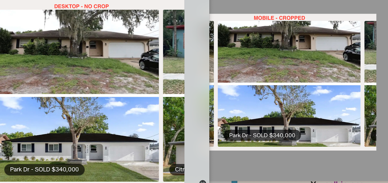
Hi quick question! With a Flickity Carousel, on desktop, the images are not vertically cropped, but on mobile, the images are vertically cropped (attached here), is there a way so the full image height is shown on mobile?
https://chrisgrenier.com/wp-content/uploads/2026/03/Screenshot-2026-03-12-at-11.51.02-AM.pngHey svtmuscle!
Can you please share the page URL so that I can take a look at your settings to assist?
Thanks in advance
Thanks for the reply, I guess an easier question is – how can I make the background image on Carousel Items be a fixed height for a 3:2 dimensional photo?
There is no aspect ratio option for carousel items. The most straightforward solution is to insert images directly into the carousel items instead of using background images. However, if you need to use background images to overlay text, you can make that change by adding the following snippet into the Custom CSS box located in the Salient Options Panel > General Settings > CSS/Script Related tab.
.flickity-slider .cell {
    aspect-ratio: 3 / 2;
    height: auto !important;
}
You can also limit that to specific carousels by giving the parent row a class name to target. e.g.
.fixed-aspect-carousel .flickity-slider .cell {
    aspect-ratio: 3 / 2;
    height: auto !important;
}
Kind regards
Hello,
I have a question about the Image Gallery block. On the Slider and Flickity styles there is an option the set the On Click event to ‘open custom link’, but as soon as you change to the Grid style, this option disappears. Is this a bug or is this on purpose? Would be great to have the On Click event option for the Grid styles as well, is this possible?
Ideally I would like to use the Post Loop Builder, so I can have the images in a custom post type. But this block doesn’t seem to have an On Click event option either. For now I can only disable the links. Would it be possible to have an On Click event options in this block?
Thanks in advance.
Hey neliuss,
If the goal is to use a custom link for each item, you can do that in the Post Loop Builder by utilizing the Portfolio post type. Each project (post) in that post type has the option to set an external URL in the Project Configuration metabox, which can be used to direct your projects to a custom location when they are clicked in the grid.
Kind regards
Hi,
That works, thanks for the suggestion. Is there a built in option to have the external link open in a new tab though? Some of my portfolio items need to link to the single page (in the same tab), what is happening be default. But I would prefer for the external links to open in a new tab.
About the Image Gallery block: are you planning to add the On Click event to the Grid style as well in a future update? This would be great for client logo grids for example. Now this is available only on the Flickity and Slider styles.
Thanks and kind regards.
Hey,
You can get that functionality by adding the class name “target-blank-external-urls” in the “CSS Class Name” field at the bottom of the Post Loop Builder element settings.
Adding that custom URL map to the post grid style was not on the wishlist, but I’ve noted the idea.
Kind regards
Hi, Thanks that works great.
Now that I’m using the Portfolio post type, I’m noticing a bug. And I can’t figure out how to resolve it. The WPbakery page builder doesn’t show up in the Portfolio items anymore.
WPbakery page builder for portfolio items is activated everywhere (role manager and page settings), the 2 buttons ‘Backend editor’ and ‘Frontend editor’ are showing up, but the actual WPbakery builder field is not showing. I checked on one of my other websites, and over there it is showing. I’m not sure what is happening.
The only difference with my other website is that I assigned some custom fields with ACF to the portfolio items. But even after I deactivate the custom fields, the WPbakery field is not showing up. Any idea what could be happening here?
The theme and plugins are all up to date.
Hey neliuss,
If WPBakery is enabled in the role manager, there should be nothing else needed to use it for that post type.
Feel free to open a ticket on the support forum so that we can follow up and take a look at the backend.
Thanks in advance
Dear Salient team,
One more question please, how can i align the Image Gallery (flickity static height style) of ISSUE Magazine on the left ? I mean to start from the beginning of the left side of the website. Now it behaves like i ‘ve put it in centre alignment (i did not). Tried also the (really amazing) Flexbook oprion from column settings but it did a strange alignment in this case and didn’t work. When I am using 4-5 images the gallery stays on the left, but when I prefer to use 1 or 2 images it goes in an auto centre alignment.
https://iliaslois.com/Many many thanks!!
Hey ilias_lois!
The Flickity Static Height Image Gallery is center-aligned by default. Since you only have two images and want them left-aligned, it makes more sense to place them inside a column and use Display → Flexbox → Horizontal. Could you share the page where you tried that option and the layout didn’t work for you?
Thanks in advance
thank you very much for the response!
I tried right now the Flexbox → Horizontal option. It works.. but it leaves a small misalignment with the text below (the images of ISSUE Magazine). When i put more images like in the PhMuseum Annual #01 – Imperfetto, 2025 it aligns perfectly with its text bellow.
You’re welcome, ilias_lois
The images should be in their own row/column if you want them to flow horizontally. The text and divider should be in their own rows above and below the row that contains all the images. Have you tried that arrangement yet?
Kind regards
Yes, now it works but I am worrying when the website loads in bigger screens. I use a 15inch macbook. When I see it in 25inch+ screens the alignment on the left is not consistent.
No its my fault! Thank you for your generous help!
Hey ilias_lois,
I’m glad that you got it working
Hi,
How I can change the burger/mobile menu icon to an svg or png ?
thanks
Hey mariospavlou,
Can you share your URL so I can review your settings and provide an accurate snippet?
Thanks in advance
Hi, thanks for quick reply.
There is any place where I can share privately credentials as it’s still under construction ?
Thanks
Hi,
I just did.
Thanks
Hi,
Where I can receive an answer for my message send via the contact form ?
Hey mariospavlou, I responded earlier today.
Kind regards
Its, possible to add Vimeo link to video lightbox?
Ex.: https://themenectar.com/salient/minimal-portfolio/portfolio/virtual-reality/Hey teaserbox,
Yes, you can insert a Vimeo video link into the video Lightbox element.
Kind regards
In the “Pricing Plan Example”, on the 3rd horizontal-list-item sample on your website here: https://themenectar.com/salient/elements/horizontal-list-item/
How do I add the “Join Now” button you exemplify?
Hey quomo,
You can search for “Wellness Pricing Tiers” inside the Salient Studio template library to set it up and see how it was made: https://themenectar.com/docs/salient/salient-studio/
Kind regards
Ah there it is! You guys are always a few steps ahead… Thank you and all the team.
Thing is, I missed the CTA/CTA2/Icon interface… late nights!
I’m glad I was able to help, quomo!
Cheers
Hi,
I’m interested in purchasing the Salient theme for use on multiple client websites. Could you please clarify if there is a license option that allows usage on 10 or more different client sites? If so, could you provide details on pricing and terms for such a license?
Best regards
Hey Disti,
Envato does not currently provide a multi-use license like that. As of now, you would need to purchase a license for each client site.
Kind regards
Dear Salient team,
The last update is wonderful.
I have one question about the background color of the lightbox fancybox3. Now it is dark (black). How can i make it white / transparent?
for example in this gallery: https://iliaslois.com/
Many thanks !:)
Hey ilias_lois!
You can make that change by adding the following snippet into the custom CSS box located in the Salient options panel > General Settings > CSS/Script related tab:
.fancybox-bg {
    background-color: #fff;
}
Kind regards
Thank you for the quick response!
Unfortunately it didn’t work.
Best, Ilias
No problem, ilias_lois.
I don’t see the CSS active on your URL, did you already remove it? If so, try to make it more specific such as:
body .fancybox-bg {
    background-color: #fff;
}
Remember to clear any performance plugins you may have active which might be caching the page assets after adding it.
Kind regards
now it worked!
Thank you so much for your patience and time
You’re welcome, ilias_lois
Cheers
One more little thing:
inside the fancybox lightbox the buttons ‘full screen’ ‘zoom’ & ‘close’ are white color and the background of them is black. How can i make them white and the background transparent, in order to match the overall light theme of the lightbox?
https://iliaslois.com/Thank you very much.
CORRECTED MESSAGE:
One more little thing:
inside the fancybox lightbox the buttons ‘full screen’ ‘zoom’ & ‘close’ are color white and the background of them is black. How can i make them black and the background transparent, in order to match the overall light theme of the lightbox?
+ is there any way to hide (not use) the arrows left and right?
https://iliaslois.com/Apologies for asking too many questions. Thank you very much.
Hey ilias_lois,
You can make that change by adding the following snippet into the custom CSS box located in the Salient options panel > General Settings > CSS/Script related tab:
button.fancybox-button {
  color: #000!important;
  background-color: transparent;
}

.fancybox-navigation {
  display: none!important;
}
Kind regards
You are the best. Have a lovely week!
You too, ilias_lois!
Morning guys, With regards to the mobile version of my test site: https://navarino.wildcolourdigital.co.za/ how can I display my shop products in two columbs? It wont display in two columbs when using a products widget, only on the shop/category pages?
Hey richardwells,
In the Salient options > WooCommerce > General tab, have you set the “Archive Page Columns (Phone)” to 2?
Kind regards
Would it be possible to get a Flickity Item Custom Mobile Width in addition to Flickity Item Custom Desktop Width?
Hey AkeatsKes,
I’ve noted the idea for granular width controls for individual carousel items on mobile. However, you might be able to achieve what you’re trying to do using the parent carousel’s “Shrink Column Width By” option, which allows you to uniformly reduce column percentages in case you want each column to be less than 100% width on mobile.
Kind regards
I’ll give that a try. Thank you!
You’re welcome, AkeatsKes
