
22305 comments found.
Hello, I have come accross a problem with the mobile menu. I have a menu which has the following structure: main menu item/ sub level 1/ sub level 2/ sub level 3. However, when I view the menu on a mobile device sub levels 2 and 3 have the same amount of padding so there is no way to tell the difference between sub level 2 and 3. Would you be able to fix this in the next update so a sub level 3 item appears slightly to the right of a sub level 2 item or provide me with a solution to change this myself?
Thanks very much
Thanks for the heads up dude!
If you add the following CSS to your site it will move the items over for 3 and 4th level dropdowns:
.sidr ul li ul ul ul li a { padding-left: 50px; background-position: 32px center; }
.sidr ul li ul ul ul ul li a { padding-left: 60px; background-position: 42px center; }
I’ll be sure to take another closer look in the next update to make sure it looks perfect.
Great works perfectly now. Another thing (not urgent) for you to consider for a future update is that when viewing 3rd and 4th level dropdowns, that because they pop up to the right that they go out of the container (mainly a problem when viewing website on ipad landscape). I have made a work around for the time being by reducing the font size and the minimum width of the sub menu from 140px to 90px. However, I don’t think a 4th level would fit in the container as 3rd level is a struggle to fit in at the moment.
Thanks for your fast reply and solution, saved me an evening of trying to work out how to do it!
Seems like an issue mostly when drop-downs are on the far right, correct?
I could add a classname for sub-items so that they open to the left instead of the right.
It’s extremely difficult to do it automatically because items on the far left should still open subs to the right but maybe items on the far right of the menu should open subs to the left.
Let me know if you think an extra class for defining which direction subs should open would be useful!
ps: This is ipad landscape only though, because portrait should show the mobile icons.
Yes that is correct. I think that would be useful if there was an extra class, just so there is more flexibility incase several sub menus are required. I dont know if it is possible with dropdown menu, but can a sub item appear below an item? Eg when you hover over dropdown 1 the submenu items of dropwdown one appear below it (almost like a hover accordian).
Also something you might want to consider for the mobile menu is having sub menu items only showing when the parent item is clicked (could have a small arrow next to it). The reason for this is that if a menu has a lot of items, I think it can look a bit messy. It would cleaner if only the top menu items were showing unless you clicked on one which brought a dropdown of that items sub menu.
Hope that makes sense!
Thanks very much!
I’ll definitely take both ideas into consideration, thanks!
The toggle for the menu is something I’ve considered doing, but most people (from my experience) have A LOT smaller menus then I do in my demo. Nonetheless, a toggle would look nice, so I’ll mess around with that.
Thanks for the suggestions.
Brilliant, I look forward to seeing the result if you manage to do it!
")
Whenever I create a column, and add other styling to it, the solid border adds their by itself, how can I remove it? I cant see other option in the boder style, it contains solid, dashed, dotted, but not “none”?
Screesnhot: http://d.pr/i/7p9
The default columns shouldn’t have any border, I just double checked to make sure I didn’t mess anything up in the last update.
Anyway, the border is added with the color option, from your screenshot it looks like you have the border set to light gray. Just clear out the Border color setting and it should be fine. Adding a “none” to the border would just be an extra check, which is why I have it setup that if a color is selected it gets added.
Let me know if you continue having issues and please make sure you are using the Visual Composer included with the theme. I’ve seen people that were using the Visual Composer that they got from another theme and the author of that theme had edited the plugin files causing all types of issues.
I checked everything, still cannot find why it keeps adding border. It happens on every new page I create. I resetted the style.css and still same things happened.
Really frusturating, whenever I create page the border adds to the style. When checking HTML code, it says following:
As you can see I didnt selected any of the styling, the colors are cleared out. But in the setting it says “border style: Solid” I cannot change that to “None”. Thats why It adds 
Ok, I think I figure out. If I add column and then add a row in that, or opposite, not sure, then it add the border. otherwise its fine now ")
Even when I do what you said and add the column and then the row its fine for me…The border might be coming from elsewhere, but hard to know where without looking at the URL.
Either way I’ll probably add a border “none” in the next update just as a second precaution
Hi! Great Theme, thank you!
I have a little problem. If I set a featured image for video post everything is well. But if I only have an embedded vimeo video the description text seems buggy at the blog page.
In this screenshot first video is without featured image, second one is with featured image set. http://milanpawlowski.de/temp/total-screen.pngHi,
Glad you like it!
Hum, this shouldn’t be happening. Could you let me know if you are using the main blog template or inserting the blog grid shortcode.
If you want you can send me a direct message via my profile page with your site url and logins and I can check for you, it’s a bit hard to troubleshoot with a screenshot since I can’t see any code.
I don’t know why, but the problem has solved by itself. I will ask you again, if it comes back. ; )
Thank you
But I have another question: Where can I find the settings for oembed videos. So that I can hide the vimeo-title and authors image in the inserted vimeo canvas. Is there a possibility? Or do I have to go into the main wordpress-code.
There aren’t any “settings for oembed”. The only available arguments for the wordpress oembed function (unfortunately) are height and width: http://codex.wordpress.org/Function_Reference/wp_oembed_get
If you want to remove vimeo titles you’ll need to create a function that filters the embed_handler_html and the embed_oembed_html hooks. Looks like you can find some answers online with a Google search…
But the easiest is if you have a Vimeo Plus account you actually can set to hide these things from your video’s settings.
Hi one more request sorry… Buddypress integration??? Or if you could please explain how I could do this myself? Thanks so much
There isn’t any built-in styles for BuddyPress because it adds a lot of bloat and not a whole lot of people use it.
It is a plugin though, so it should work out of the box. The only thing you’ll really need to do is probably add some CSS to make it look good.
OK thanks. Do you have an alternative to buddypress that you’d recommend for use with this theme?
I’m not sure there is anything decent out there for creating a social type website for WordPress with members besides BuddyPress.
Hello,
On the law template, how do I customize the text for Professional, reliable, focused, efficient? Also how would I switch out the icon above the text?
Thanks!
You have to be working with the Visual Composer, simply click on the little “pencil” icon and you can customize these: http://cl.ly/image/380w3c3b1E0B
Is there a way to make the edges of the header round?
Sure, with a little CSS. If you are using the boxed layout for example it would be something like this:
.boxed-main-layout #wrap { border-radius: 4px 4px 0 0; }
I tried locally, that actually looks pretty decent, good idea!
cool. i added that in the custom css section but nothing changed.
Make sure your site isn’t being cached. The CSS works fine, I even tested locally before posting. If you want to show me the URL I can tell you why it might not be working.
Ya i disabled cache. http://ergo21.com.octobersparrow.com here is the site. Thank you
Thanks for sharing the URL. I didn’t realize you were using header style 2 which has a background added to the header.
So add the rounded edge to the header as well:
.header-two,
.boxed-main-layout #wrap { border-radius: 4px 4px 0 0; }
ok i put that in the custom css section but I am still not having any success. Do I need to change a setting somewhere else? Thanks again for all your help.
I don’t see the CSS applied to the header-two class on your live site.
ps: You also have a white main background and a white content background, so it’s going to be tricky to see once its added correctly.
This is what it would look like:
http://cl.ly/image/2S0b1i3f2V35You might want to consider adding a border to the main content wrap or making the main background darker for a higher contrast.
Is there a way to login to the demo site to see how to use the Visual Composer in all the different ways proposed in the demo? Looking at creating a services pages but would love to see a demo from the backside.
No there isn’t a way. I don’t allow that for security reasons.
The full-sample data from the demo is included though with your purchase. You can always install the sample data locally and check it all out
This seems like it would be a simple question … but I can’t find an answer anywhere. If I choose the Title Style: Background Image … what size image do I put in there? It seems like something that works on my computer monitor cuts off when I open it on a mobile device. I’m using the boxed style, rather than full screen. Is there a standard here??? Thanks
There isn’t a standard, it really depends on what you are trying to accomplish. Generally a background image in a header is for design only, you wouldn’t add an image in there that that has text or an image that must be displayed always perfectly.
There is an option though for the height of the header when adding a background image, so be sure to edit that to fit your needs.
If you show me an example of what you are trying to accomplish or the URL in question maybe I can give you some tips.
I tried adding some CSS to make this image resize when it’s opened on a mobile device, but it either leaves me with a big gap between the image and the page content beneath it, or the image resizes inappropriately (see: http://funtimes.lernia-ts.co/hideandseek/about-us/).
I appreciate your help.
I see you added the following css to your site:
.page-header-title { opacity: 0; }
To “hide” the title. Instead of doing this, why don’t you just tweak the css to move the title to where you want it positioned over the image?
The other alternative, if you don’t have a lot of pages you are adding the background at the top for, you can create a layerslider for each. This way you can also animate the title if you wish ")
Where can I find A list of the short codes
There is no need. This theme runs on a page builder, so you would use that to insert different modules: http://cl.ly/image/0x2F2L2R0V0H
Please refer to the included documentation which explains how to use the Visual Composer drag/drop builder.
Hi again, are there any plans to release this template under the HTML section? I was hoping it was coming, when I asked 60 days ago 
It’s going to depend on demand. So far you are the only one that has requested it so far. I’m going to hold off a bit until I get a bit more demand
Thank you for your interest!
Hi!
Great Theme, almoast done but I am having One single problem…
Is there any way I could get different Header-menues on different pages?
My site is suppose to be “spilitted”. Company one and Company two with the same frontpage – but with two choices “go to company one…”
Thx For a great Theme!!
That’s pretty complicated stuff. You’ll need to use a 3rd party plugin for this (unless you want to manually create menu locations and edit the function at functions/header-menu.php). I’m not sure of any plugin, but maybe this would work (just found it doing a quick search)?
http://wordpress.org/plugins/menu-per-pages/Thx, damn I’ve searched for that plugin in weeks!! Works Great Now!
Hello there!)) I have some questions.
1. I put video link to post using self hosted video link, but on the page i see only string with link and no video. You can see here http://tati-vet.ru/video1/ (it works only with video from youtube).
2. At this post http://tati-vet.ru/video_wedding1/ I can’t see relative post image, unfortunately it shows the video screenshots, but it should show other post thumbnails.
3. There some strange thing with pictures in portfolio when I see it using iPad (or iPhone). There are white spaces between photos. you can see – http://s8.uploads.ru/nWeIz.png (on PC its perfect – you can see here – http://tati-vet.ru/portfolio-item/andreytatiana/ (image crop width and hight – 500).
4. I set «Category filter – True» but there is no filter in a staff page http://tati-vet.ru/about_tati_vetru/staff/ (there should be two category) in portfolio filter works.
5. Is it ok, when i creat post (for instance news1) they have URL like this www.mydomain.ru/news1, but not – www.mydomain.ru/blog/news1 ?
I’ve got reason, when it displays the default overlay when a user hovers over the featured image – link on iPad doesn’t work.
I just noticed that the phone number in my Top Bar displays differently on my mobile devices than it does on my laptop screen. I set the Top Bar text to be white, and it displays correctly on my laptop. But on the phone and iPad, the phone number looks grey while the rest of the text is white. There is nothing in the HTML code that would change that. And I can’t find any other setting that would have changed that. Where can I go to fix this? Thanks.
Is your phone (for some reason, maybe skype) isn’t changing the number into a clickable link?
Yes … it looks like that’s what’s happening. Any way I can turn that off? Or change the format? Is that a class style that I can edit?
I’m not sure (because I don’t know what app is causing this). Can you try targeting the link with CSS?
/*make all links white in the top bar content area*/
#top-bar-content a { color: #fff !important; }
That took care of it. Thanks again!!
Great!
Hi WPExplorer !
First of all I would like to congratulate you for designing such a great theme !
I am a newbie to Wordpress but from what I could see of your theme, it seems pretty comprehensive and I am considering purchasing it to use on my projects.
Before I go ahead and purchase the theme, I have a few questions that would help me take a quick decision. Any help you can provide will be much appreciated.
Here are my questions :
1. On the contact line on top of the header, is it possible to include icons of flags of countries, which would precede the contact nos. for offices in these countries ?
2. On the home page, I would like to have a slider with (a) bullet list and action button on the slider, (b) slider/carousel of client logos, (c) 2/3 slider/carousel of testimonial picture and text with a link to testimonial page, (1/3) video and (d) portfolio slider with link to portfolio page. Can this be done using your theme ?
3. I would like to set up the single post portfolio page with a slideshow and description below it and a side bar with social media sharing buttons and a tab with category-wise list of portfolio items. Can this be done using your theme ?
4. In the single post blog page I would like to set up a sidebar with social media sharing buttons, a sidebar with a tab showing similar, popular and recent posts and list of tags. Can this be done using your theme ?
I have the layouts for the above pages in pdf form and could send them to you through email if it would help you to visualize my requirements better.
Many thanks in advance for your help and hoping to start working soon with the Total theme.
Waiting for your reply.
Sorry for the delay!
1. Sure, this area is controlled by a small editor in the theme options:
http://cl.ly/image/3J141k2U3J1B2. To be honest not quite sure what you want to do. You want to have a carousel inside the slider? If you have a mockup I can let know how!
The theme of course uses a page builder though and a very flexible slider (LayerSlider) so you can pretty much build any page you want using the included composer modules:
http://cl.ly/image/1m2Q0u3c2S46
http://cl.ly/image/2P253s3r1b04
3. Sure. You would first want to select the portfolio with sidebar layout (so you can add widgets to the portfolio items for the social and whatever other widgets you want). Then for the actual post you just use the Visual Composer for adding your slider and content.
http://cl.ly/image/0r123h3W152Mhttp://cl.ly/image/3j1W3U1N2y2c
If you want the same layout for each portfolio item, you can also save any Visual Composer layout as a “template” for re-use.
4. You’ll need to use a 3rd party plugin for the social sharing links and the tabs. There are tons of free ones on WP.org though for this, you just need to search around for the one you want – http://wordpress.org/plugins/ – or get a premium one on codecanyon – http://codecanyon.net/category/wordpress
Again, sorry for the delay!
- AJ
Hi AJ,
No problem, I know you were not well and there was a lot of backlog of work. Hope you are feeling better now.
Thanks for your detailed reply. It indeed helps me to visualize how I would go about setting up my site the way I want. I do have some wireframes to show you. Please let me know your email id so I can send them over.
Regards,
Ranjan
You can contact us directly here: http://themeforest.net/user/WPExplorer
I’ll respond then you can reply via email with attachments if you wish.
I have sent you an email. Please check and respond. Thanks.
There is a lot of support tickets that take priority, because they are buyers. I’ll get back to you as soon as I can. Thank you for your patience.
Hi AJ,
I would like to purchase the theme as soon as I can, so that I can get started on my project asap. However, I do need to be sure that the theme can support my design and hence am waiting for your feedback after you have gone through the mockups.
As soon as you can, do let me know your email ID, where I can send you the mockups. Once you have received the mockups, you are welcome to go through them as per your order of priorities.
Many thanks in advance and looking forward to working with you and with the Total theme.
Regards,
Ranjan
I thought you had sent links to the screenshots, I’ll reply so you get our email Ranjan
Actually it looks like I did respond to you 2 days ago! I’ll reply again incase you didn’t get my first message.
Hey, AJ. I didn’t get your earlier messages but did get the one you sent today. I have responded with the mockups in a zip file. Look forward to your comments and feedback. Thanks and regards, Ranjan.
Waiting for your reply. Would like to purchase the Total theme tomorrow to get started on my project.
I have not heard from you in more than 14 days despite several reminders. Perhaps it is time to look for other options. I am really disappointed as I was looking forward to working with the Total theme.
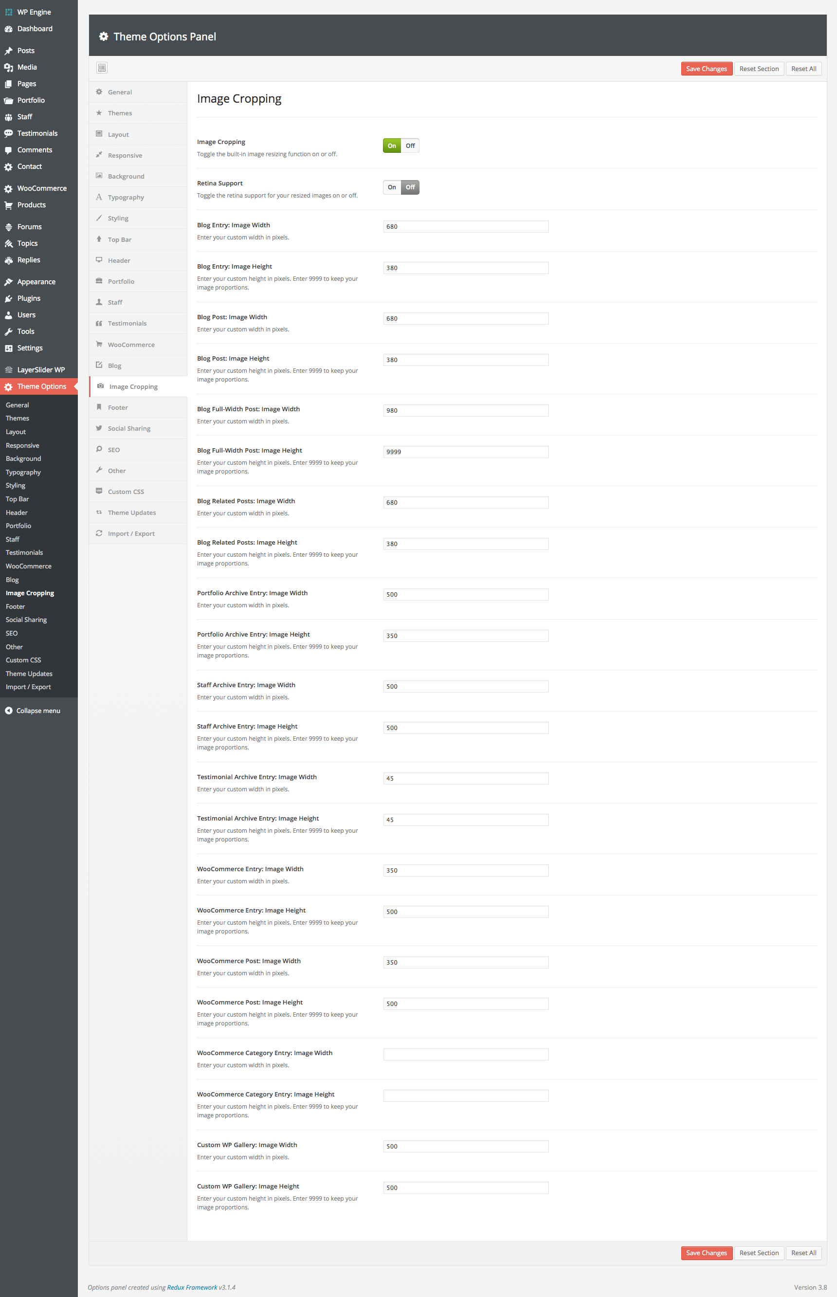
Hi, Can the thumbnails previewed on the ‘Blog Masonry 4 column’ be previewed in different orientations or is there a set width and height? I’d ideally like some to appear in portrait and some landscape.
Matt
Hi Matt,
You can have portrait and landscape images. All you need to do is set the height value for your image cropping to “9999” that way your images won’t be cropped vertically and they will keep their proportions:
http://0.s3.envato.com/files/78750779/screenshots/16_cropping.pngI finally pulled the trigger with a Total theme.
Looking forward to working with another of your amazing themes.
Brad
Awesome, thanks for the purchase Brad!
I want to implement the Google+ Authorship on my website, but Googles test tool says: “Missing required field ‘entry-title’. Missing required field ‘updated’. Missing required hCard ‘author’.” Well, I’ve already found the solution here: http://urbanstoic.com/how-to-fix-google-hfeed-or-hcard-warnings The problem is that I don’t know where to put the “entry title”, because the title seems to be hidden in the “wpex_hook_main_top()” and I don’t know how to change this (can’t find it). I’ve got similiar problems with the “updated”-field and the “author”-hCard. P.s. I hope this will be the last time bugging you.
To be honest I’m not quite sure what you are trying to do, you don’t have to do all that for Google+ ownership.
The easiest way is to add ownership is like this: https://support.google.com/webmasters/answer/2539557?hl=en
Any SEO plugin you use on your site should have these settings built-in. I always use WordPress SEO by Yoast and it’s all built-in.
What you are linking to above is something quite different.
I did this, but the results aren’t that good. So my homepage is connected with Google+, but my single blog posts aren’t. Maybe the SEO plugin will do it, don’t know. I’ll give it a go.
I actually use the Fanciest Author Box on my website and that works great for Google Plus authorship on posts – even when you have multiple authors.
Oh by the way…don’t forget it can take Google a while to update ownership. So even if it’s setup correctly on the site you’ll need to give it time before your avatar displays on search results.
The Fanciest Author Box could be a good idea. I know that Google might take some time, but the test tool says that it’s not working properly, so I doubt if time might change it.
You can also try email verification for Google ownership. Might be the easiest for site-wide ownership – https://support.google.com/webmasters/answer/1408986?hl=en
Hi, I am building a website at sms1984.wpengine.com. I added a row with two columns and put a Layer slider in the left column and some placeholder text in the righthand column. The slider is set to be 480px by 480px. It is displaying slightly smaller and the text on the right is set too far left for even columns and is not as wide as it should be.
I don’t know if it is my settings or a bug causing these issues. If you need login credentials, let me know.
Thanks for your assistance. Michael
Hi Michael,
This page looks like it has a sidebar, so there is extra space on the right where the sidebar would go.
You’ll want to select the Full-Width page layout in the page options if you want to remove the sidebar.
ps: There is a “spacing” module available in the Visual Composer you can use to add some space above your columns to separate from the menu.
pss: If you are just adding images, you might want to check out the Image Slider module in the Visual Composer instead of the layerSlider you might find it a lot easier to edit and definitely “cleaner”.
The site is looking really unique, awesome!
1) Thanks for the help! You were right, there was an invisible sidebar causing the issue.
2) I am now using the spacer module – thanks for the suggestion.
3) The Image Flex Slider works much better for my purposes – thanks for that suggestion, also.
4) Thanks for the compliment on the website.
I have used maybe 100 themes over the years of building websites. Total is newly discovered on my part and my favorite theme of all time. It has an option for nearly every customization and is completely flexible such that this one theme can be used to create thousands of unique looking websites. Excellent work!
All the best, Michael
I’m glad things are working out and you like the theme Michael!
Hope you had a nice weekend
Hi,
I’m about to purchase this theme, but I just have one question, can I install this theme in my sub-domain as well? My website has a sub-domain that is for my clients to log in. It would be a bummer if I had to purchase the entire theme again just to include it in my sub-domain log-in page.
Thanks.
For this circumstance it shouldn’t be a problem
Of course if you want to buy it 2x I won’t stop ya!
Under ‘Theme Options: Typography: Headings’ There is an option to change the font and boldness. Is this for all headings, h1 h2 h3, etc? Is there anywhere to change the headings styling individually?
Thanks,
This is to target all headings if for example a specific font you choose doesn’t have semi-bold (headings are 600 by default) so you can alter all of them.
There aren’t any individual settings because headings are used in so many areas it would literally add like 40+ options and really bloat the theme panel.
If there is a specific heading you want to modify I can help you with the custom CSS for that. If you are having trouble.