
38434 comments found.
Hi! Anyway I could change the color of the area shown here to white? See screenshot here… http://i.imgur.com/PfCM2dA.png
Hey again! Please see this in regards: http://themenectar.ticksy.com/ticket/166506/search/
Thank you!
You’re welcome ")
Hi, everything worked when I put in all of the css code accept some of the text is white. How can I change the color of the text shown here… http://i.imgur.com/n0W0npU.png
Hey again! Add this as well:
body #portfolio-filters-inline .container > ul li#sort-label, body #portfolio-filters-inline #current-category {
  color: #000!important;
}
How do I call out one menu item in the header? Similar to how http://breather.com/ calls out “Book Now” on the right side of their header menu?
Is this possible in the Custom CSS box?
Thank you so much! Hard to find that link in the forum based on how the question was asked Glad you remembered.
So when I do this method, I take out the menu item from the Appearance>Menus so I don’t have two of the same menu item. Now on mobile viewing, I lose that link. Is there a way to add it to the mobile menu list when viewing on mobile? Love the 100% responsive web design. It is great!
Hey again!
Yes – you can also add the additional list item into the “mobile-menu” div towards the bottom of the header.php file
Cheers
With three easy modifications to the style.css I changed the box layout from 1200px to 1400px. Everything worked swimmingly except for the portfolio layout. Oddly it shifted all of that off the page to the right. I’ll keep looking into it but wanted to see if you might know off the top of your head what might be a rye.
Hey greatnorwegian!
Is there anyway you could share a URL to the page in question so I can see what’s going on?
Cheers
Hi guys,
I’m wondering if you can advise the right custom CSS to change the colours of the boxed columns?
I’m using Firfox Firebug to identify the CSS class but can’t seem to get it right.
I’d like to change the box colour, the size of the box within one full-width section only to a default height to keep them neat!) and subsequently the font colour within them.
Can you advise?
Many thanks.
Ash
Just to add more info. This is the page we are editing – the 3 boxes in the first ‘services’ section should be the same size. The three below should also be the same size (but smaller).
Is there a way of individually coding each of these boxes? I presume applying a class but wonder how this would be done.
Thanks in advance. Link: http://sloly.reececropley.com/
Hey Ash!
You’d need to add a class on the row holding each set of columns to then set the height on.
As for changing the colors – enter this into the Custom CSS box located in your Salient Options panel:
.boxed.col {
   background-color: #000!important;
   color: #fff!important;
}
.boxed.col p {
  color: #fff!important;
}
Cheers
is there any chance we can make the menu background become transparent [ 60% ].. ?
Hey wongsamar!
Yes – just add this into the Custom CSS box located in your Salient Options panel:
#header-outer {
  background-color: rgba(255,255,255,0.6)!important;
}
Cheers
thanks
You’re welcome
hi Themenectar,
thank you for the great template but there is 1 problem, the icon set font awesome is working great on my website but the icon set steadysets doesn’t work annymore, how can i fix them so they will work again?
Hey hubie681!
Can you please allow me to see your URL so I can check out why it’s not working anymore?
Cheers
Hi Theme Nectar
I am asking quite a few questions, I hope you still have the time to help
We have a few more things to do before it is all set up.
Woocommerce shop page:
1.How to remove the Title of the page, plus the filtering, and the text “showing the single result” ?
2. Would you know, how to have the product images on the shop page in rows, 4 products in a row, without spaces between the product images? the products would be aligned just like the images are here: http://themeforest.net/item/salient-responsive-multipurpose-theme/full_screen_preview/4363266 but without the empty space between the images of the same row.Many Thanks for your time and attention
Best wishes
M.
Here is a view of a page similar to what I am looking for to achieve, but with tiny spaces between the images, we would like to remove the space. and also to have the product images wider on a page than the “container” option. http://functionals.eu/products
Additional thing is, I have searched through the comments, to find the solution to Log in/ Log out section in menu. When someone is logged out, they see Log In, when they are Logged in, they see logged out. It is for the “my account” pages. I tried BAW plugin, but it is something different, it actually takes you to admin login
many thanks!
Hey again New_Castle!
1. Add this into the Custom CSS box located in your Salient Options panel:
.woocommerce-ordering, .woocommerce.archive .page-title, .woocommerce.archive .woocommerce-result-count {
   display: none!important;
}
2. Try this:
@media only screen and (min-width: 1000px)  {
   html .woocommerce ul.products li.product, html .woocommerce-page ul.products li.product {
       margin-right: 0!important;
       width: 25% !important;
   }
  woocommerce.archive .container  {
     width: 80%!important;
  }
}
3. As far as the log in/out – I think this would take some custom development. I’ve seen various workarounds posted like this: http://stackoverflow.com/questions/15179863/add-login-logout-to-menu-woocommerce-wordpress But am unaware of a plugin for it (there very well could be one though)
Cheers!
Hey Theme Nectar
You solved the issues again
Thank you Best wishes M.
You’re welcome!
Hi there!
First things first, this is an amazing theme, HUGE CONGRATS for that.
I left a message in the support forum, detailing my problem/bug and with a screenshot of it. I am building my home page but when I add the “Recent Projects”, for some reason it appears with +/- 30px or so in the left side margin of the widget.
If I try to remove it with css it will affect the widget when I resize the screen in responsive mode.
Can you help me with that?
Thank You! Alfredo
Thanks Alfredo!
I’ll be with you as soon as I can on the forum in regards what’s your ticket #?
Cheers
Just love this theme.
I noticed that when I set a nectar slider to Fullscreen slider, it behaves a little strangely on the Chrome mobile browser. The entire page jumps as the slider image is automatically resized when scrolling up or down which reveals or hides the chrome menu bar. Is there some way to disable the Fullscreen slider feature when being viewed on mobile chrome or mobile devices in general? Thanks!
Hey Olimess!
Unfortunately this behavior issue would require some scripting attention – there’s no quickfix I can give out here in regards. If you wanna try and take a stab at with some hacking, the correct file is going to be the nectar-slider.js towards the lower half. I’ve noted to sort this for the next release though and if I come up with an early solution I’ll post it on the forum
Great, thanks! I’ll have a look … just wanted to make you aware of it and also to see if you had a quick solution.
Sounds good & you were actually the first to report
I love this theme. As I start implementing the Nectar Slider, what size image(s) should I use? Thanks.
Great to hear Josh!
The size is up to you – but as a general rule, when using the fullwidth option make sure the width is at least 1800px. The height of the image can then match what you define as your slider height.
Cheers
Great. Thank you! Awesome, awesome theme. I would love to offer free assistance; you have some grammatical errors.
You’re welcome Josh! If you’re referring to grammatical errors within the theme I’d be happy correct what you’ve found. Just open a ticket on http://themenectar.ticksy.com/ in regards
Cheers!
Hi
I purchased the theme a few days ago, and enjoy its capabilities. I am having a problem with the home slider. The slider has 4 slides, the first three videos, each with a preview image.
All is displayed correctly in IE., as does the other pages and all of the Nectar sliders.
However, on Chrome, the Nectar sliders are display, but the home slider videos do not display. moving whites dots against a black background is displayed.
Any thoughts?
According to your grid, chrome and IE both use mp4 files. the 2nd format is also available.
Regards Rich
Hey Rich!
If you can supply me a URL i’d be glad to take a look
Cheers
Sent you link via your email address. Also, I used online video to convert again source to ogv file, and uploaded new file. Cleared chromes browsing data and refreshed, with no change. Appreciate your thoughts.
Thanks! I just responded
Themenectar – I have another question. I’m trying to implement a page-wide background using the custom CSS below. It’s not working. See the header area at http://outpost.marcfest.com—it’s white. I want it to show the background specified in the body attribute in the custom CSS. Thanks for your help.
body { background-image: url(“http://outpost.marcfest.com/wp-content/uploads/2014/02/green-bg.jpg”); }
body .home-wrap, body .container-wrap, body .page-header-no-bg, { background-color: transparent!important; }
Hey again!
The only way to do that would be to remove the header color by using this:
 #header-outer {
   background-color: transparent!important;
}
body .container-wrap  {
    margin-top: 73px!important;
    padding-top: 0!important;
}
Cheers
I upgraded woocommerce to the latest version and now product lightbox gallery isnt working, any ideas? Thanks!
Hey jcc123,
The version of Salient released last night (3.1.5) sorted that issue
Thanks! Solved! Another quick question. Any way to add breadcrumbs? even on shop? thanks!
You’re welcome!
See this in regards: http://themenectar.ticksy.com/ticket/73962/search/
Cool thanks! One last question. Any way to add extra zoom on the fancybox once an image is clicked?
Unfortunately the size of the image is calculated dynamically from within the plugin. Modding that would require some script tinkering.
Ok I’ll look into it, can you help check why time to first byte and loading time is really high onmy site? If I change the theme the problem goes away. Where can I send a url privately? thanks!
Sure – just open a private ticket here in regards http://themenectar.ticksy.com/
When I put a tab component in a page and then embed a blog category in that tab, the blog only shows up on the first tab.
For example, tab 1 – Stuff: category household tab 2 – Wortheless Stuff: category junk.
I can swap categories in and out of the first tab, and they show up just fine. However, as soon as I embed a blog category in the second tab, it won’t show up at all—just blank.
Any ideas?
Hey sildona,
The main blog element is only meant to be used once per page – this is a limitation that will be lifted in future releases, but for now it would require some custom development
On “Blog Options” for the home page, if I set the excerpt as ‘off,’ the front page displays the featured images and any images I insert into the post. This is nice as it makes the masonry layout visually appealing. However, if the posts are long, it makes for a lot of reading.
If I set set Blog Options to excerpt of, say, 150 words, the posts are shortened, but the images are also removed, creating a full page of just text—very visually unappealing.
How do I get the best of both worlds—post images that display in home-page excerpts?
Hey sildona,
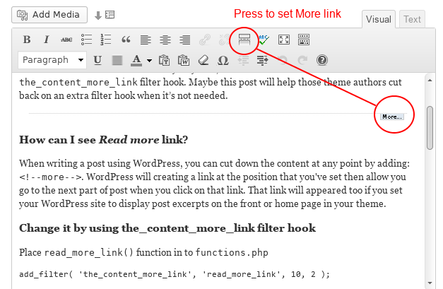
You need to leave the excerpt off and just use the “more” tag in your posts to manually define where the read more button will go.
http://www.narga.net/wp-content/uploads/2013/01/WordPress-read-more-link2.pngCheers
Hello, very interested in purchasing this theme! Does it have a horizontal scroll option? Thanks!
Hey radioherostl,
there’s no horizontal scroll option currently – just the option to toggle the smooth scrolling / styled scrollbar.
Cheers
Hi! Anyway I can close up the space as seen here in this screenshot?... http://i.imgur.com/BmhRI95.png
The dividing height is set to zero.
Hey LiskaD!
Anyway you can provide me a URL to that page so I can see what’s causing it?
Cheers
I’m working locally on my computer using MAMP. When I switch to live I’ll send you a link.
Sounds good
Hi! Loving your theme, thank you! I have a quick question, I am trying to get the portfolio pages to be 1/2, 1/2 column verses its default styling of 3/4, 1/4- would it be possible to direct me to the line of code to change this? I am not super code savvy and it would help me immensely- thank you!
Sophia
Hey Sophia!
Add this in the Custom CSS box located in your Salient Options panel: html .single-portfolio #sidebar, html .single-portfolio #post-area {
width: 50%!important;
}
Cheers
Can you change the height of the header area that contains the map? We have 17 locations, and the map looks a bit claustrophobic at 350px. Also you can only add 10 map markers, can you add more? As mentioned, we have 17 locations.
Hey supernovacreative,
You need to use the google map page builder element (added in the v3.0) as you’ll have control over the height and also not be restricted to the number of markers you need to add
Hi! Loving everything, just a couple of questions Ive been trying to solve but cant. On this page there is a white boarder under my nectar slider, but I cant see why… http://replayhouse.com/studio/ And Im getting a 404 when selecting four boxes icon from this page..http://replayhouse.com/portfolio/replayhouse-grand-tour/
Any advice would be much appreciated! Thanks lots, Jack
Hey Jack!
1. I’m seeing a lot of weird things happening in your stylesheet as if it’s been modified somehow. Is there anyway you could allow me to log in so I can check on the files?
2. Make sure you have a URL entered for that in the Portfolio options tab of the Salient options panel.
Cheers
Hey! Thanks for the help. Oh modified in what way? Sure, do you need me to send the password via a secure email? Or can you get in without it?
Modified as in there’s missing rules from your style.css file – I’d be glad to log in and take a look for you
Can you please open a private ticket on the support forum here: http://themenectar.ticksy.com/ and post your ticket # here?
Cheers!
Great thanks! Im pretty code illiterate. Here you go: 171893
Thanks! I’ll be with you soon
